12 Ways to Draw the Letter A. Level up your hand-lettering style with these twelve creative and easy ways to hand-letter the letter A.
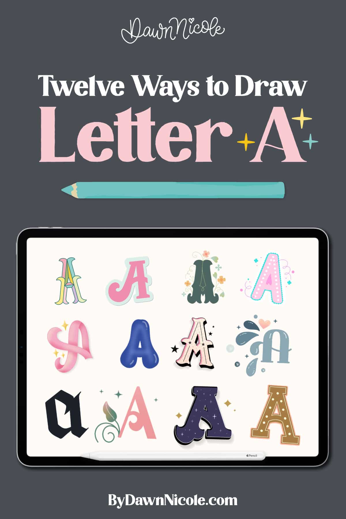
12 Ways to Draw the Letter A
If you’re ready to give your hand lettering a little extra flair, the letter A is the perfect place to start.
In this post, we’ll explore twelve fun and creative ways to draw the letter A, from playful and whimsical to sleek and modern.
Whether you’re brand new to lettering or looking to add fresh styles to your toolkit, these ideas will help you level up your skills and make your designs stand out.
Be sure to check out the FAQs at the end of the post for a ton of lettering tips and resources!
Noteworthy
This blog post showcases styles from a complete lettering style I’ve created over the past year. Below each example, you will find a link to the workbook where you can learn the entire style. Additionally, I have linked free video tutorials for each style.
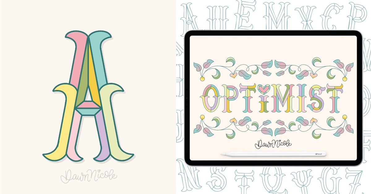
Style No. 1: Beveled Colorblock SERIF
My beveled Colorblock Serif Lettering style combines bold, structured elegance with playful, modern flair.
Beveled lettering styles are relatively common. But beveled serifs are pretty rare! I struggled to find much inspiration for this style, but I love how it turned out.
The serifs are accented by pointed spurs at the midline that give the letters a touch of vintage charm, while the beveled effect creates the illusion of depth and dimension.
Each section of the letterform is divided into distinct color blocks, making the design pop with contrast and energy. It’s perfect for creating eye-catching headlines, statement art, or retro-inspired branding.
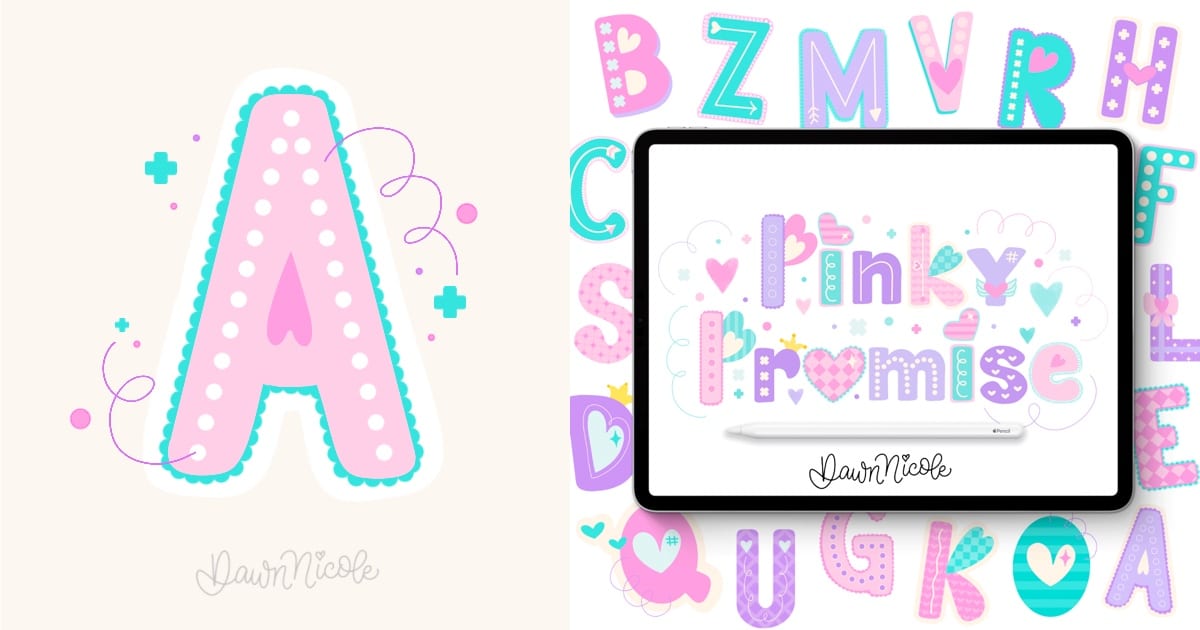
Style No. 2: Heart-inspired Playful SanS Serif
This Sans Serif is a decorative display style that’s anything but basic. The addition of patterns, simple doodles, and layers creates a playful, maximalist vibe. The fundamental elements can be mixed and interchanged with other letters to create custom variations.
A display style is intended for use in display type/copy at large sizes for titles, headings, pull quotes, and other eye-catching elements, rather than for extended passages of body text.
This style was created using the Maximalist Lettering Kit for Procreate.
Style No. 3: Decorative Gothic Tuscan Serif
This Bifurcated Gothic Tuscan Serif is an Ornate Decorative Serif that works best as a Display Style. Inspired by flower gardens, you can customize the vine work and botanical elements to suit your taste. You can opt to add spurs to letters to add balance or more detail. Watch the video lesson for more tips!
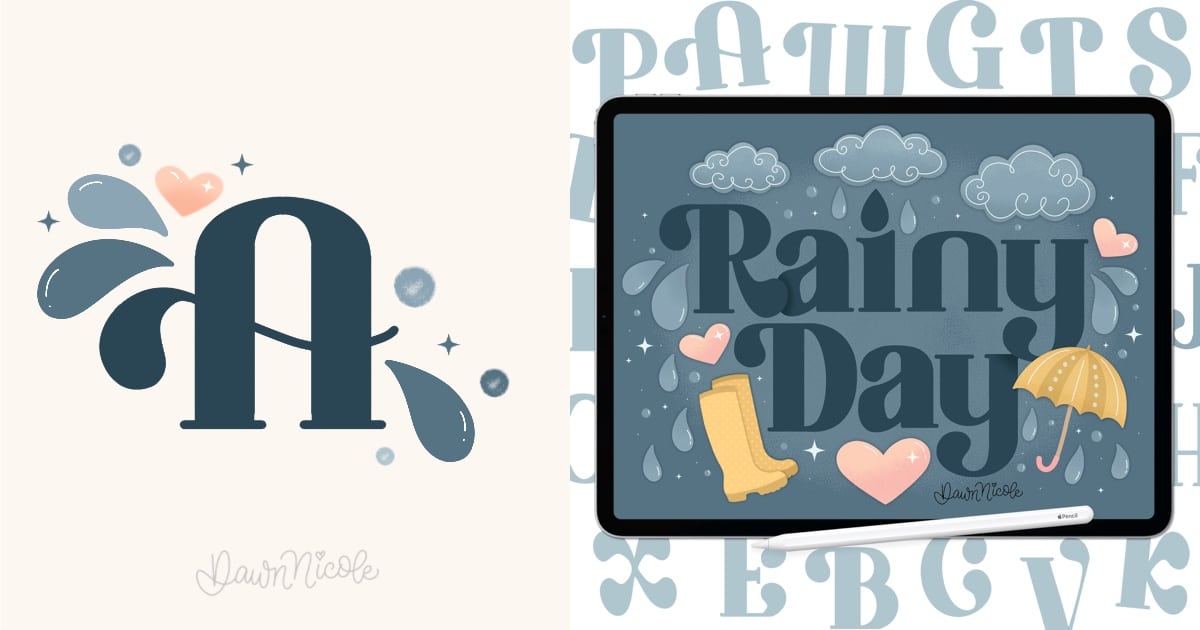
Style No. 4: Round Serif with Teardrop Terminals
This versatile style, inspired by Spring showers, features teardrop terminals and rounded serifs. There is a high contrast between the thick and thin lines. The bluesy color palette helps evoke the same feelings that you get from a Rainy Day. The peach and yellow illustrations keep it from being too dreary.
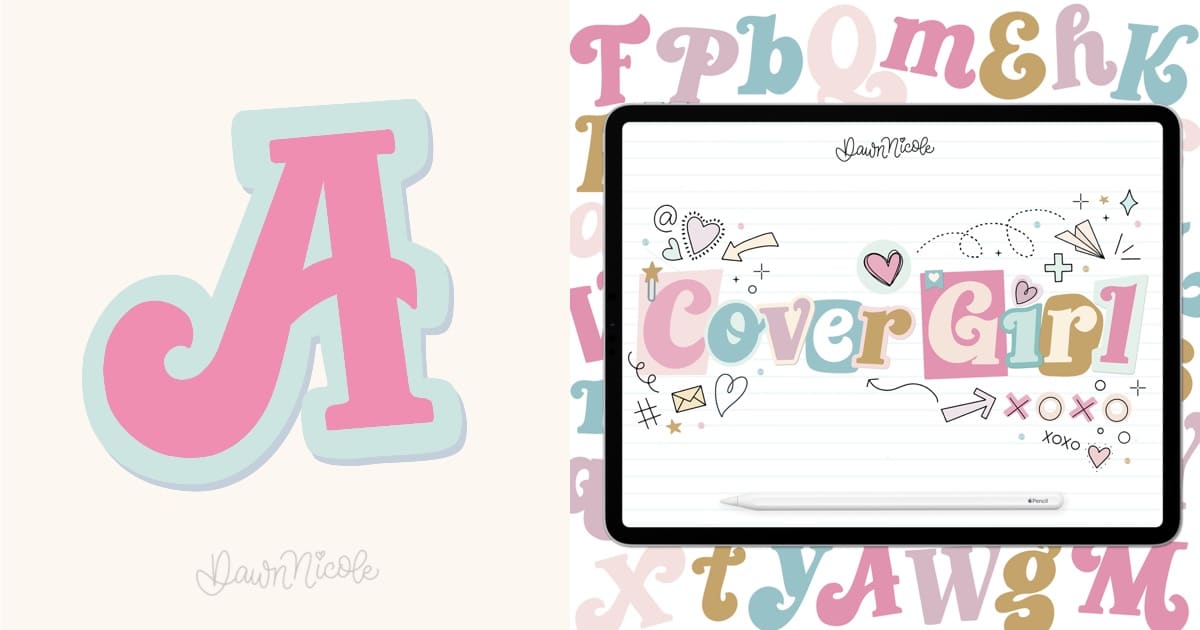
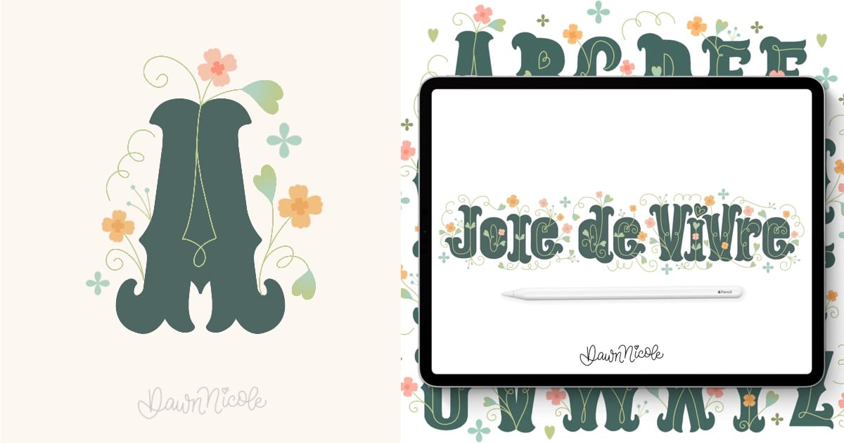
Style No. 5: Retro-inspired script + Serif Mashup
This retro-inspired script and serif mashup lettering style is inspired by 90s magazine style and letter cutouts. Cover Girl stands out with its unique mash-up style, which combines bracket serif elements and heavy-bottomed retro script.
While it’s not a mixed lettering style, the magazine clippings treatment we’ll give it gives off a similar vibe. The use of a cutesy color palette and doodles is a deliberate choice to enhance its playful nature, steering it away from a creepy ransom note vibe.
Style No. 6: Playful & Bubbly with retro vibes
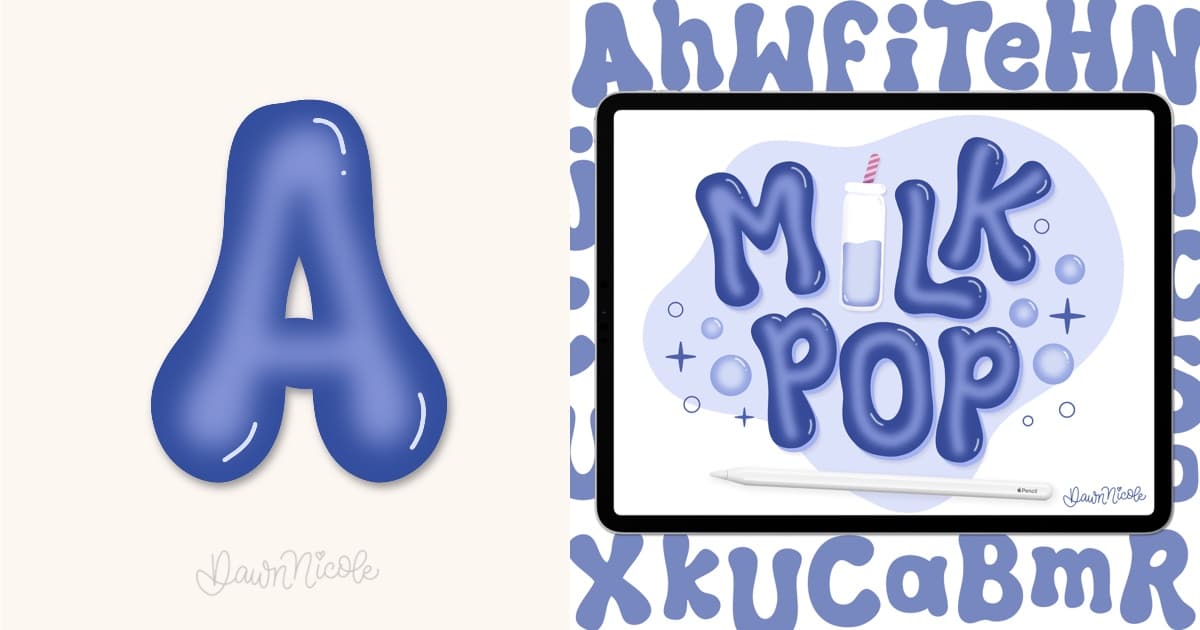
Milk Pop is a fun, bubbly twist on classic bubble lettering. It already brings playful vibes on its own, but it truly comes to life with a dimensional style that makes it leap off the page. The inspiration came from my kids’ obsession with Boba and Milk Tea—hence the name Milk Pop, blending the fun burst of popping boba with the creamy sweetness of milk tea. The result? A name and style that feels both retro and cheerful.
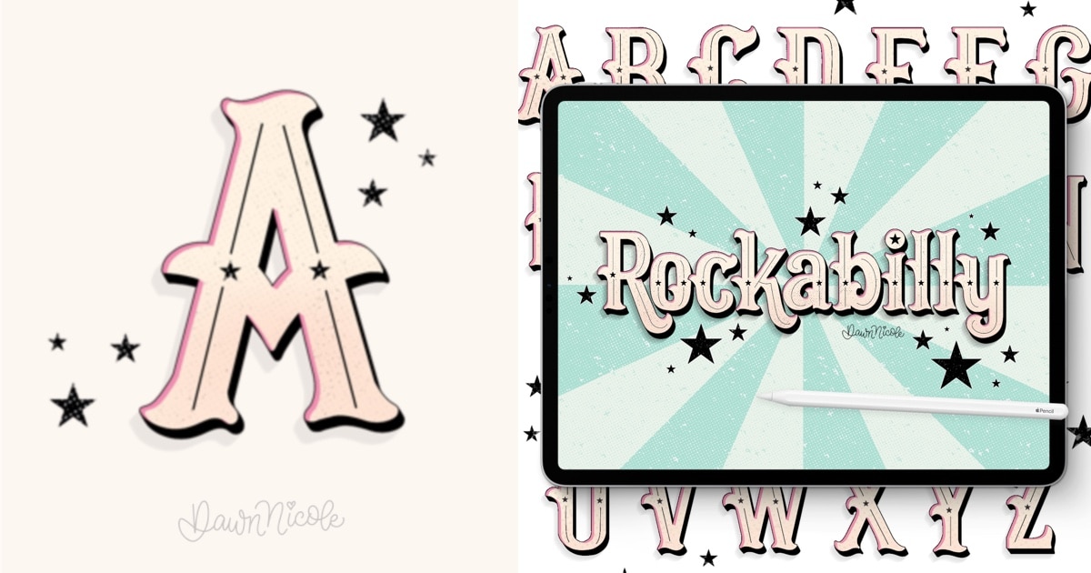
Style No. 7: Victorian-inspired serif
Rockabilly is a Victorian-inspired lettering style that fuses ornate elements with bold, contemporary flair. Its design blends the elegance of 19th-century typography with the rebellious energy of retro Americana, creating a dynamic aesthetic that feels both nostalgic and modern.
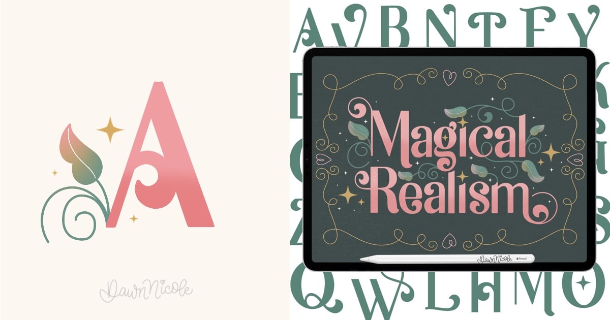
Style No. 8: Whimsical Sans Serif
Magical Realism is a distinctive lettering style that blends clean, modern aesthetics with whimsical charm. As a swashy sans serif, it features smooth, flowing strokes that defy the typical rigidity of sans serif fonts, introducing a sense of movement and enchantment. Its crescent-shaped terminals add a subtle celestial flair, while delicate sparks, leaves, and flourishes of “magic” dance around the letterforms, evoking a dreamy, storybook quality.
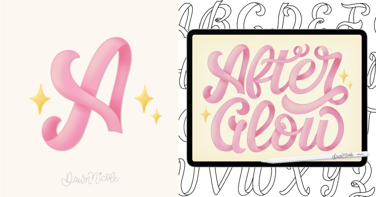
Style No. 9: Sweet & Ribbony Script
AfterGlow is a playfully sweet, ribbony script that brings a touch of whimsy to every word you draw. With soft curves and delightfully simple dimension, it dances across the page like ribbons in a breeze. This style is infused with feminine charm with a hint of romance. It’s perfect for creating a cottagecore vibe. AfterGlow feels both nostalgic and fresh, blending delicate elegance with a joyful, handcrafted touch.
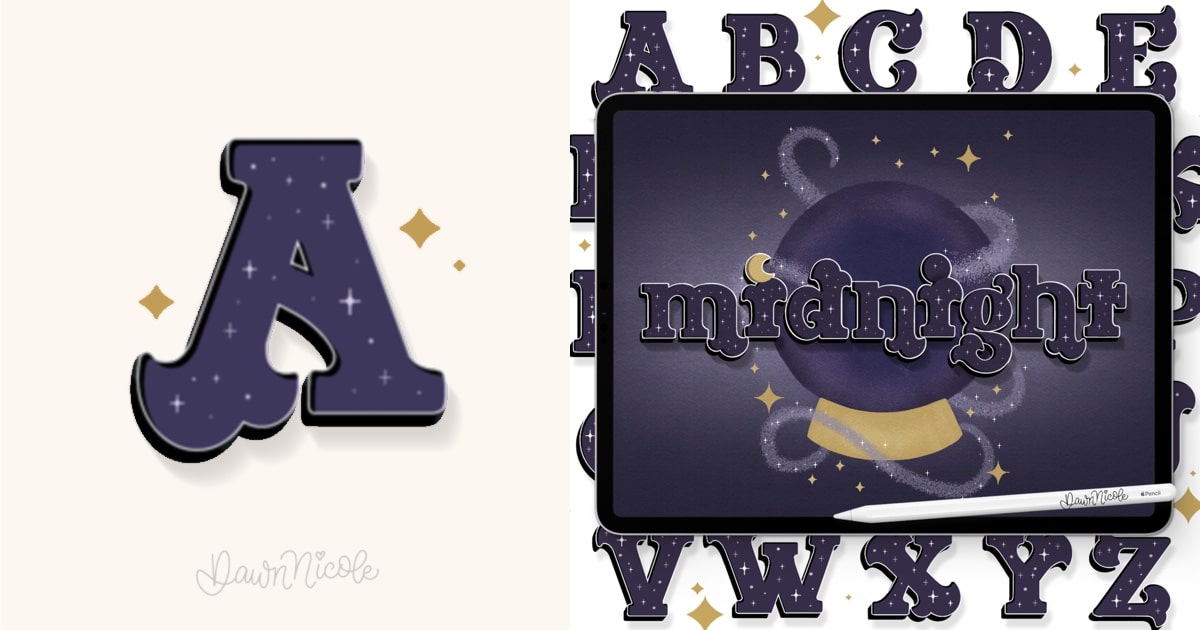
Style No. 10: a Bewitching Mixed Serif with Gothic Vibes
Midnight is a bewitching mixed serif lettering style that draws its magic from the starry night sky. With high-contrast strokes and subtle gothic elements, it feels both mysterious and elegant. Its moody color palette evokes deep indigos, shadowy blacks, and hints of gold, capturing the allure of moonglow and twilight. This style blends romance and darkness, making it perfect for designs that whisper of enchantment and mystery.
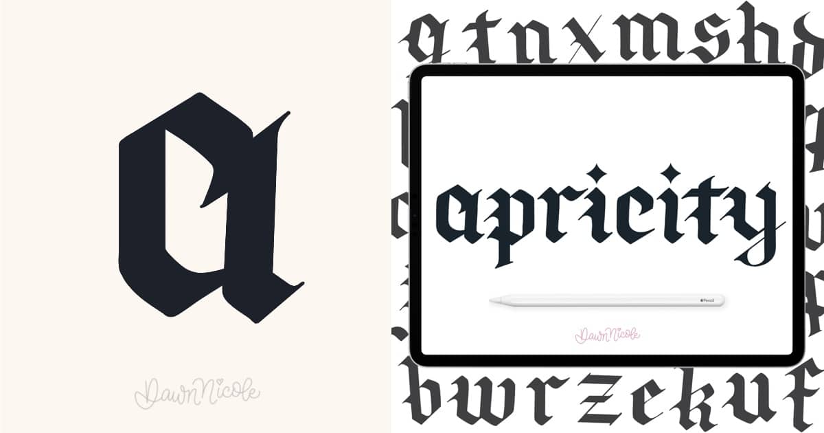
Style No. 11: a Blackletter with Modern Edge
Apricity is a fresh, modern twist on classic gothic calligraphy and penmanship. It is inspired by the bold, dramatic strokes I loved creating using a Pilot Parallel pen when I was a teenager. This style softens the rigid structure of traditional blackletter with a more playful, expressive touch (while still honoring its timeless roots). Each letterform feels both nostalgic and new—a balance of sharp edges and fluid movement. Apricity captures the warmth and artistry of old-world calligraphy, reimagined for contemporary creative work.
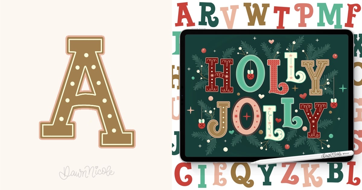
Style No. 12: a Slab Serif with Festive Flair
Holly Jolly is a slab serif lettering style that strikes the perfect balance between tradition and playfulness. Its bold, blocky serifs give it a classic foundation, while subtle curves and decorative details add a cheerful, festive flair. This style feels warm and welcoming, perfect for holiday projects, greeting cards, and seasonal designs. Whether you keep it simple or customize it with embellishments like dots, curls, or color accents, Holly Jolly brings fun,
Lettering FAQ: Drawing Letters & Exploring Styles
Before we dive into the twelve styles, let’s discuss some basics.
What’s the difference between lettering and handwriting?
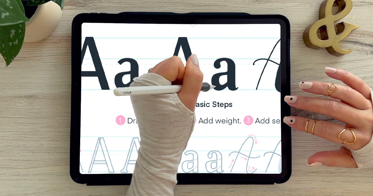
Handwriting is writing letters quickly and naturally. Lettering is drawing letters with intention. When you letter, you’re carefully crafting each shape, adjusting spacing, style, weight, and details to create a finished design rather than simply writing words on a page.
Do I need good handwriting to be good at lettering?
Not at all. In fact, they’re two completely different skills. Lettering is about understanding shapes, structure, and style. You can have messy handwriting and still create beautiful lettering because you’re drawing each letter, not writing it.
What tools do I need to start?
You can start with:
- A pencil and paper
- A brush pen
- A fineliner
- An iPad with Procreate and the Apple Pencil
The tool matters far less than learning basic letter structure and practicing consistently.
What are the main lettering styles?
Some common lettering styles include:
- Serif
- Sans serif
- Script
- Brush lettering
- Block lettering
- Bubble letters
- Calligraphy
Each style has its own personality. Serif styles feel classic. Sans-serif styles feel modern. Script feels elegant or playful. Bubble letters feel bold and fun. You can mix and match styles for more dynamic compositions.
How do I improve my lettering?
Focus on:
- Practicing basic strokes
- Studying letter anatomy (Check out my series The Anatomy of Letters: An A-Z Guide)
- Paying attention to spacing
- Slowing down
- Using guidelines
Tracing can also help train your eye and hand. The key is consistent, intentional practice rather than rushing through pages.
Why do my letters look uneven?
Usually it’s one of three things:
- Inconsistent slant
- Uneven spacing
- Different letter heights
Try using guidelines for baseline, x-height, ascender, and descender lines. These act like training wheels and instantly improve consistency. Check out my Modern Cursive Free Practice Sheet Series to work on consistency and linework
How do I create my own lettering styleS?
Start by learning the rules before breaking them. Learn to draw the basic letter styles first. Check out my How to Draw Letters A-Z series for Beginners. Study existing styles, practice them accurately, then slowly tweak details like:
- Stroke thickness
- Serif shapes
- Curve exaggeration
- Proportions
Over time, your preferences naturally combine into something uniquely yours.
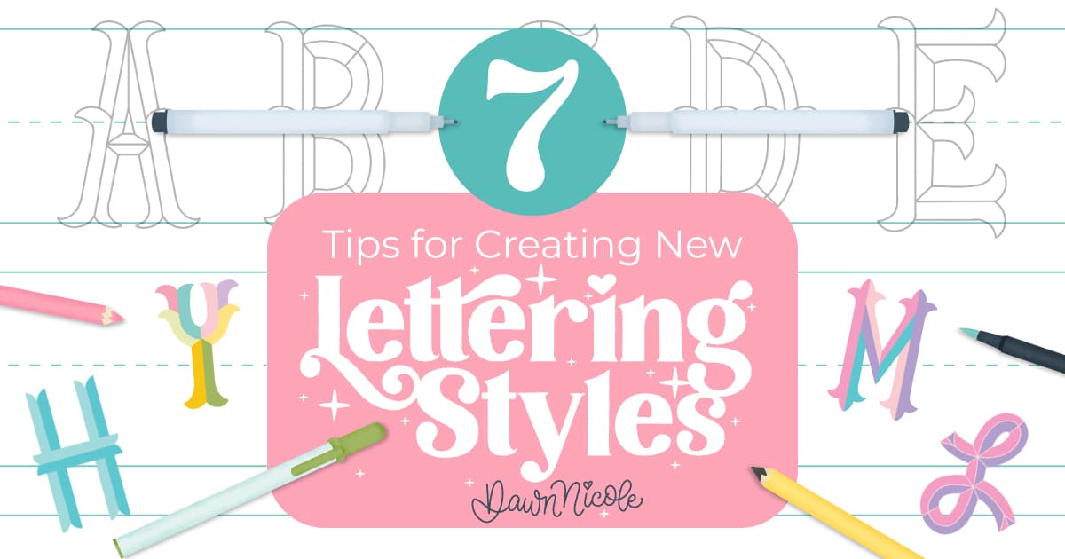
7 Tips for Creating New Lettering Styles
Should I trace other artists’ work?
Tracing for practice is fine as long as it’s for learning and not for sharing or selling. Think of it as a studying technique. When you create finished pieces, make sure the design and style are your own.
How long does it take to get good at lettering?
It depends on how often you practice and how intentionally you practice. Many people see noticeable improvement in a few weeks of regular practice. Mastery takes longer, but progress can happen surprisingly fast when you focus on fundamentals.
Do I need expensive supplies?
Nope. Skill grows from repetition and understanding, not fancy tools. A simple pencil can teach you everything you need to know about letter structure.
HELPFUL LINKS
- The Anatomy of Letters: An A-Z Guide
- Hand Lettering the Alphabet A–Z for Beginners
- Modern Penmanship Tips for Calligraphy and Lettering Lovers
Happy Lettering!


