7 Tips for Creating New Lettering Styles. My top tips for drawing original letters to create new, complete alphabets and fonts!
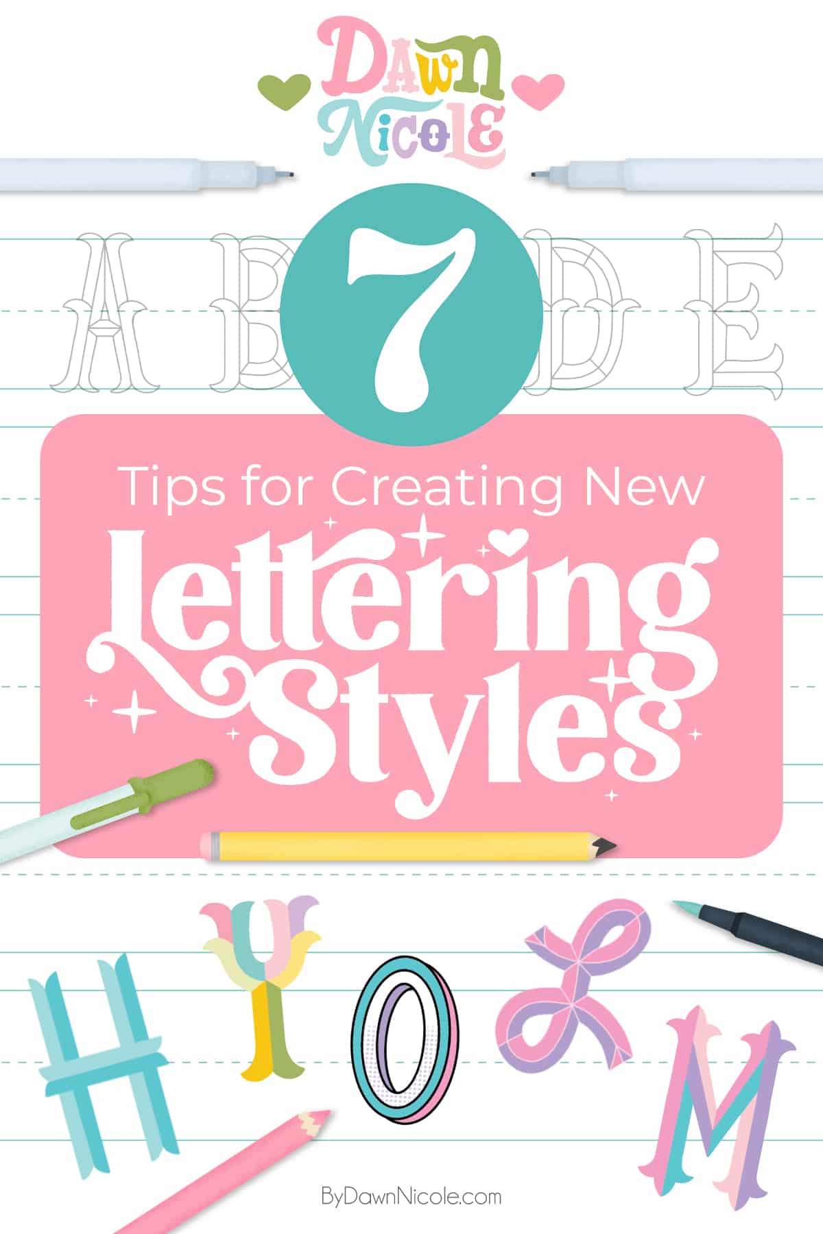
7 Tips for Creating New Lettering Styles
One of the main things I’ve focused on over the past few years is developing original lettering styles to share in my published books. Coming up with a brand new lettering style can feel a little intimidating, especially when you’re staring at a blank canvas waiting for inspiration to strike.
The good news is that you don’t need a lightning bolt of genius to create something fresh and original. In this post, I’m sharing 7 practical, creativity-sparking tips that will help you experiment with confidence, develop your own unique look, and turn simple letterforms into styles that feel completely your own.
No. 1: Gather Inspiration
Go shopping and sightseeing out in the real world. Online inspiration is excellent, too, but getting out and about can help you feel extra creative and inspired.
My favorite places are the Art Museum, bookstores, and grocery stores. That last one may seem weird, but I’ve found some of my best inspiration in spice containers, eggs, and coffee packages, especially in boutique and health-market-style grocery stores.
One of my personal favorites? The Vital Farms Egg Cartons are designed by Unpack’d, as shown below. (See more of their fantastic work for Vital Farms here.)
Snap photos while you’re out to add to your vision board for the next step.
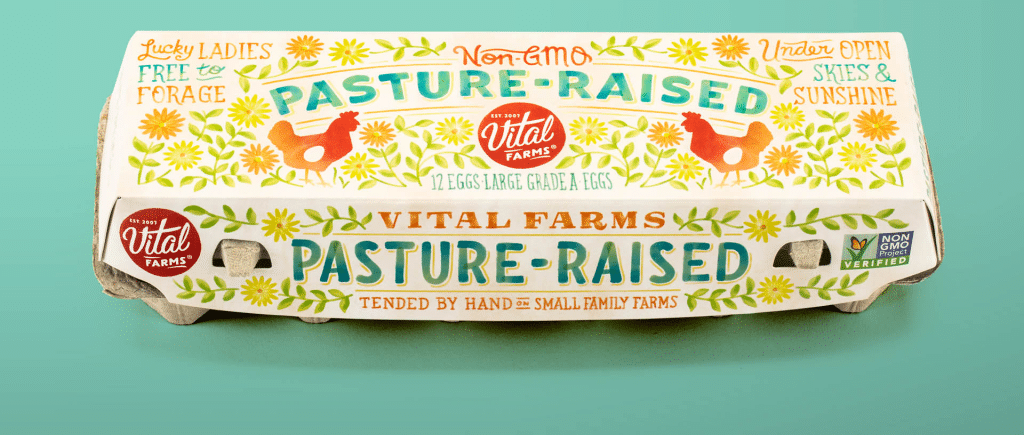
Image via Unpack’d. Click on the image to go to their website.
No. 2: Create a Design Brief + Vision Board
Your design brief can be just a few sentences or bullet points. Questions you’ll want to consider for the brief include the following:
- Serif or sans serif? Display or decorative?
- Dimensional or flat?
- Black and white or colorful?
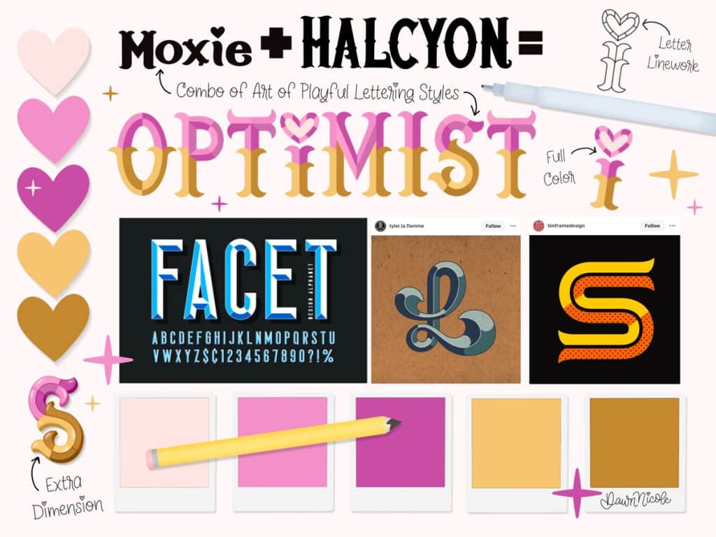
My design brief for the Optimist style:
- Style: Birfucated Serif with a Second Layer and Beveled Dimension
- Color: Colorblock with Alternate Options
- Design: Uppercase Lettering with Lowercase Heart-Tittle Letter i
- Style Name: Optimist
- Tagline: “A Beveled Colorblock Serif”
My vision board is typically a digital one-page collection of inspirational images, color palettes, sketches, sample letters, and anything else I want to reference as I create a new style.
For Optimist, I use two styles I designed for The Art of Playful Lettering as inspiration. I couldn’t find many beveled serif styles online, which is good. It meant I had to get a little extra creative, and it guaranteed an original result.
I like to make my vision boards cute and even update them as I complete the title style, but they certainly don’t need to be pretty unless, like me, you find that extra inspirational and fun to create.
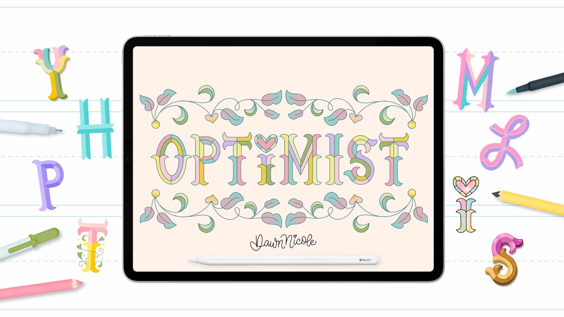
The Vision Board
The Final Style
No. 3: Use a Single Letter as your starting Point.
This is my “secret” top tip for creating new lettering styles.
Almost all the original lettering styles I make start with using a single letter as my main inspiration. Sometimes, that’s a letter I draw based on various things. Other times, it’s a letter I saw in the real world or online.
If it’s a letter I saw somewhere, I study it and then move it out of sight. This helps prevent copying anything! It inevitably changes when I draw my version.
Next, I sketch out the rest of the alphabet based on the characteristics of that sole letter I drew first.
No. 4: Study and Refer to Classic & Well-Designed Fonts.
Studying classic fonts will help you with particulars like Serif placement, angles, etc. Here are some of my personal favorites.
- Sans Serif: Avenir, Helvetica, Avant Garde, Century Gothic
- Serif: Adobe Garamond, Bodoni, Clarendon, Times New Roman
No. 5: Sit down and sketch the entire alphabet.
The hardest part is often getting started, so force yourself to sit down and sketch all the letters in one sitting. There is no need to be perfect; this is just the first round of sketching.
No. 6: Revise and Refine.
For round two of sketching, the main things I focus on refining are:
- Consistency of the Letter Stroke Widths
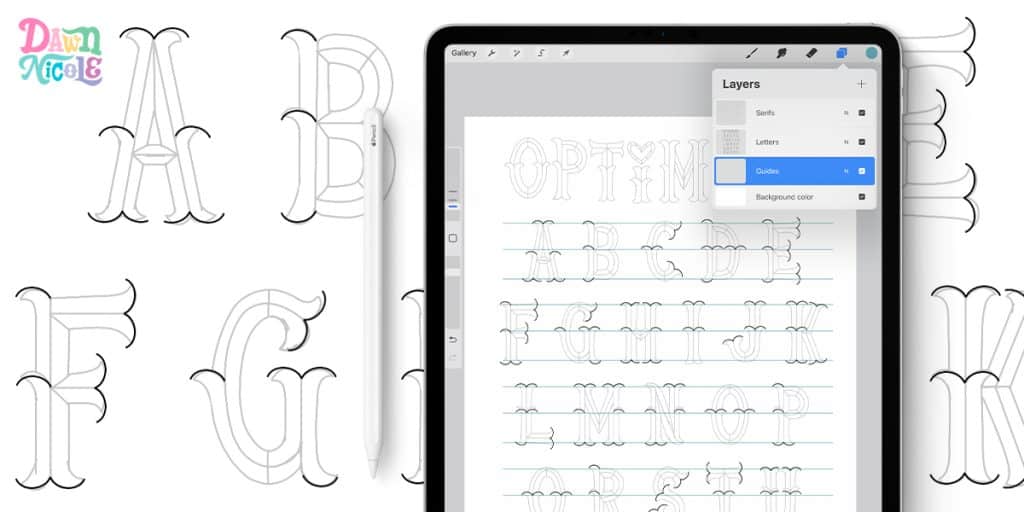
- Repeating main elements for cohesiveness and continuity. For the Optimist style, this meant using the same Serif shape throughout. (Shown in the image below.)
- Intentional imperfections: Don’t make it too perfect. We’re creating hand-lettering, not a font; imperfections are part of the charm. I like to change enough to keep it interesting and playful.
No. 7: Repeat No. 6 AS NEEDED.
I usually revise and refine it three or more times when creating a new lettering style. When I’m happy with my final sketch, I make one final version of the lettering style with clean lines and connections.
Friendly Reminder
Remember, the goal is to be original, not copy other people’s work!
I highly recommend reading Austin Kleon’s book Steal Like an Artist. This Good Theft vs. Bad Theft chart from the book is just one helpful example of how to learn to be inspired by things rather than copy them.
FAQ: 7 Tips for Creating New Lettering Styles
How do I come up with a completely new lettering style?
Start by modifying something familiar. Change the slant, exaggerate proportions, add contrast, or simplify shapes. New styles are often evolved, not invented from scratch.
What if I feel like everything has already been done?
Your perspective has not. Even if a style concept exists, your hand, preferences, and creative choices will make it different.
How long does it take to develop a signature style?
It varies for everyone. A signature style usually develops naturally over time as you experiment, refine, and notice what you gravitate toward most.
Should I sketch first or experiment directly in Procreate?
Either works. Some artists think more freely on paper, while others love the flexibility of digital tools. Try both and see which helps you generate more ideas.
How do I know if a new style is working?
Ask yourself if it feels cohesive. Are the letterforms consistent? Do repeated elements tie everything together? If it feels intentional, you’re onto something.
What if I hate everything I create?
That is part of the process. Not every experiment will be a winner, and that is completely normal. Treat those attempts as stepping stones, not failures. I often dislike something at first, but after sticking with it and revising a lot, I end up loving it!
How do I refine a rough concept into a polished style?
Pick your favorite version, clean up spacing, adjust proportions, and make repeated elements consistent. Refinement is where experimentation turns into a usable style.

Happy creating!
Be patient with yourself, stay curious, and remember that every beautiful style started as a simple experiment.


