Color Theory for Lettering Artists. Learn the essentials of color theory so you can confidently create eye-catching, harmonious designs that evoke all the feels.
Color Theory for Lettering Artists
In design school, I took an entire class devoted to color theory, so I feel it’s an important topic to cover for lettering artists. Many creatives have an eye for what colors complement each other, but there is a science behind it.
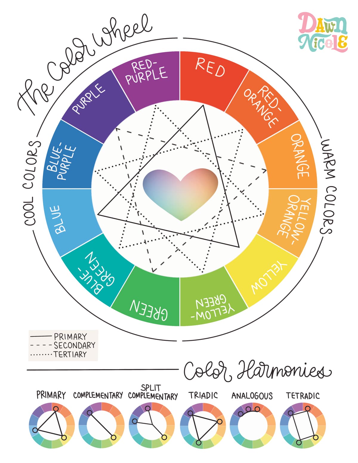
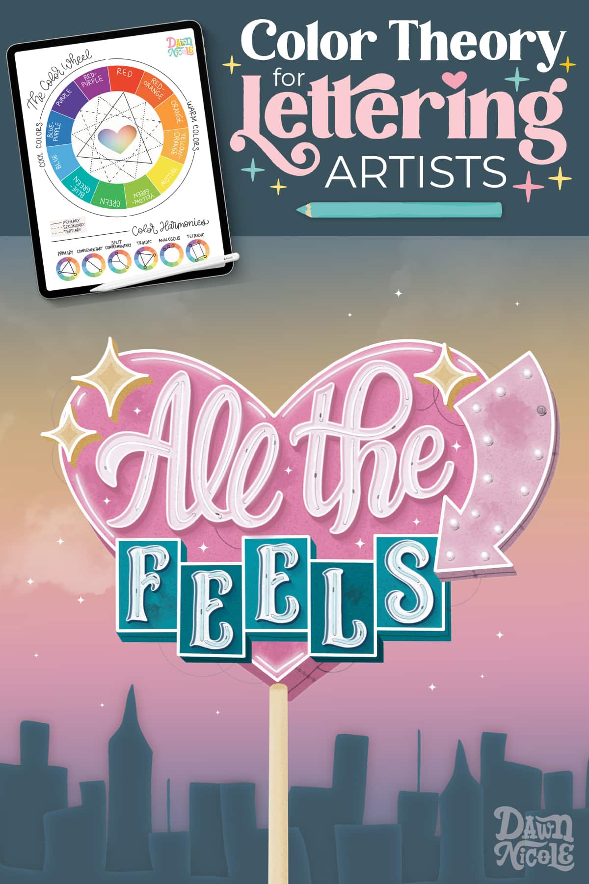
The Color Wheel
- The primary colors are red, blue, and yellow. You cannot mix other colors to create these colors; all other colors are derived from the three primary colors.
- The secondary colors are orange, green, and purple. They are created by mixing two primary colors in equal amounts.
- Tertiary colors are created by mixing a primary color and one of its adjacent secondary colors. For example, if you combine the primary color blue with its adjacent secondary color purple, you get the tertiary color blue-purple.
- Hue is another word for color. Adding black to a color is known as creating a shade. When white is added to a color, it produces a tint. Adding gray to a color results in a tone.
COLOR HARMONIES
Color harmonies refer to the relationships between specific colors on the color wheel that complement each other. By selecting any fixed set of colors based on this geometric arrangement, you can create an appealing palette to work with. Below, you’ll find examples visually represented in the graphic.
- Complementary: Two colors that are directly opposite each other on the color wheel
- Split Complementary: Any base color and the two colors directly adjacent to its complement
- Analogous: Any three colors that are found side by side on the color wheel
- Triadic: Three colors evenly spaced around the color wheel
- Tetradic: Four colors evenly spaced apart in a rectangular shape
Artwork created for my The Art of Playful Lettering Book with Better Day Books ©2024
The Psychology of Color
Color isn’t just about aesthetics. It has the power to influence emotions, perceptions, and even decision-making. Below, we’ll explore the fascinating psychology of color and how different hues can subtly shape our moods, behaviors, and creative choices. Whether you’re designing, decorating, or simply curious, understanding color psychology can add powerful intention to your work.
- Pink: sweet, romantic, compassionate, sensitive
- Red: energetic, bold, exciting, love, urgent, danger
- Orange: friendly, cheerful, confident, brave
- Yellow: happy, warm, creative, optimistic, caution
- Green: nature, peace, growth, healing, fresh, quality, health
- Blue: trust, loyalty, strength, peace, stability, dependable
- Purple: royalty, luxury, imagination, wise, ambitious, magical
- Black: formal, dramatic, sophisticated, death, evil
- White: simple, clean, innocent, honest, hope, light, goodness
- Gray: neutral, stable, balanced, mature, calm
In other words, color can give you “All the Feels.”
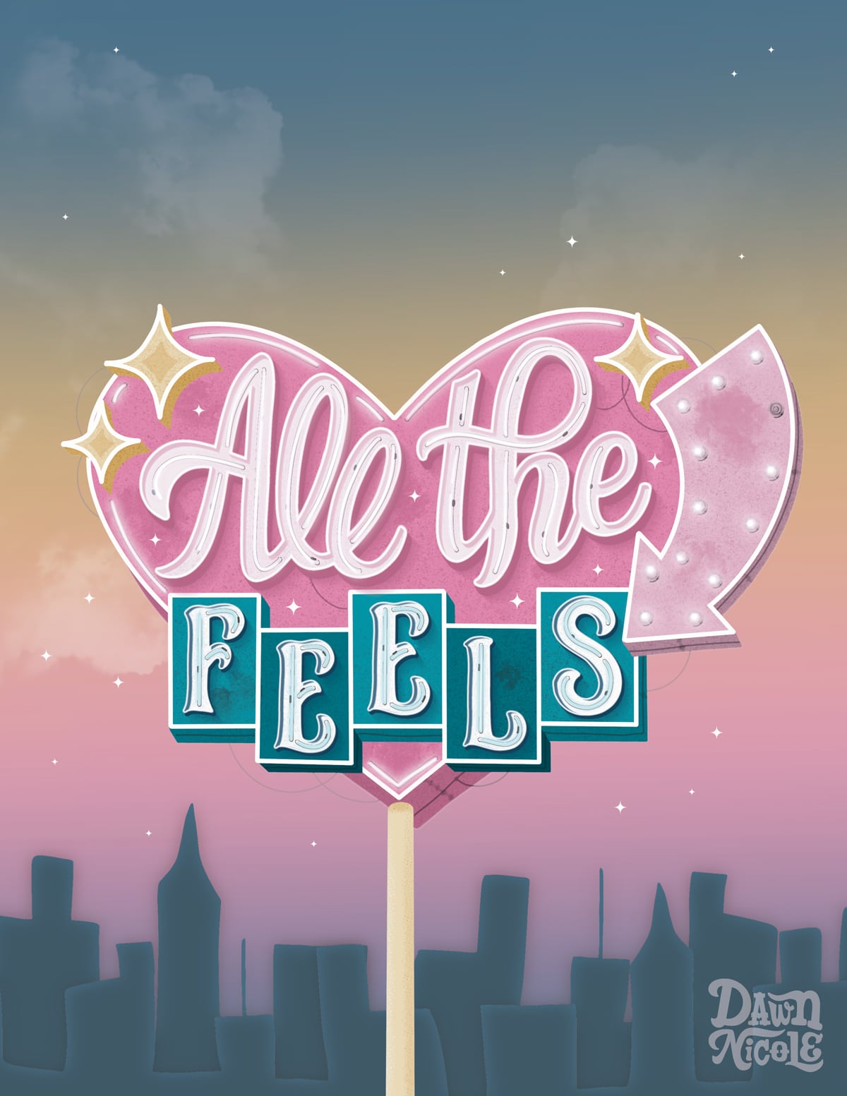
Artwork created for my The Art of Playful Lettering Book with Better Day Books ©2024
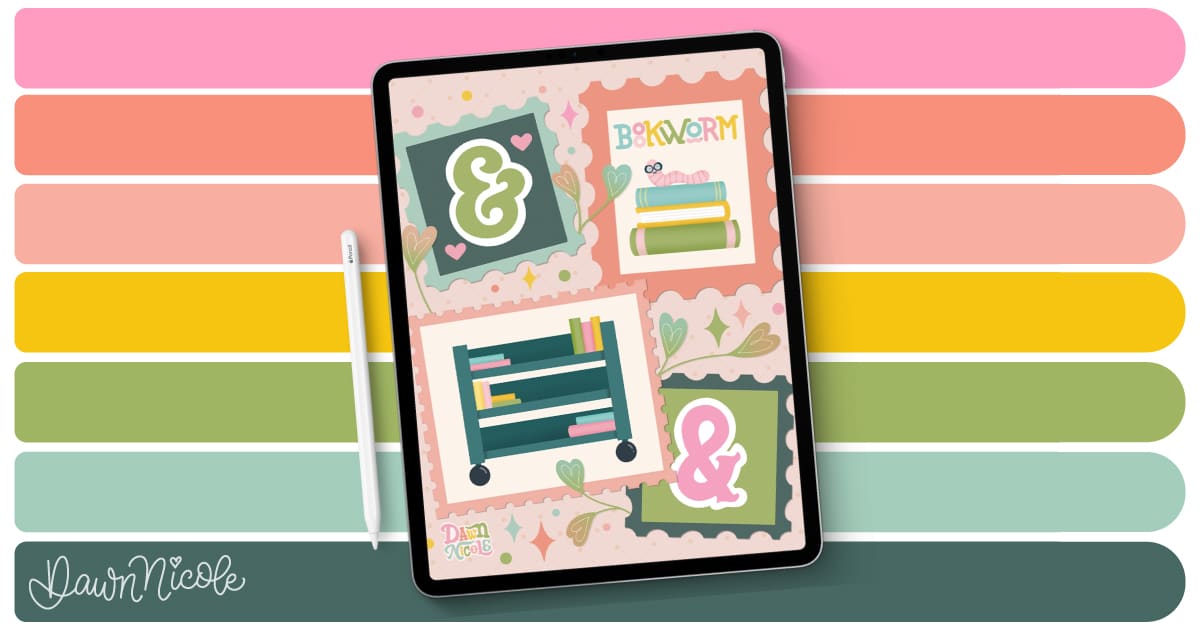
Procreate Color Palettes
Did you know I have a whole section on the blog dedicated to sharing free Procreate Color Palettes? Check them all out with the button below!

Learn the art of playful lettering with me
- Grab a copy of my book, The Art of Playful Lettering, on Amazon. Some of the info and artwork in this blog post were created for this book. That section of the book also contains color palettes to inspire your lettering creations!
- Check out the Procreate Brush Sets and Online Classes in my lettering shop.
- Pre-order my Modern Folk Art Coloring Book to relax and color my hand-drawn designs.
- Check out my 2025 Playful Lettering Style Challenge.
From the lettering Shop
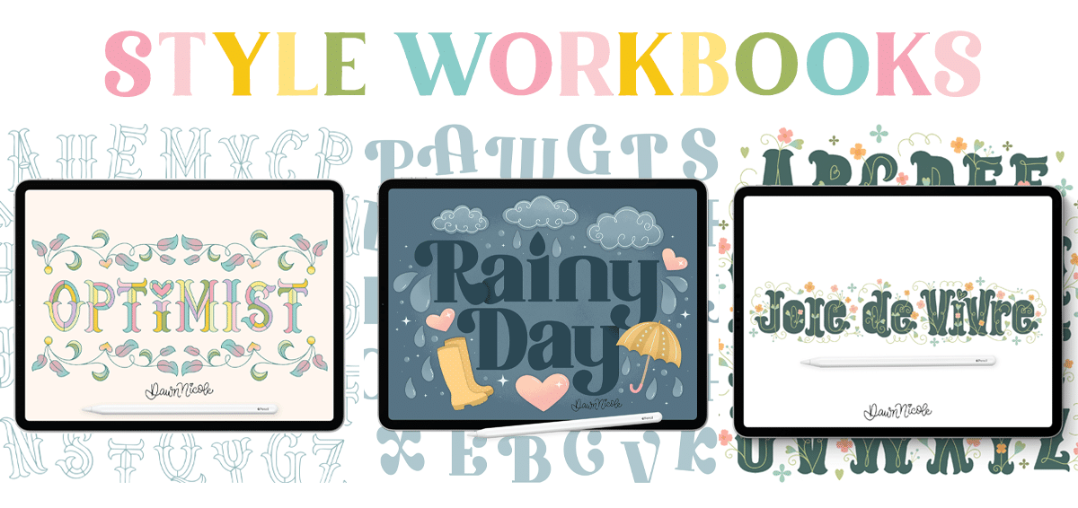
Check out my five-star rated Procreate Brush Sets, Classes, & Lettering Style Workbooks!
I hope you found this guide to Color Theory for Lettering Artists helpful!
Happy lettering!


