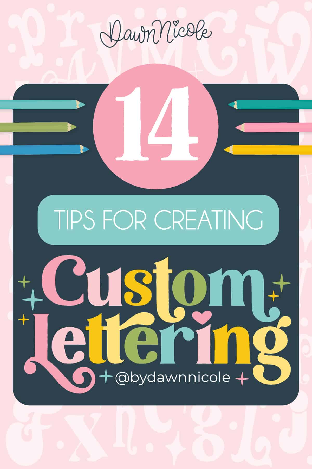
14 Tips for Creating Custom Lettering. Ready to level up your lettering? Get 14 fun and practical tips for creating custom hand-drawn letters that are full of personality and style.
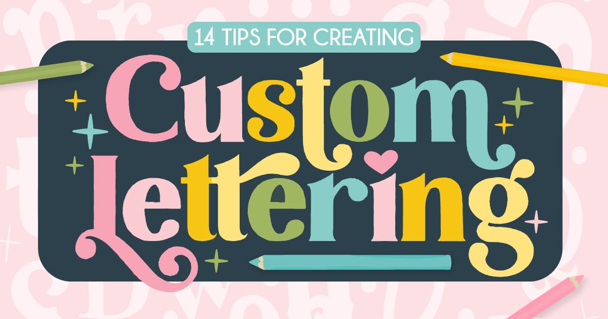
14 TIPS FOR CREATING CUSTOM LETTERING
If you’ve ever stared at a blank page wondering how to make your lettering look more you, you’re not alone!
Creating custom hand-drawn letters is all about infusing your personal style into every stroke. And it’s easier (and more fun) than you might think.
In this post, I’m sharing 14 of my favorite ways to elevate your lettering game, from playful details to creative techniques that’ll make your designs stand out.
Whether you’re new to lettering or just looking for fresh inspiration, these tips will help you craft letters that are anything but ordinary.
P.S. One of the top tips I shared in my 7 Tips for Creating New Lettering Styles is to use a single letter as your starting point. The fourteen tips in this post will help you transform that letter, and then you can build an entirely new alphabet from it.
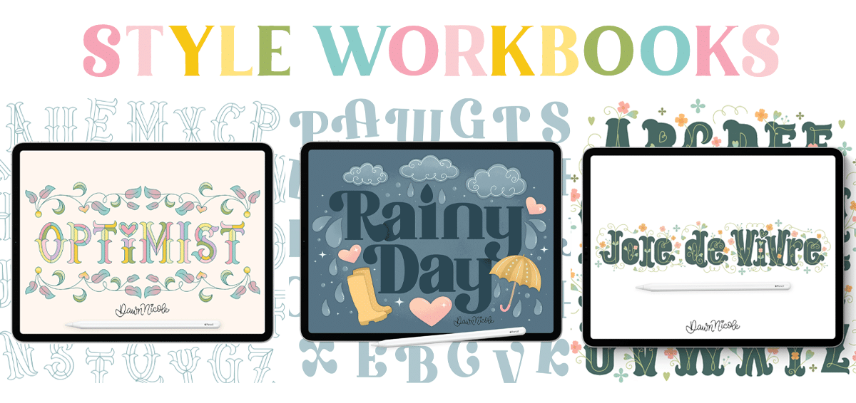
P.P.S. I’ve shared many customization tips in my The Art of Playful Lettering Book, my Lettering Style Workbooks, and my upcoming Bibliophile’s Coloring & Lettering Book. This blog post compiles the general tips into one handy resource.
Let’s get to it!
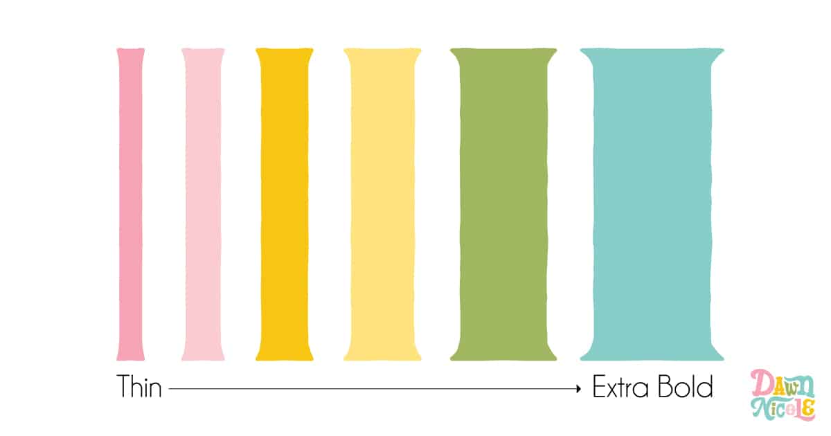
Tip No. 1: Change the Letter Weight
From thin to light to regular to bold to extra bold, changing the weight of your letter can significantly alter the feel.
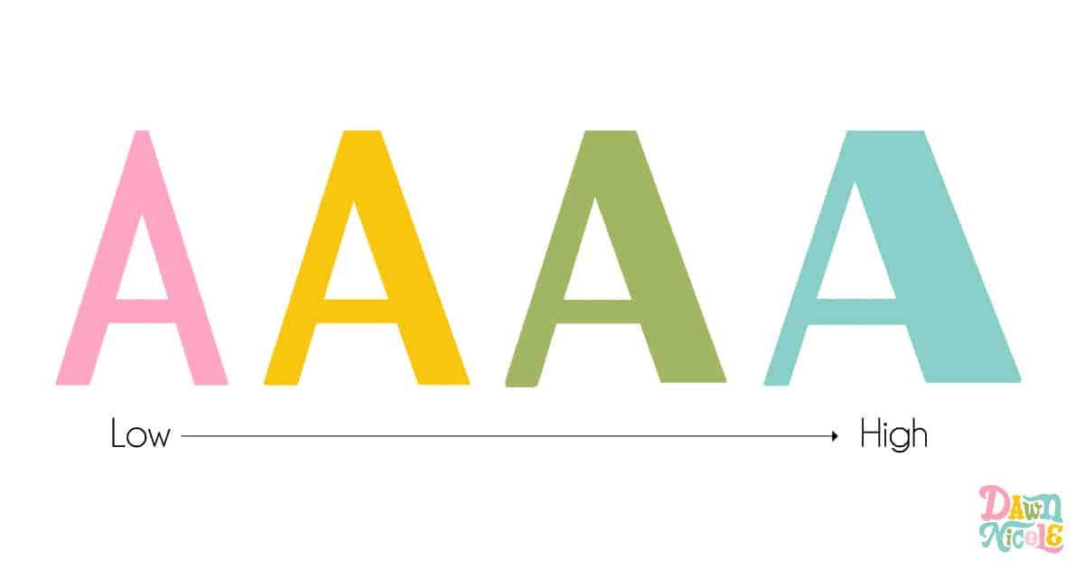
Tip No. 2: Alter the Contrast
Contrast refers to the amount of variation in the weight of the thin and thick letter strokes. Low contrast has little to no variation, while high contrast exhibits a significant amount of variation.
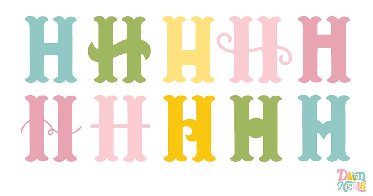
Tip No. 3: Change the Crossbar
Look how changing something as simple as the style of the crossbar can alter the overall vibe of the letter without any additional changes.
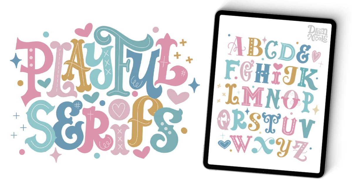
Tip No. 4: Switch up the Serif Style
A basic lowercase letter “i” can instantly become more interesting with a serif and a heart tittle (that’s the technical term for the dot over a lowercase “i”).
Speaking of Serif Styles…My free Playful Serifs in Procreate series includes 26 Easy-to-Follow Video Lessons (3.5 combined hours of videos!) featuring a new Serif Style in each lesson. By the end of the series, you’ll have a super cute piece of alphabet art!
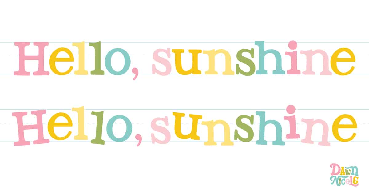
Tip No. 5: Bounce the Baseline
In the graphic below, you can see how I didn’t alter the letters themselves. All I did was change the angles and position of each letter on the baseline to create a bouncy look that is instantly more playful and fun!
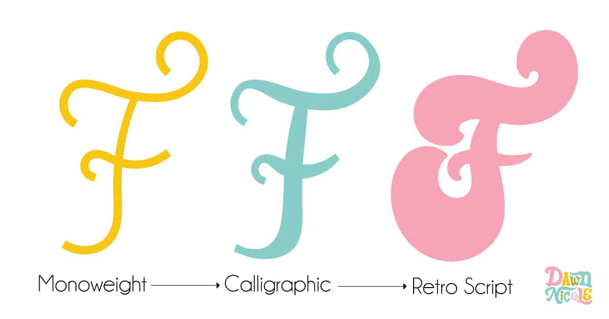
Tip No. 6: Switch up the LETTERING Style
Try changing Monoweight letters to a calligraphic or Retro Script style. This is just one example of ways to switch up a letter’s style. Can you take one letter and try to draw it 20 different ways? It’s a great way to brainstorm and stretch your skills!
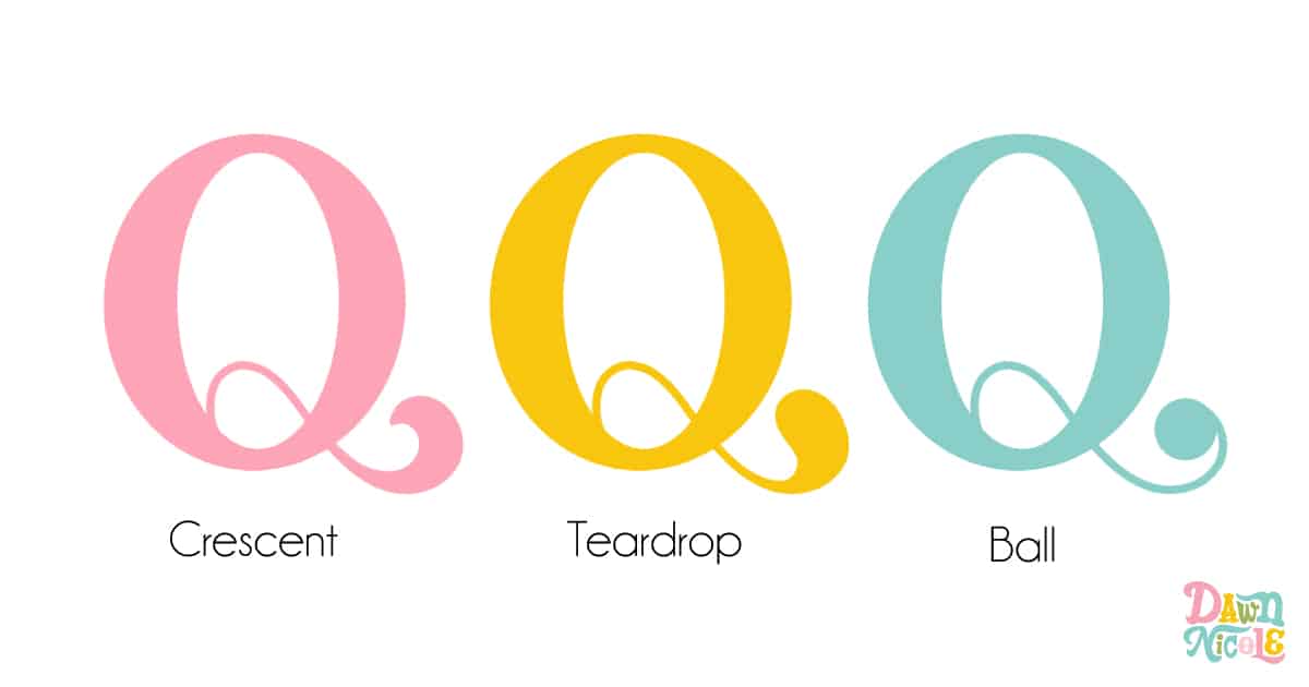
Tip No. 7: Try Alternate Terminal Styles
A terminal is the ending of a stroke. Crescent, Teardrop, and Ball are among the most common terminal styles, as shown below.

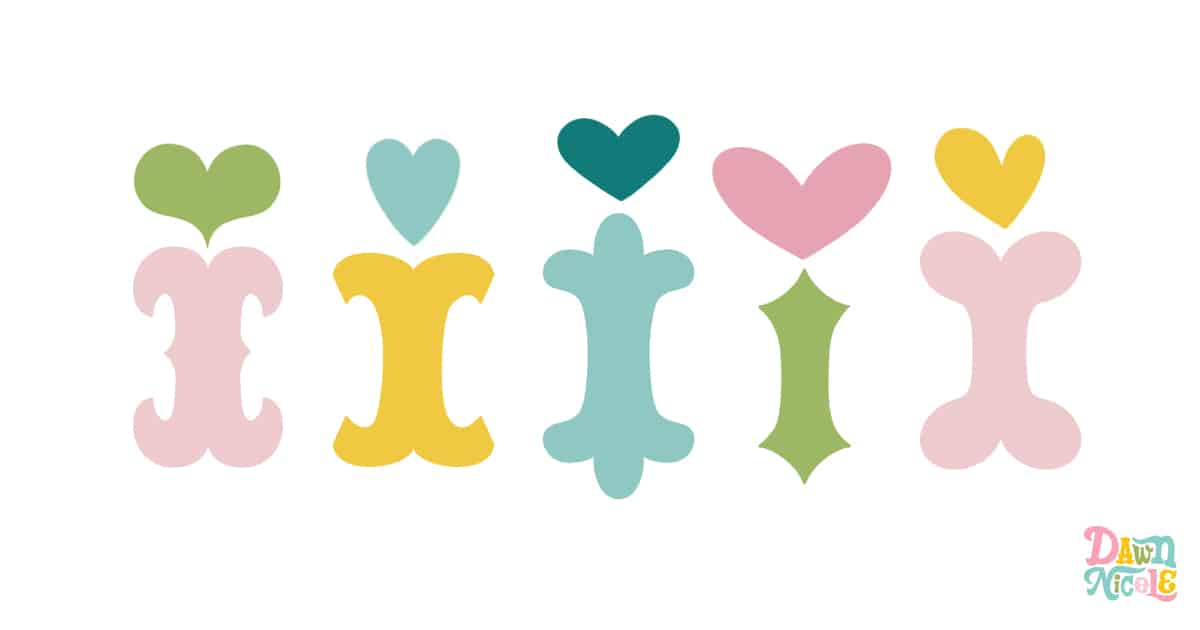
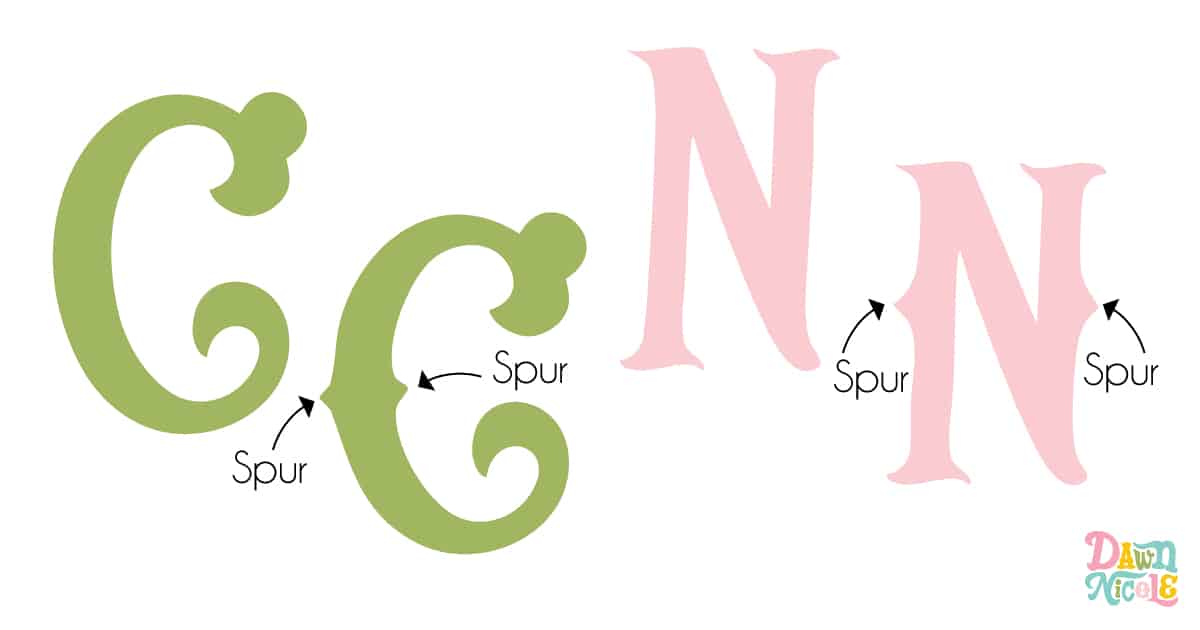
Tip No. 8: Add Median Spurs
A median spur is a vibe! Here’s a look at two Serif letters with and without median spurs.
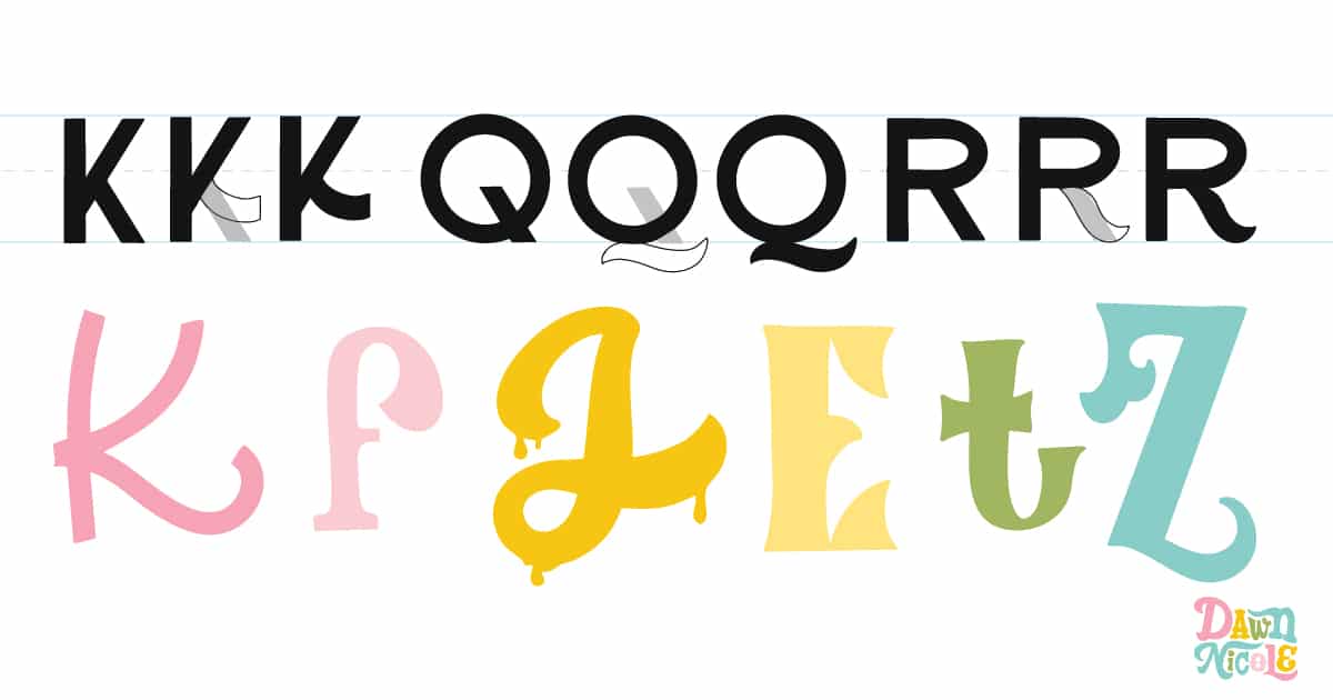
Tip No. 9: Make the Letter Parts More Playful
Try taking a basic Sans Serif letter and modifying one part of it to make it more playful. You can see how I’ve done this with the black letters below. The bottom row of colorful letters shows more examples of playful variations on hand-drawn letters.
Here’s an older lettering piece I did with this tip in mind. It’s kind of like figuring out a puzzle, but with letters instead of puzzle pieces!

Tip No. 10: Swashes
Swashes and flourishes are game changers when it comes to creating custom styles of hand-lettering. You just can’t make the same magic with a font!
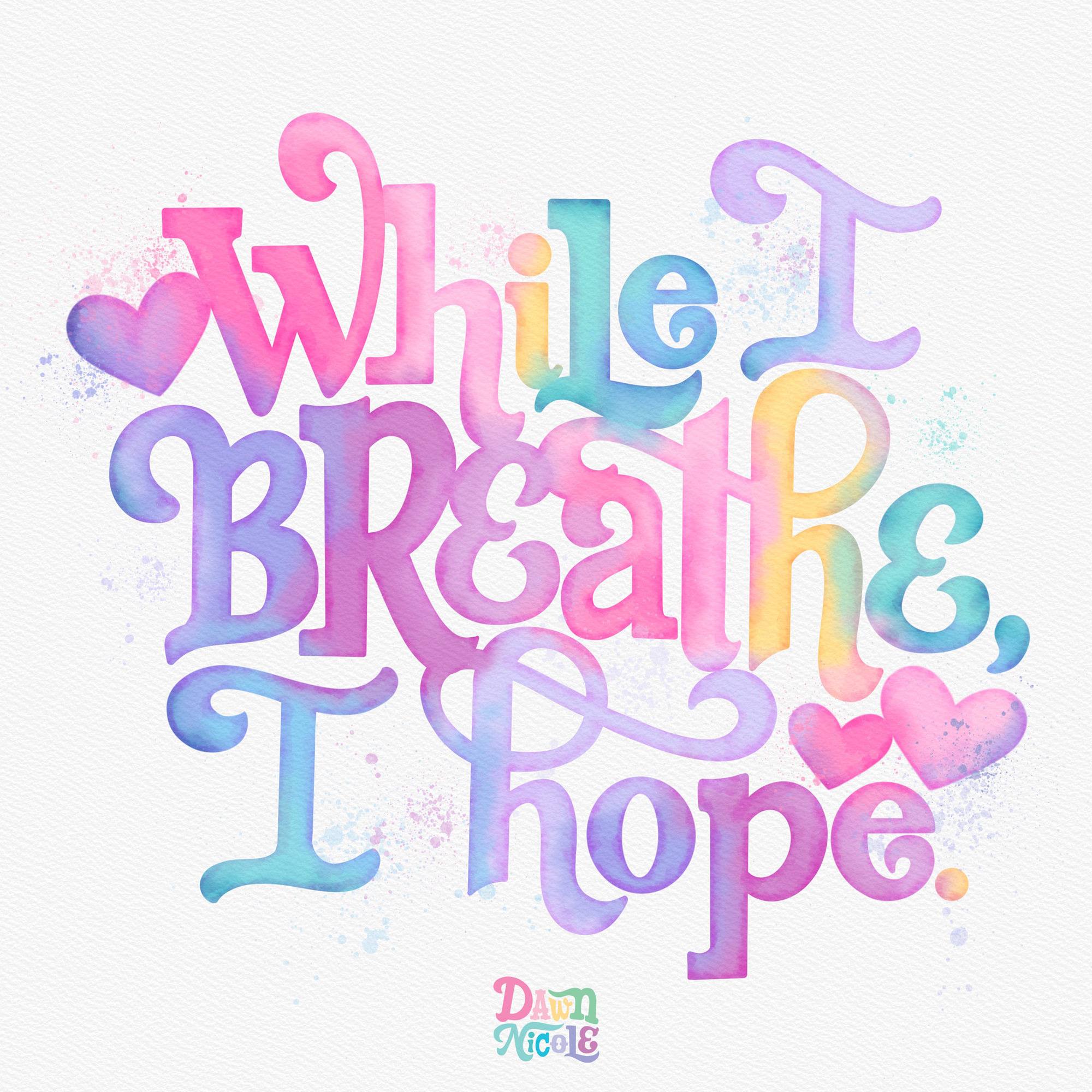
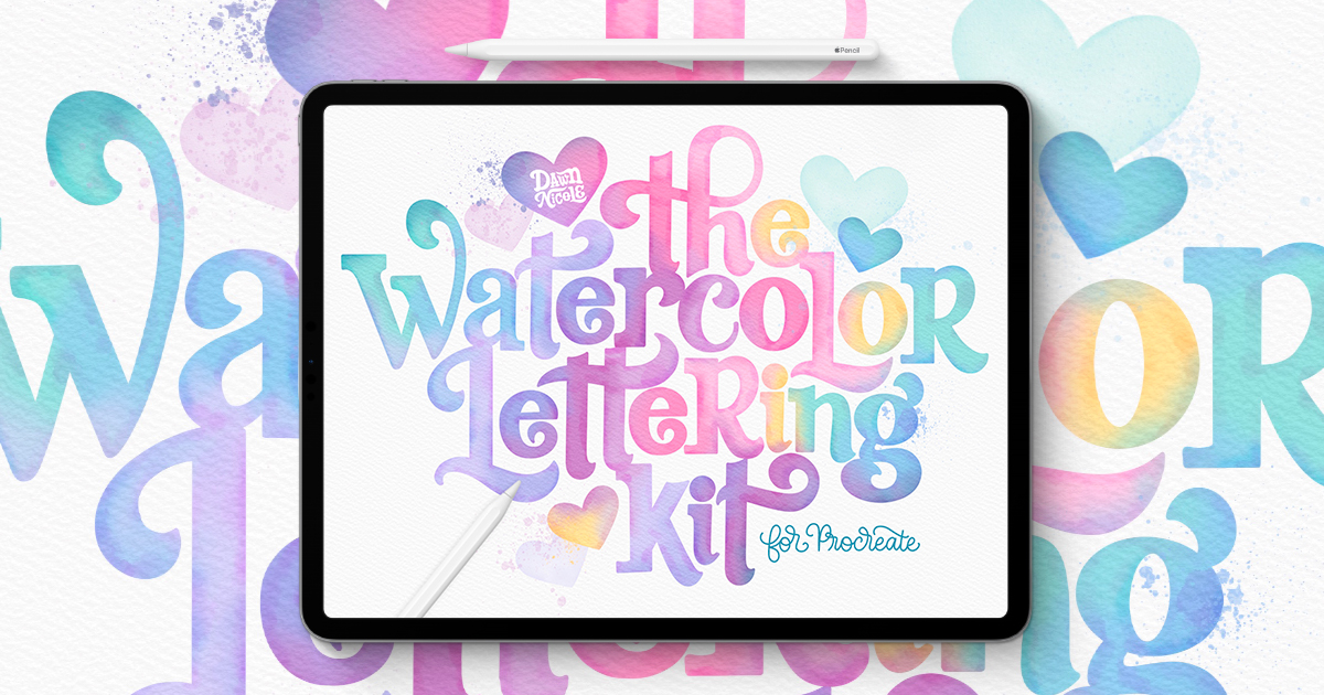
You can learn this Digital Watercolor Style with my Watercolor Kit for Procreate and/or my Watercolor Lettering in Procreate Online Class.
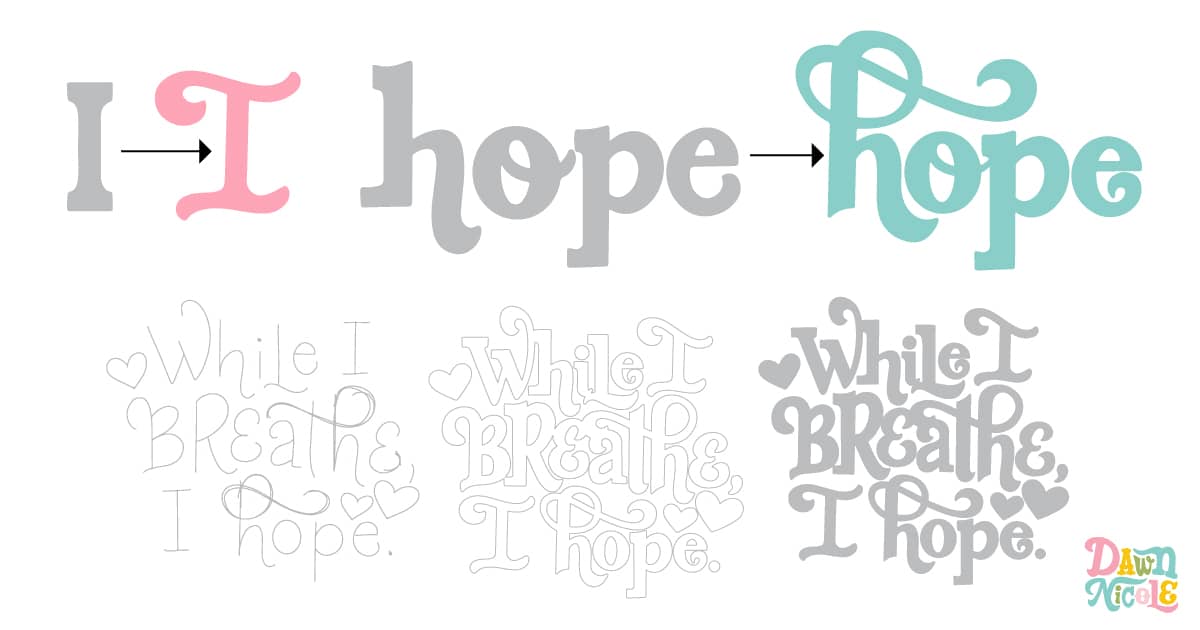
Tip No. 11: Look for Ways to Add Ligatures
In typography, a ligature is a single glyph created by combining two or more letters. These special character combinations are typically used to enhance visual flow and fix awkward spacing or collisions that can occur between certain letter pairs when set individually. They’re also just pretty and fun!
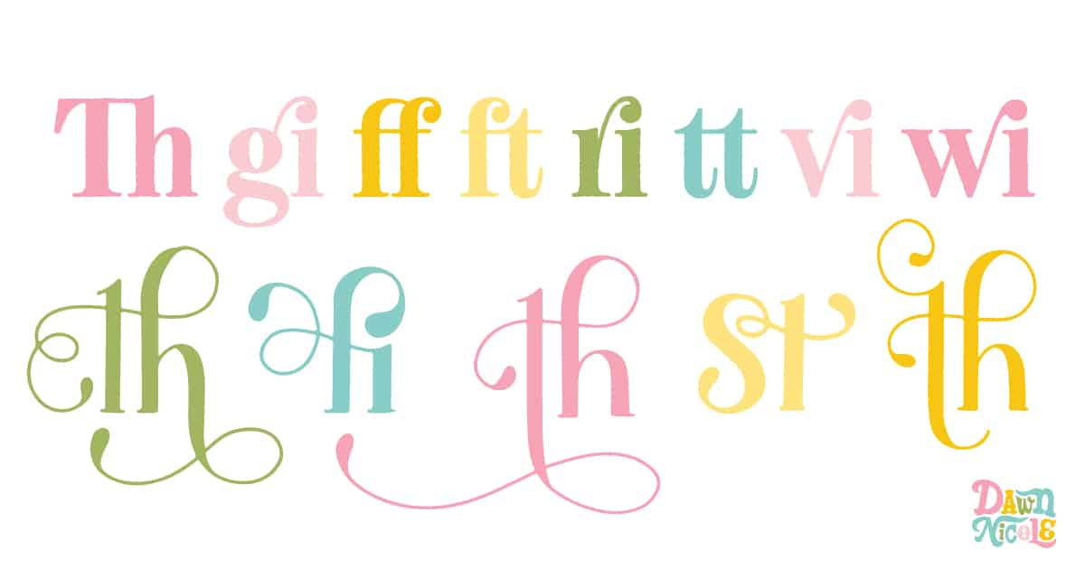
The “th” ligature is my favorite!
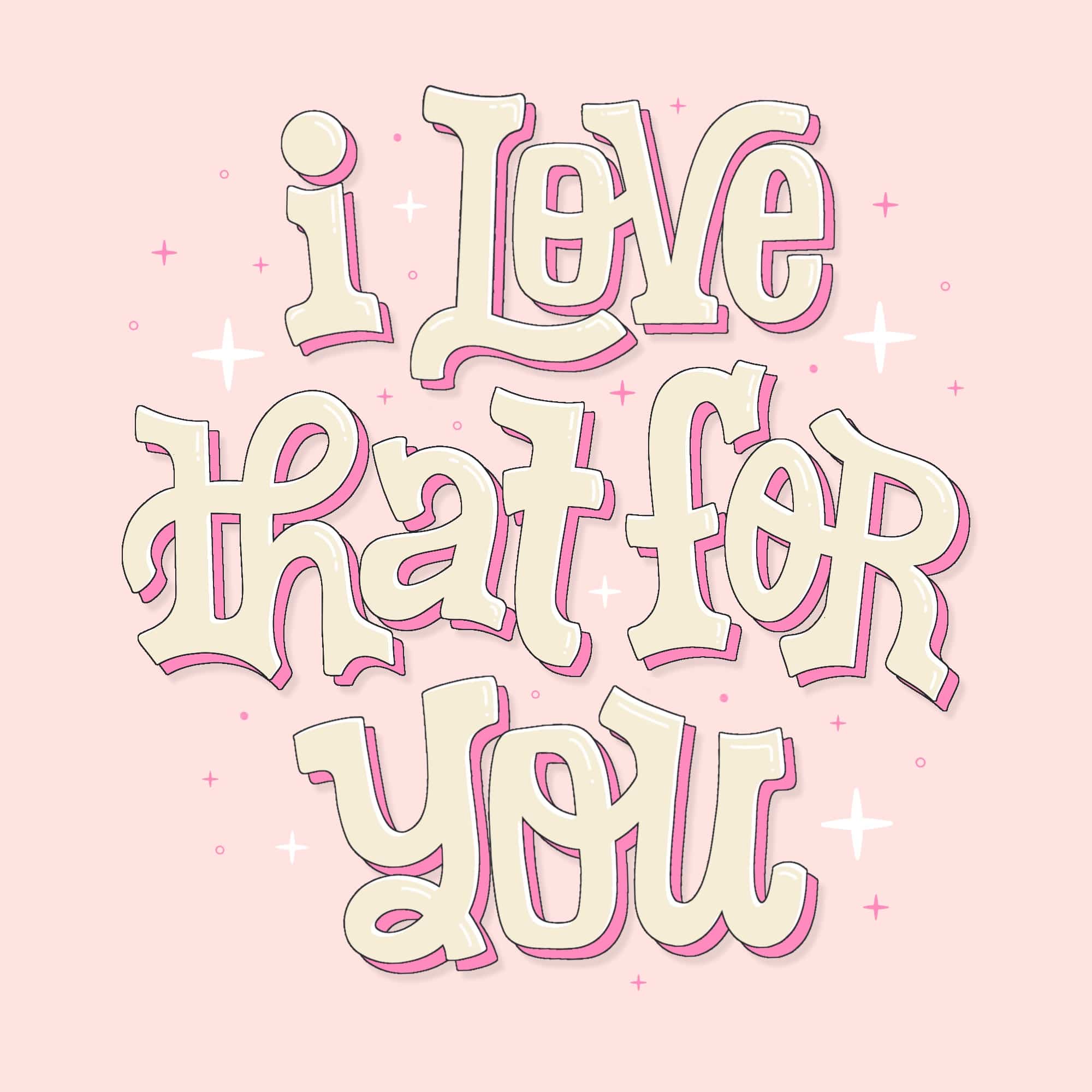
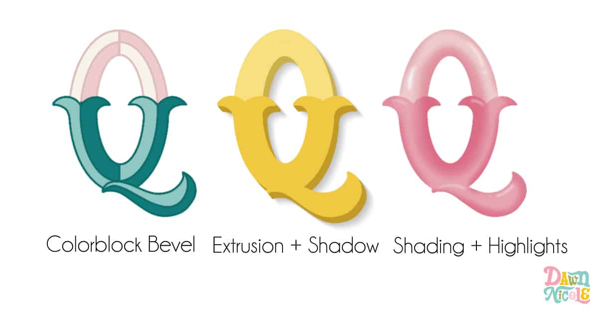
Tip No. 12: Add Dimension
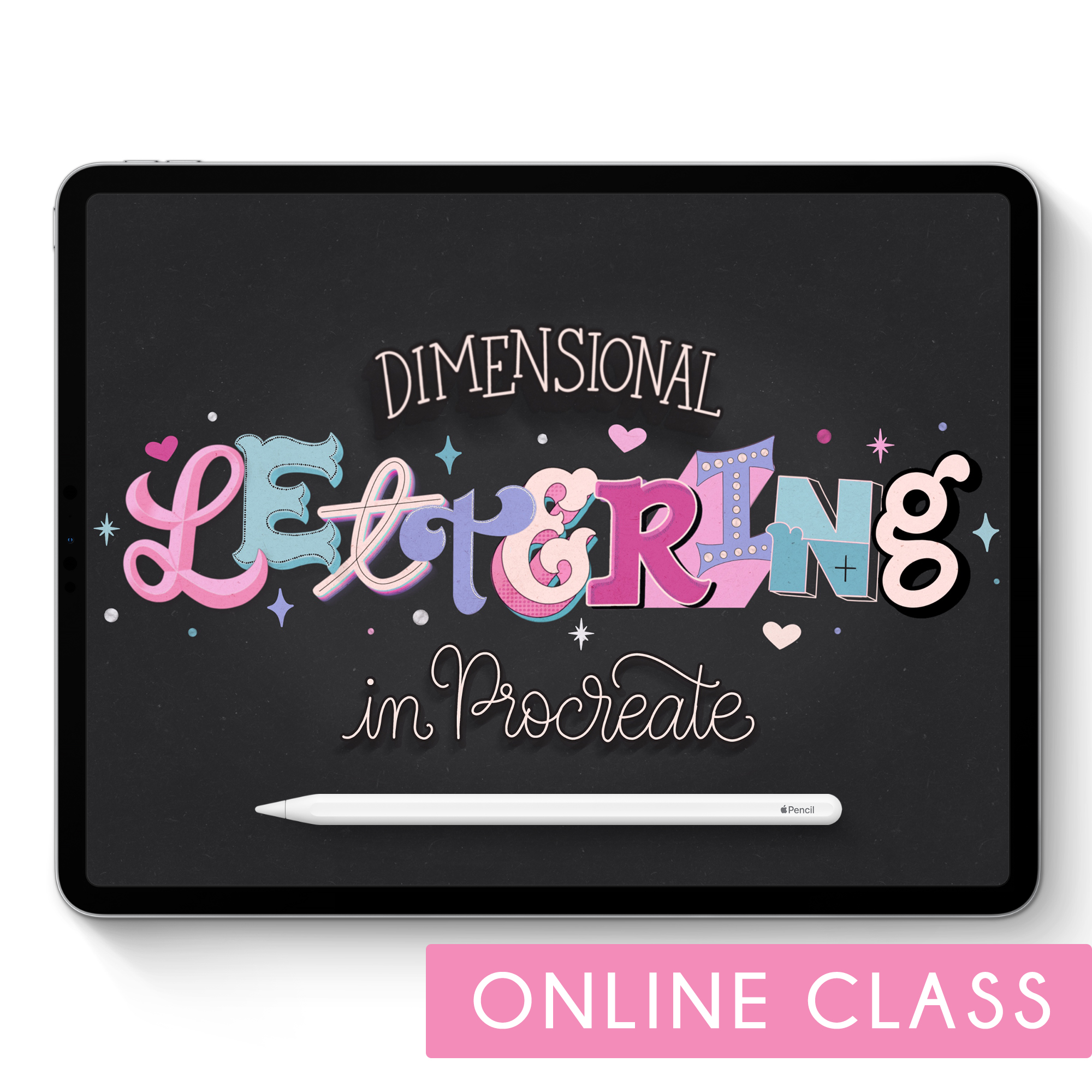
Dimension makes your letters pop off the page! I came up with a list of 20 different dimensional styles, so I’ll write a whole blog post to detail them all. In the meantime, here are a few common ones, along with a link to my online class on Dimensional Lettering in Procreate.
Tip No. 13: Add inline details
Inline details are the decorative or structural elements placed inside the main strokes of a letterform to add interest, depth, or character. I kept it simple with lines, dots, and curlicues in the artwork below (which I created for my upcoming Bibliophile’s Coloring & Lettering Book). I’m working on compiling a long list of inline detail options to share soon!
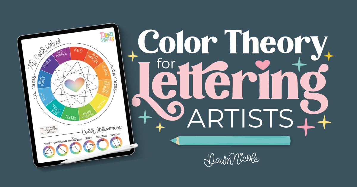
Tip No. 14: RECONSIDER THE Color Palette
Color is always the longest part of my process. The topic of Color Theory is so vast that I wrote another blog post to cover it. Click the image below to read it!
You can also head over to my Color Palettes section on the blog for some inspiration to try on your next lettering project.
Each palette can give your piece a different mood, so consider how you want people to feel when they see your work. Calm? Happy? Moody? Pick a palette that matches the vibe you’re going for.
Learn the art of playful lettering with me
- Grab a copy of my book, The Art of Playful Lettering, on Amazon.
- Check out the Procreate Brush Sets and Online Classes in my lettering shop.
- Get my Modern Folk Art Coloring Book to relax and color my hand-drawn designs.
- Check out my 2025 Playful Lettering Style Challenge.
From the lettering Shop
Check out my five-star rated Procreate Brush Sets, Classes, & Lettering Style Workbooks!
I hope you found my Custom Lettering Tips helpful! Did I miss any ideas?
Happy lettering!


