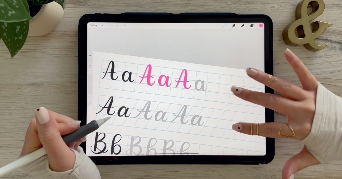
Calligraphy A: Uppercase & Lowercase (Video Tutorial). Learn to draw the letter A in this step-by-step brush calligraphy video tutorial for beginners. Follow along with paper or Procreate!
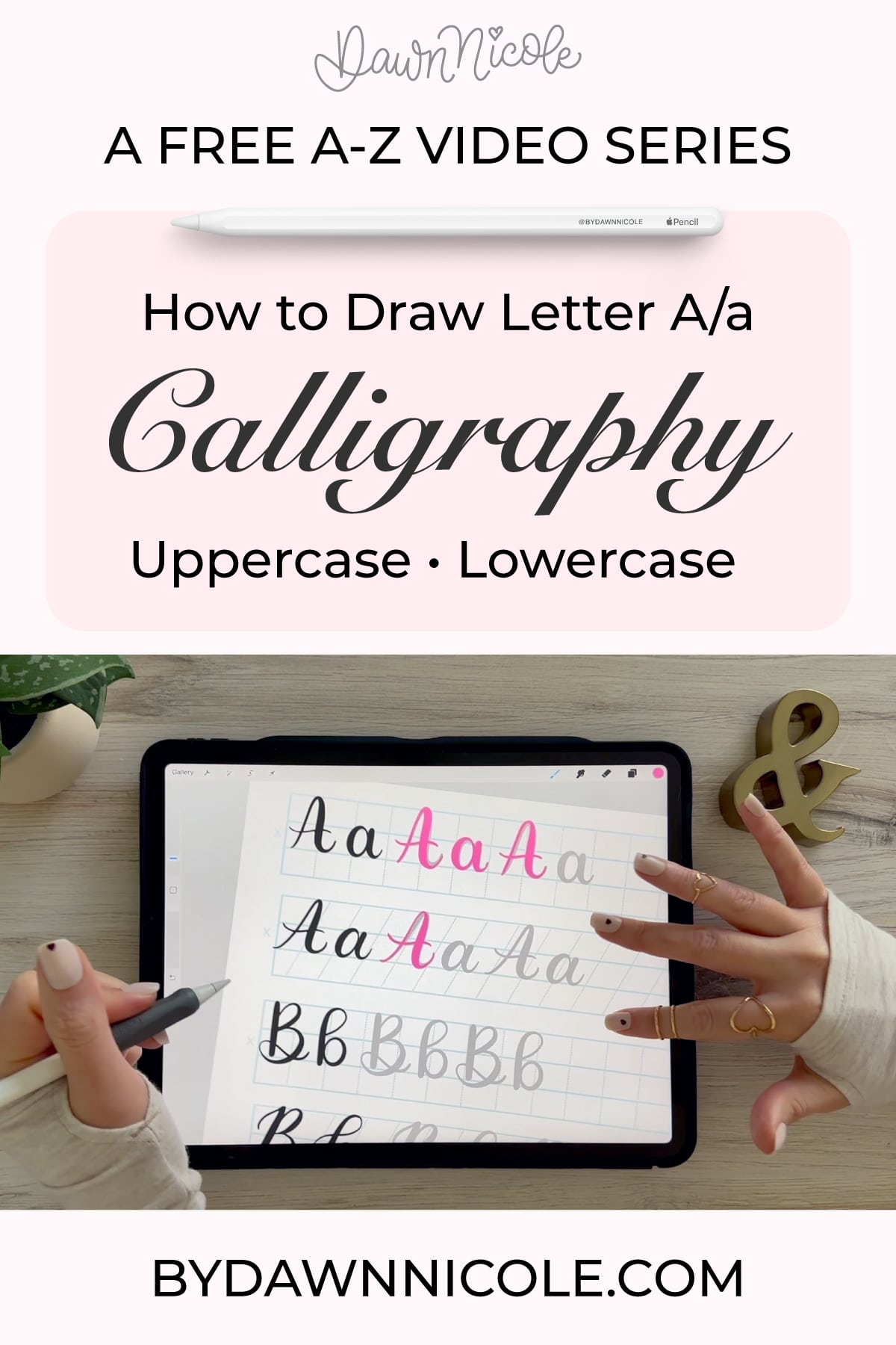
Calligraphy A: Uppercase & Lowercase (Video Tutorial)
The letter “A” is one of the best places to start with brush calligraphy.
It introduces the contrast between thick and thin strokes, helps you get comfortable with angles, and gives you a feel for how structure and movement work together. Once you understand “A,” a lot of other letters start to click.
In this tutorial, I’ll walk you through both uppercase and lowercase “A” step by step so you can build confidence and clean up your strokes as you go.
Brush Calligraphy Basics (Quick Refresher)
Before we start, remember the two rules that make brush calligraphy work:
- Upstrokes = light pressure (thin lines)
- Downstrokes = heavy pressure (thick lines)
Everything we’re about to do is built on that contrast.
Calligraphy A: Uppercase and Lowercase Video Tutorial
Want to Take This Further?
If you’re practicing on Procreate and want more guidance on strokes, consistency, and building polished lettering pieces, I walk through the full process step by step inside my iPad Calligraphy in Procreate course.
It’s designed to take you from practicing letters… to actually creating finished work you’re proud of.
All of the practice sheets and Procreate brushes I’m using in the free video series are included in this class.
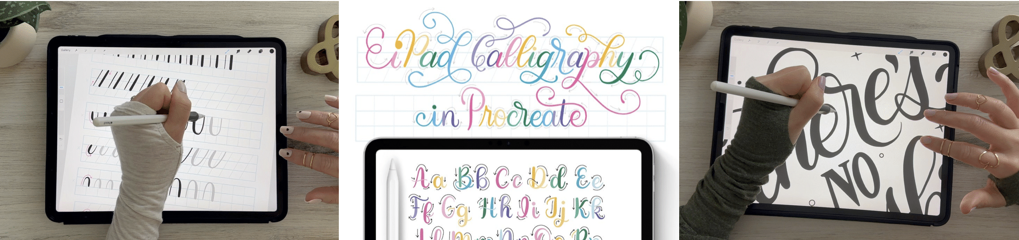
Want Step-by-Step iPad Calligraphy Lessons?
If you want guided, start-to-finish instruction for learning calligraphy on your iPad, I teach the full process inside my iPad Calligraphy in Procreate class. You’ll learn strokes, letterforms, words, and finished pieces with real-time demos and practice projects.
There are 50 Lessons and 3 Hours of Video Content. It’s well-organized and easy to follow via my online class platform (Thinkific). All the brushes and worksheets you need to learn iPad Calligraphy are included with the class.
- Intro Lessons (3 lessons + Class Downloads)
- Drills (1 lesson + Worksheet Set)
- Alphabet (26 lessons + Procreate Workbook)
- Words + Short Phrases (1 lesson + Worksheet Set)
- Tricky Letter Combos (1 lesson + Procreate workbook)
- Project No. 1: Calligraphy Word Art (6 Lessons)
- Project No. 2: Dancing Calligraphy Animation (2 Lessons)
- Project No. 3: Ghostwriting Animation (2 Lessons)
- Bonus Lessons (2 Lessons + Procreate Worksheet)
iPad Calligraphy in Procreate Class →
IPAD CALLIGRAPHY CLASS FAQs
- What Do I Need for this Class? You’ll need an iPad, Apple Pencil, and the Procreate App. Everything else you’ll need is included in your class downloads.
- Can I watch it anytime? Yes! The class is pre-recorded and available to watch at your convenience. You have lifetime access.
- Is it okay if I’m new to Procreate and/or Calligraphy? Yes, you are the intended audience for this class. We’ll take things step-by-step. I love project-based learning because it makes things more fun and easier to understand.
How to Draw a Lowercase “a”
The lowercase “a” is a foundational letter. It shows up in so many words, so it’s worth slowing down and getting it right.
Step 1: Start with an oval
Draw a slightly slanted oval shape, similar to the letter “o.”
- Light pressure on the upstroke
- Heavier pressure on the downstroke
- Keep the shape balanced: not too narrow, not too wide
Step 2: Add the entry stroke
From the top right of the oval, add a thin upstroke that leads into the letter.
This helps the letter connect smoothly when writing words.
Step 3: Create the downstroke
On the right side, pull a thick downstroke straight to the baseline.
Keep this stroke steady. This is where beginners tend to wobble.
Step 4: Add the exit stroke
Finish with a light upstroke that curves slightly out to the right.
This sets you up to connect to the next letter.
What to watch for
- A common mistake is making the oval too stiff—keep it fluid
- Make sure your thick downstroke is actually thick (don’t be shy with pressure)
- Try not to rush—smooth > fast
How to Draw an Uppercase “A”
Uppercase “A” is more structured, but still has that soft, brush-lettered feel.
Step 1: Left stroke
Draw a diagonal downstroke from top to baseline.
- Start light, then press into the stroke as you move down
- Keep the line slightly curved—not rigid
Step 2: Right stroke
Draw a second diagonal stroke meeting at the top.
This stroke is usually lighter and more controlled.
Step 3: Crossbar
Add a horizontal crossbar across the middle.
You can keep it straight or slightly curved, depending on your style.
Optional: Add style
Once you’re comfortable, you can soften the structure:
- Add a slight curve to the legs
- Extend the entry or exit strokes
- Play with bounce or spacing
Practice Tips for a Better “A”
- Practice the oval shape on its own before building the full letter
- Slow down your downstrokes—they matter more than speed
- Use guidelines (baseline, x-height, slant) to keep things consistent
- Don’t aim for perfect—aim for controlled
Practice Words with “A”
Once you feel comfortable, try writing:
- and
- art
- always
- amazing
This helps you see how “a” connects and flows in real words.
Common Mistakes
- Pressing too hard on every stroke (you’ll lose contrast)
- Uneven oval shapes
- Rushing through the letter instead of building it intentionally
Final Thoughts
The letter “A” might feel simple, but it teaches you so much about control, rhythm, and structure.
Take your time with it. The more comfortable you get here, the easier the rest of the alphabet will feel.
If you’re working through the full series, head to the next letter and keep the momentum going.
FAQ: Calligraphy Letter A
Why is my lowercase a not smooth?
This usually comes down to inconsistent pressure or rushing the oval shape. Try slowing down and focusing on one clean motion at a time.
Do I have to use an oval for the lowercase a?
Yes—the oval is the foundation. Once you understand it, you can start stylizing, but structure comes first.
Why does my uppercase A look stiff?
You’re likely treating it like a printed letter. Try adding slight curves and varying your pressure to give it more movement.
Should I practice uppercase or lowercase first?
Start with lowercase. It appears more often in words and helps build foundational stroke control.
HELPFUL LINKS
- Practice the next letter: Calligraphy B worksheet
- Or go back: Brush Calligraphy: Free A-Z Video Tutorials
Related Series
- The Anatomy of Letters: An A-Z Guide
- Hand Lettering the Alphabet A–Z for Beginners
- Playful Bubble Letters: A-Z (with free Practice Sheets!)
- Playful Serif Lettering Alphabet: A-Z Tutorials (with freebies!)
- Modern Penmanship Tips for Calligraphy and Lettering Lovers
Subscribe to my YouTube Channel!
Happy Practicing!


