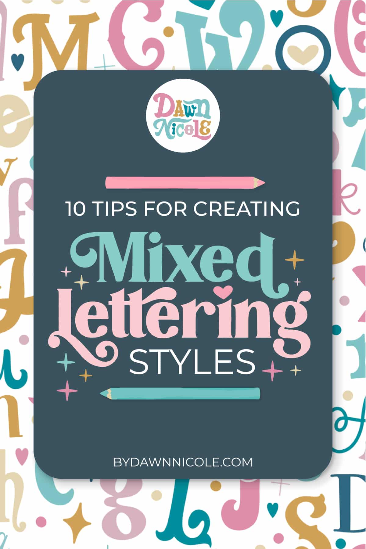
10 Tips for Creating Mixed Lettering Styles. Learn how to mix lettering styles for fun, colorful, and personality-filled designs!
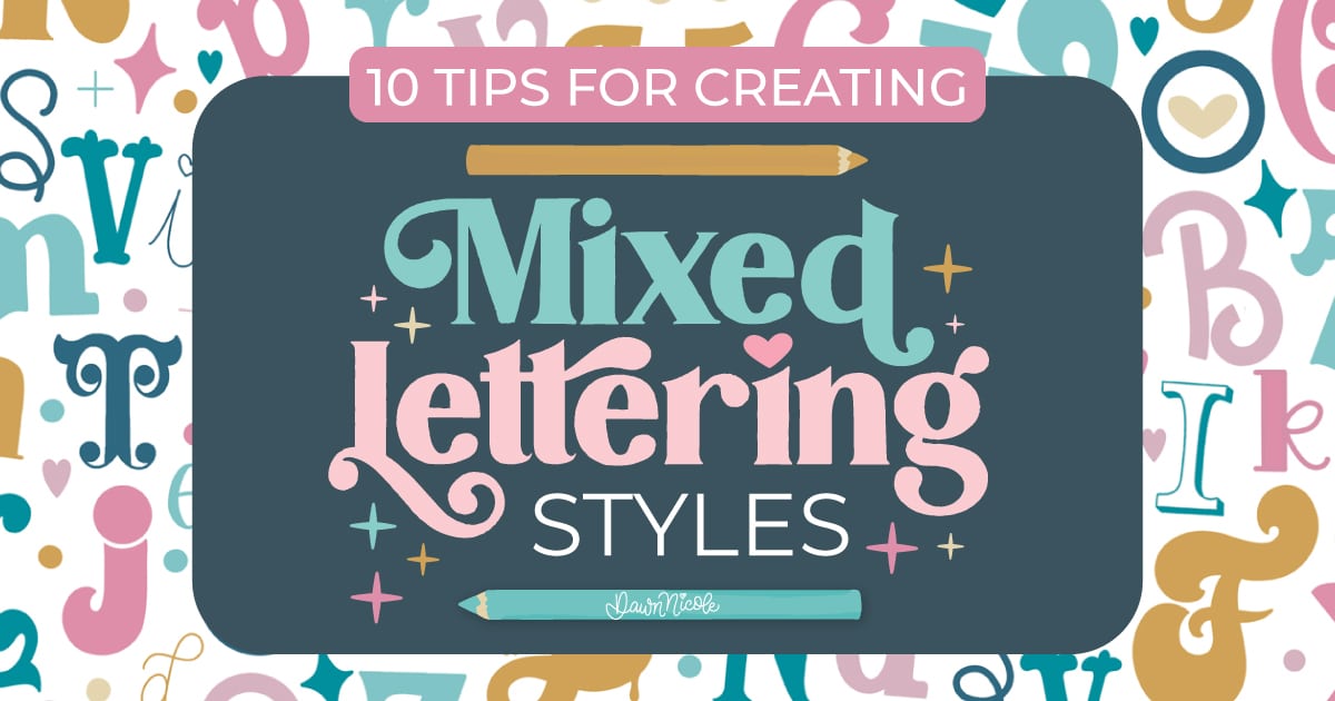
10 Tips for Creating Mixed Lettering Styles
Let’s toss the rulebook and have some fun! Mixing and matching different lettering styles is one of my favorite ways to add personality and playfulness to a piece. It’s all about creating something balanced, bold, and totally unique. Mixed lettering is kinda my thing. It’s doodly, colorful, perfectly imperfect, and most of all, totally me.
Noteworthy: I often combine two or more of the tips below within one lettering piece.

Tip No. 1: Mix and match!
The basis of this style is using different foundational styles (serif, sans serif, script, decorative) within one word or phrase. Here are a few examples.
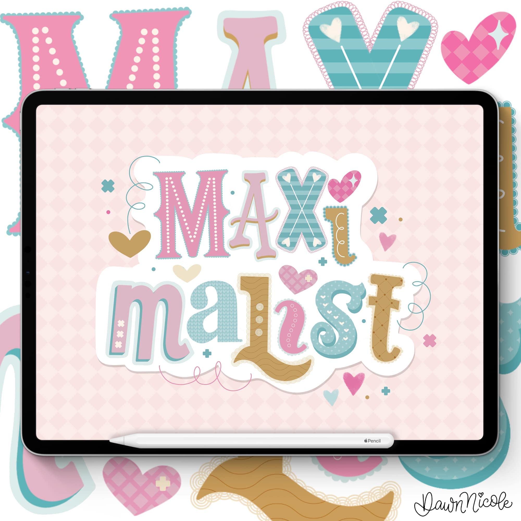
I created this artwork for my Maximalist Lettering Kit for Procreate. It incorporates many of the tips in this blog post!
Maximalist Lettering is a “more is more” style. It features layered patterns, textures, and linework. It’s playful and boldly colorful. Some might call it chaotic or kitschy.
My signature mixed lettering style lends incredibly well to a maximalist vibe.
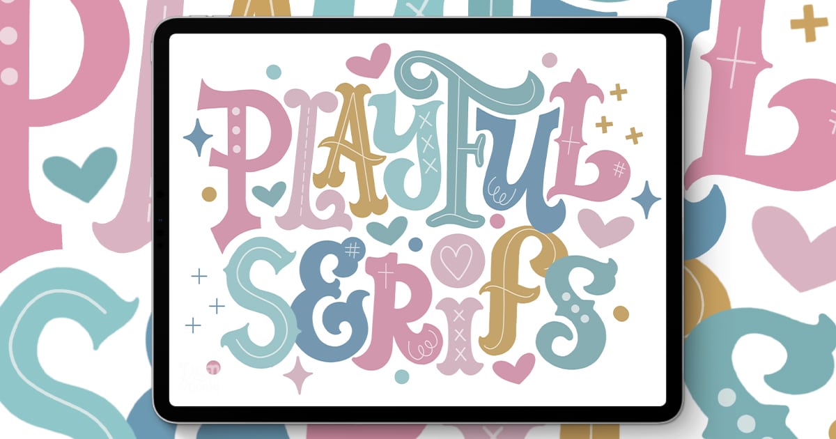
TIP NO. 2: ASSORTED SERIFS
Use all serifs, but vary the Serif Type and letter style for an easy Mixed Lettering look.
The Awake-ish art below is from a live class I taught, which is now FREE on my YouTube. You can learn more about it and take the class here.
- The first 20 minutes of the class cover Serif types and tips.
- In the following 30 minutes, we will put what you’ve learned to use to create a fun Mixed Serif Style project together in Procreate.
- Even if you don’t use Procreate, you can watch to learn a ton about Serifs.
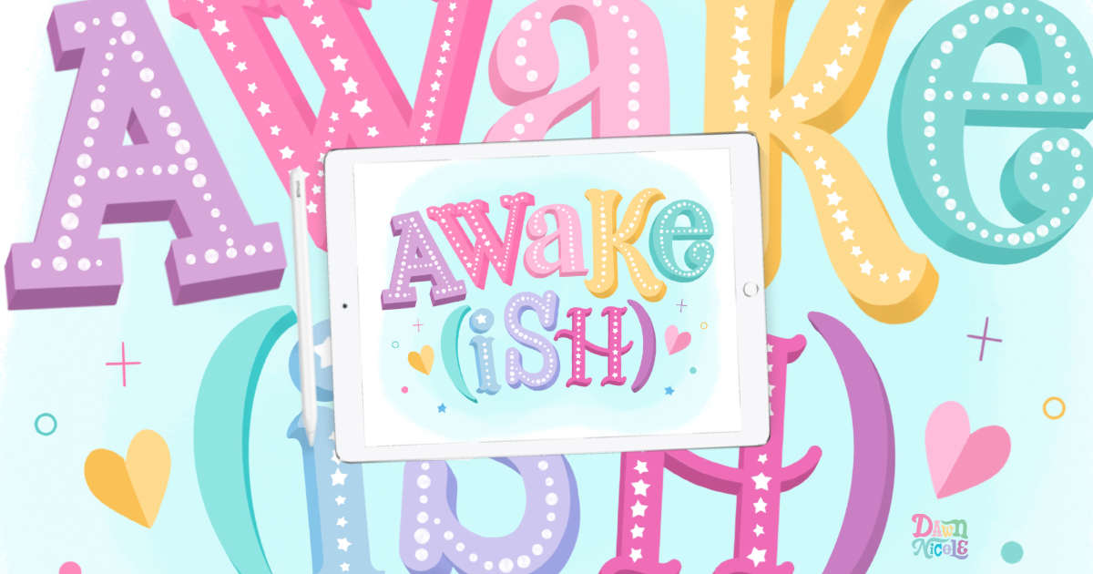
If you want to learn a TON of different serif styles (26 to be exact), check out my FREE Playful Serifs in Procreate Class.
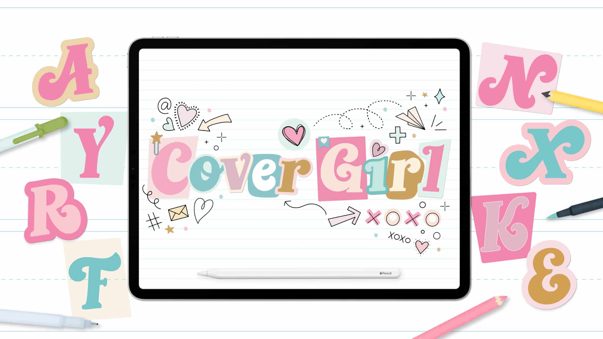
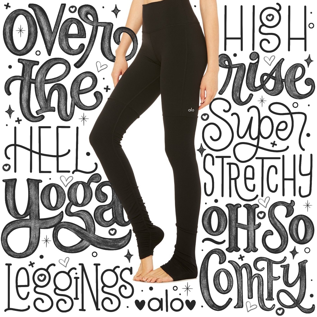
TIP NO. 3: Vary the size OR color of each letter
In the Cover Girl art below, the lettering style remains consistent. I’ve used color and detail elements to create a mixed look. Check out the complete Workbook for the Cover Girl Lettering Style if you love this style!
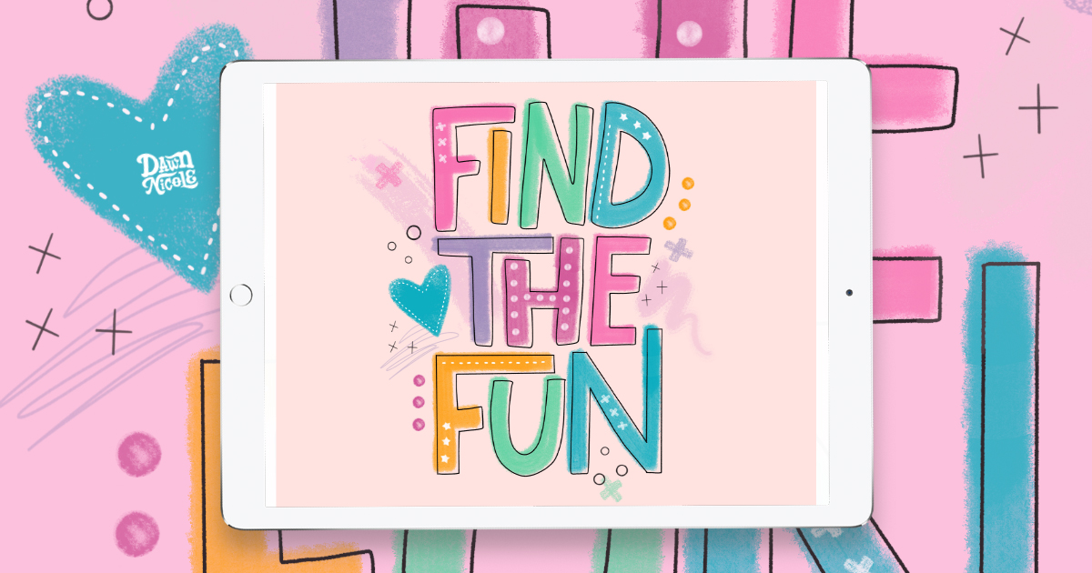
In this example, I’ve kept the letters loose and playful. Again, they’re all the same style, but the varied colors and treatments give it mixed lettering vibes. You can follow along with the free lesson in my Find The Fun Procreate Lettering Tutorial.
Tip No. 4: Vary the weight of each letter or word
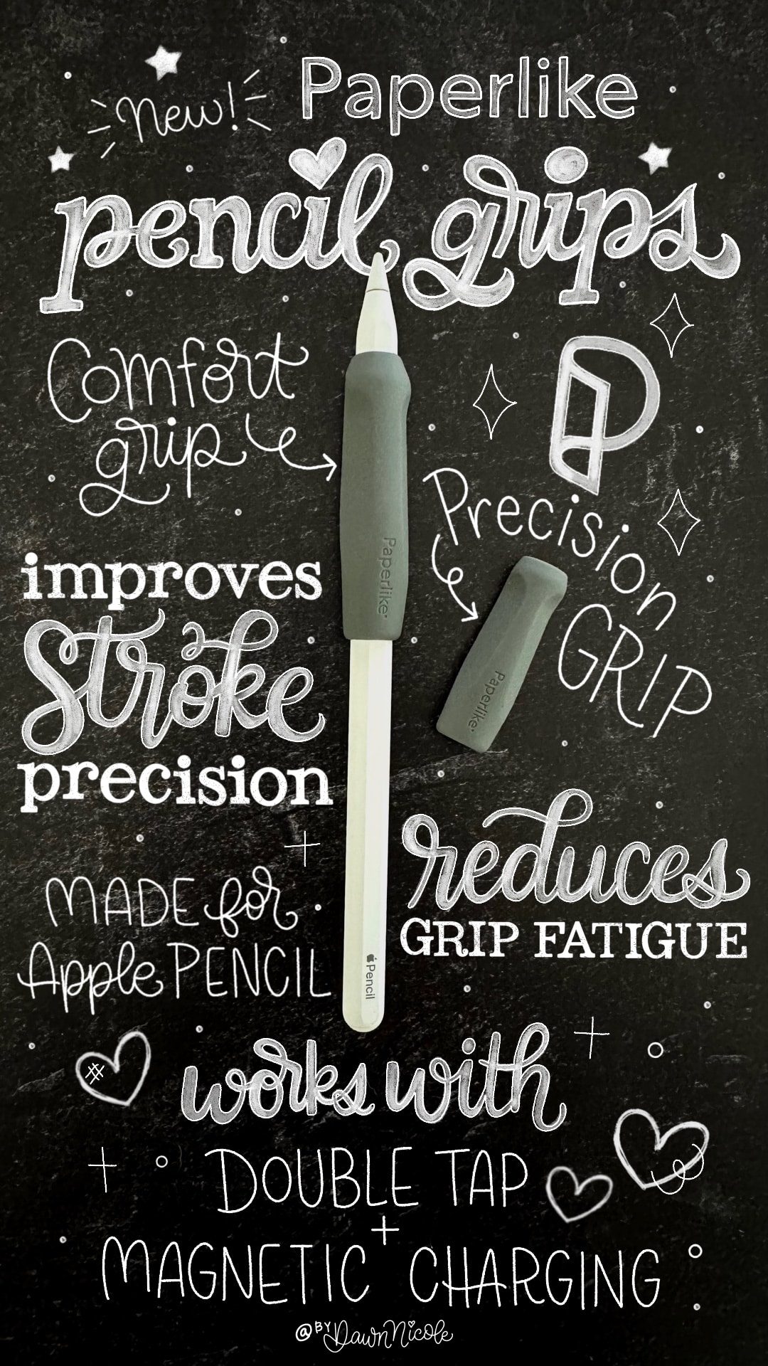
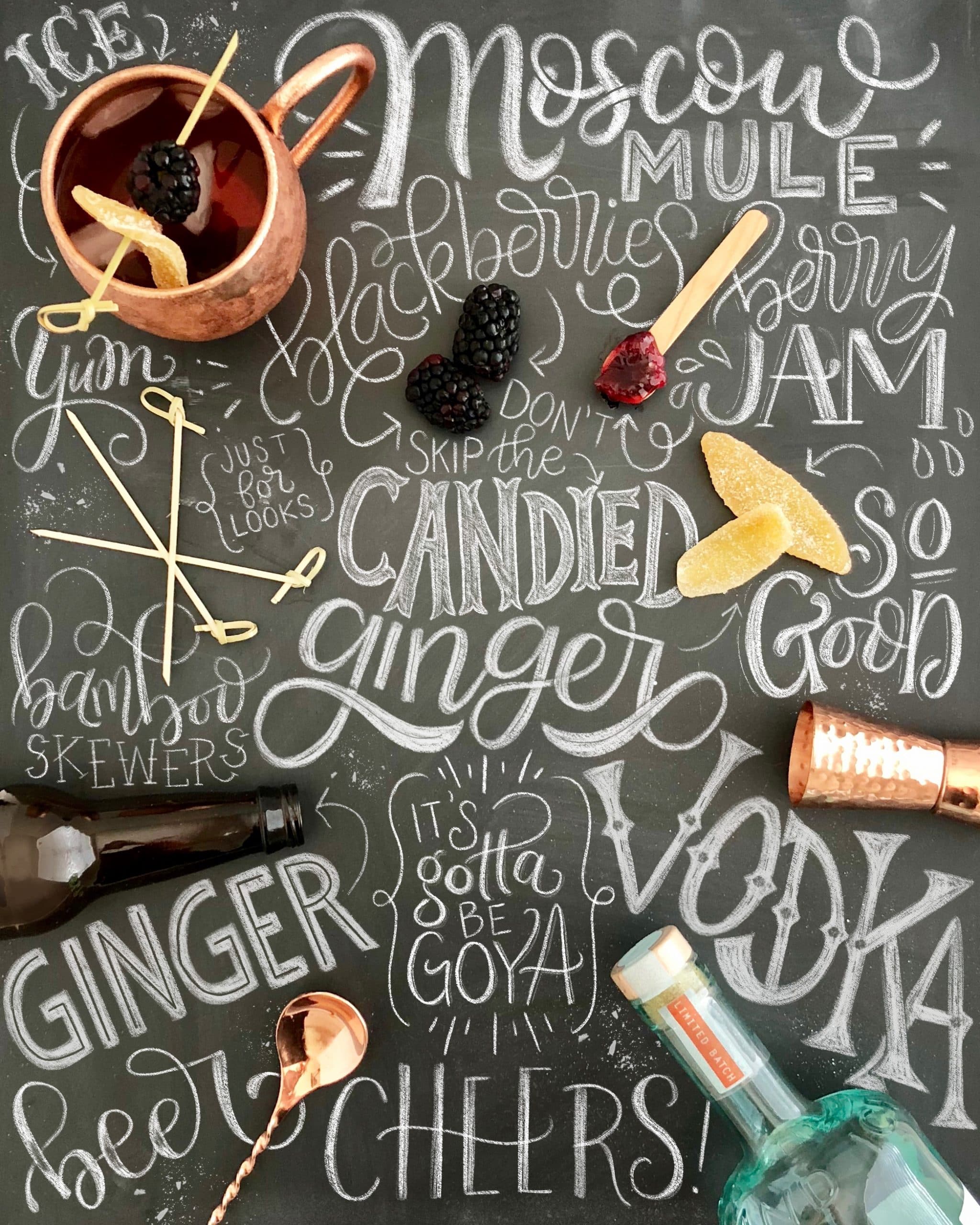
In the chalk art-inspired piece I did for Paperlike below, I incorporated monoline, bold, calligraphic, thick, and thin lettering styles. It’s mixxy, but it’s still cohesive since it’s all the same color.
Tip No. 5: Add different styles of decorative elements on each letter
This Pinky Promise art is similar to the Maximalist piece from above, but the letters are all the same style. I’ve used dots, lines, textures, and outlines to create a mixed-up look on a singular lettering style.
You can learn this exact style in my Pinky Promise Lettering Style Workbook.

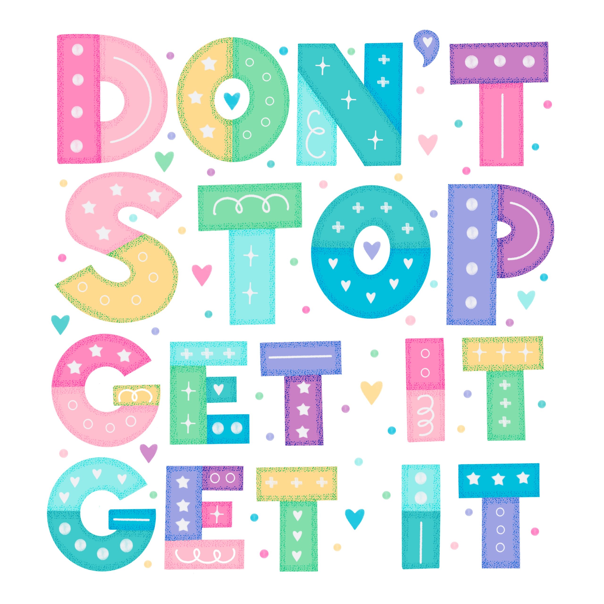
The “Don’t Stop. Get it. Get it.” artwork below is a similar example. You can learn this one for free in my Patchwork Quilt Lettering Style in Procreate Video Tutorial.
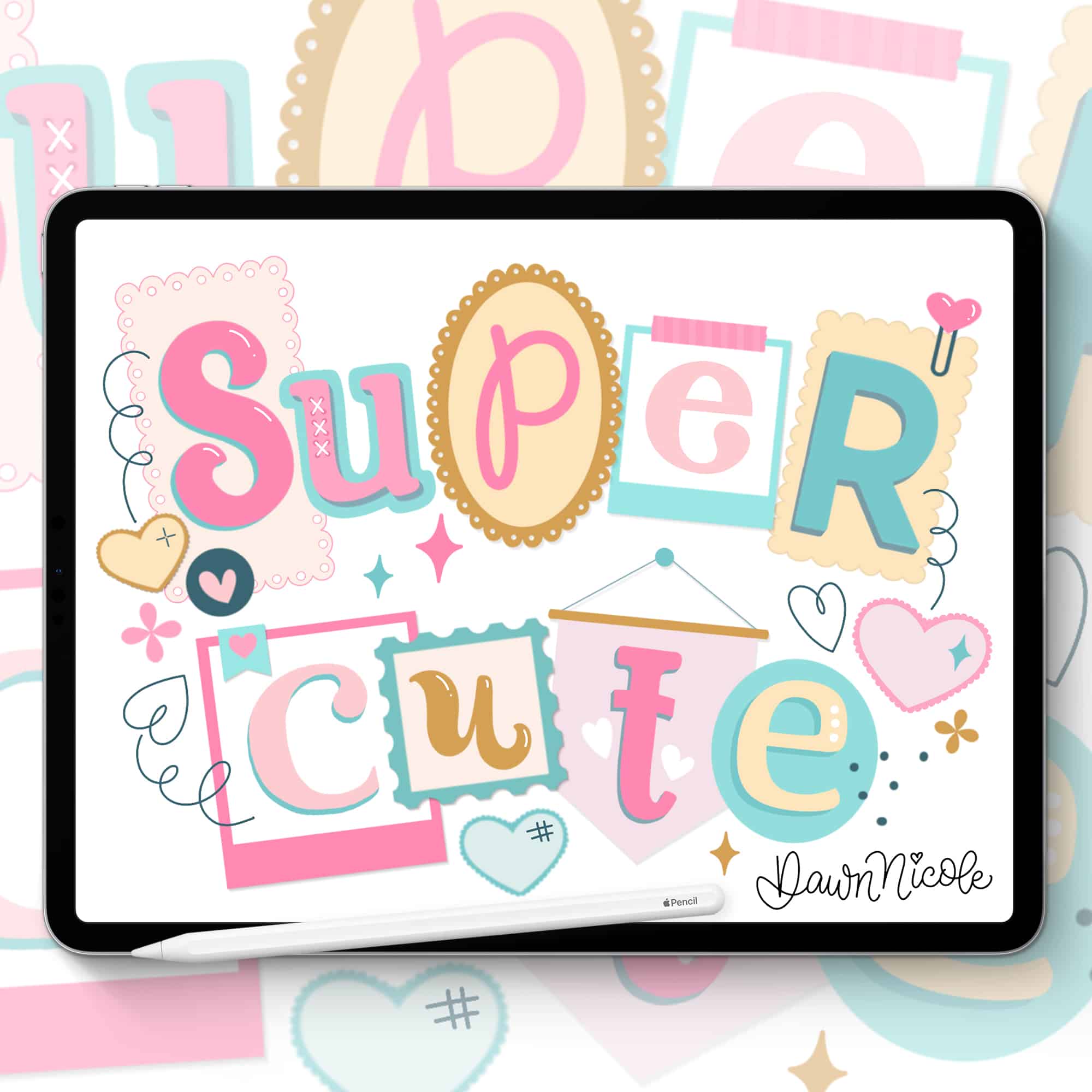
If you combine this tip with some of the others we’ve discussed, you could come up with something like this: the Super Cute art I created for my Super Cute Collage Stamp Kit for Procreate.
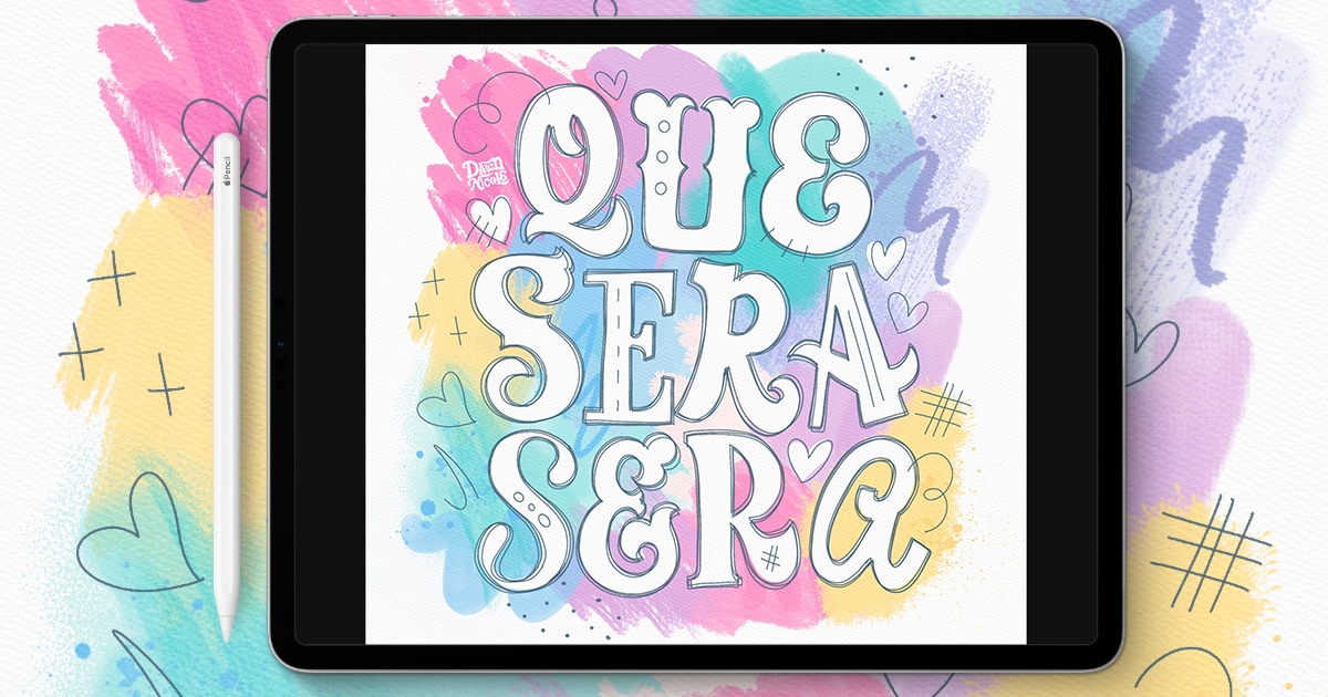
You can follow along with me to create the Que Sera Sera Artwork below over on my Artsy Aesthetic Mixed Media Lettering Video Tutorial.
Tip No. 6: Selective shadows and dimension
You can change the angle and direction of the dimension and shadows, or you can choose to only add them to some of the letters in your piece.

Tip No. 7: Mix lowercase and uppercase letters in an unconventional way.
I love to use uppercase letters in the middle of a word or a lowercase letter at the beginning. In the artwork I created for my Watercolor Lettering Kit, I’ve incorporated both elements.

TIP NO. 8: WORD ART
For a longer phrase, change each word’s lettering style instead of each letter. Alternatively, you can do a Sketch Note-Inspired Style as shown below.
Tip No. 9: IT’S ALL IN THE DETAILS
You’ve seen this tip used already, even though I haven’t mentioned it specifically yet. Vary the details you add to each letter. This includes inline details, outline details, dimensional details, and illustrative elements. It’s the more intricate version of Tip Number Five.


TEN: Embrace your sense of play!
Mixed styles can be like assembling a puzzle without the reference picture. It can take a few tries before you get the desired result.
Sketching and playing around with your letter layout are key. The more time you spend creating Mixed Lettering, the easier it will get to “eyeball it” when creating mixxy designs that are aesthetically appealing.

Learn the art of playful lettering with me
- Grab a copy of one (or all!) of my physical lettering and coloring books.
- Check out the Procreate Brush Sets and Online Classes in my lettering shop.
- Check out my 2025 Playful Lettering Style Challenge.
From the lettering Shop
Check out my five-star rated Procreate Brush Sets, Classes, & Lettering Style Workbooks!
Happy lettering!


