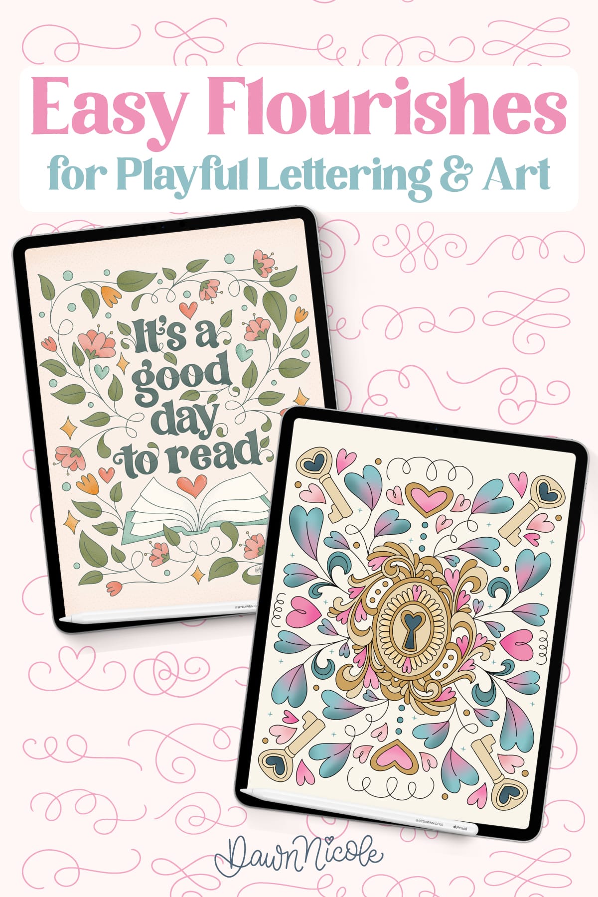
Easy Flourishes for Playful Lettering and Art. Simple flourishes you can add to whimsical lettering and art, plus simple tips and tools to make embellishing fun and beginner-friendly.
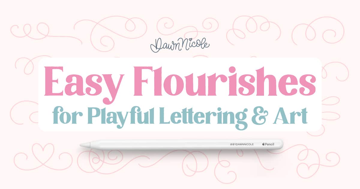
Easy Flourishes for Playful Lettering and Art
Flourishes are one of the easiest ways to add charm, movement, and personality to your lettering and art. A few simple swirls, curls, or decorative accents can turn plain words into whimsical designs in minutes. In this guide, you’ll learn easy flourishes you can draw right away, beginner-friendly tips to keep them balanced, and simple ways to use them in both traditional and Procreate artwork.

What Are Flourishes in Lettering and Art?
Flourishes are decorative lines, swirls, curls, and accents added to lettering or illustrations to create movement and visual interest. They can be extended from letter strokes or used as embellishments around your artwork. Flourishes are not meant to overpower your design. Instead, they support and enhance the main focal point. Even simple flourishes can make a piece feel more polished and expressive.
Why THEY Make Your Designs More Playful
Easy flourishes add personality without adding complexity. A few light curves or loops can instantly make lettering feel more whimsical and energetic. Because they’re quick to draw, you can experiment freely and develop your style faster. Small decorative touches often have a big visual payoff.

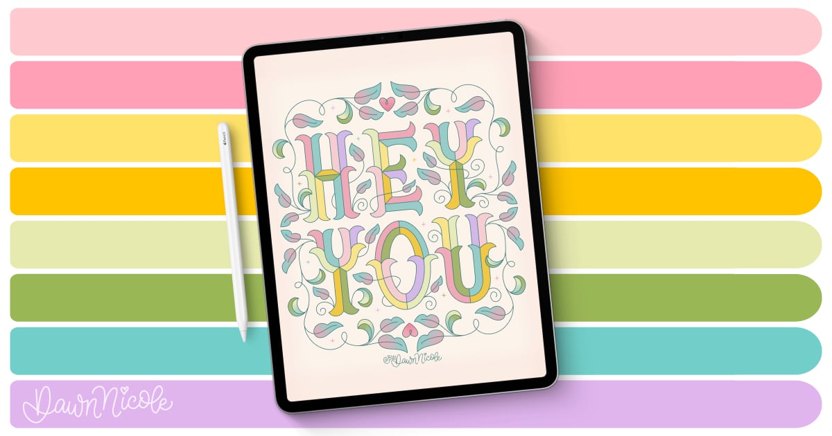
Get the color palette shown above as a free download!
Beginner Tips
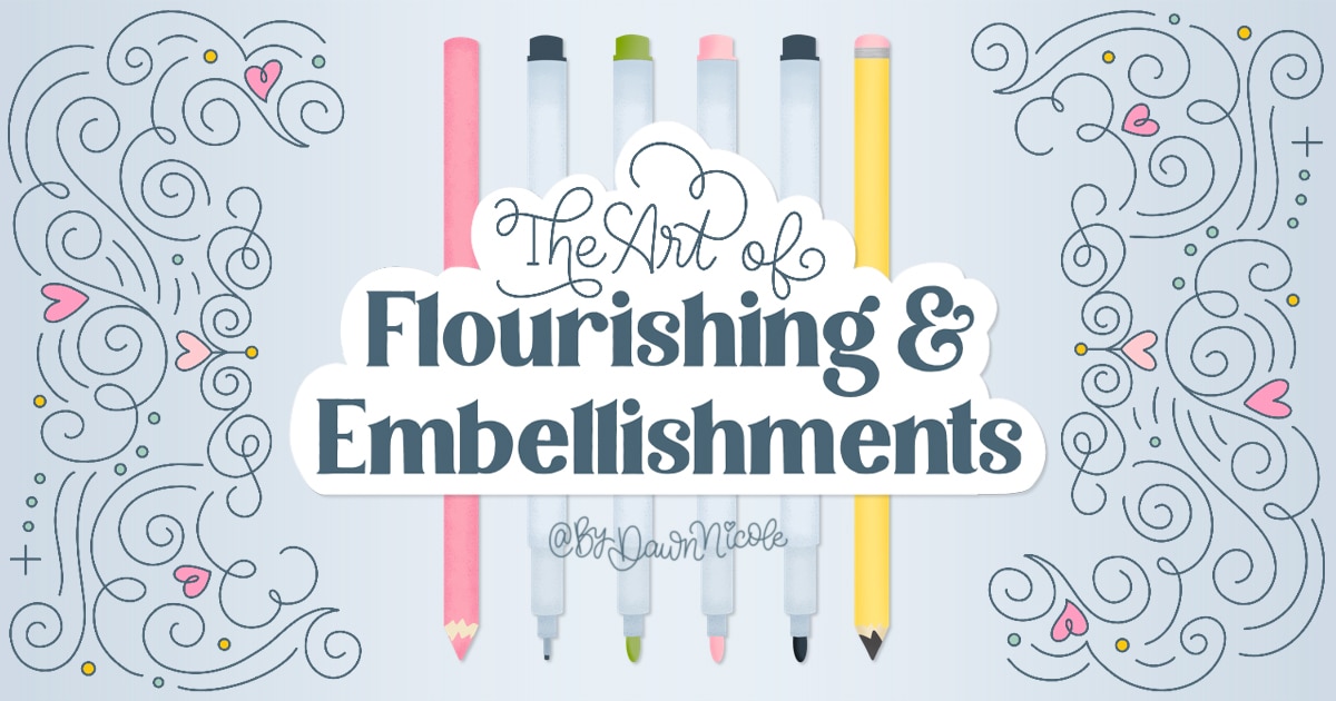
In my blog post, The Art of Flourishing & Embellishments, I share six tips for learning the art form. You’ll find easy, approachable tips to help you draw confident, balanced flourishes that enhance your designs without overwhelming them. Here’s a super simplified summary of the tips:
- Sketching is essential.
- Start with symmetry.
- Fill Negative Space with Flourishes
- Legibility is key
- Sleep on it (a highly underrated tip!)
- Trace-to-Learn
THE TL:DR VERSION
- Keep it simple — beginner-friendly shapes and minimal detail help your lettering stay readable and elegant.
- Focus on balance — place flourishes in ways that feel visually even around your lettering, not overpowering it.
- Enhance, don’t overwhelm — flourishes should support the word or phrase, not distract from it.
- Practice confident strokes — work on smooth, deliberate curves so your flourishes feel intentional.
- Think about line flow — follow the natural motion of the letters to create harmonious embellishments.
- Use playful embellishments—small decorative accents can add personality without complicating the design.
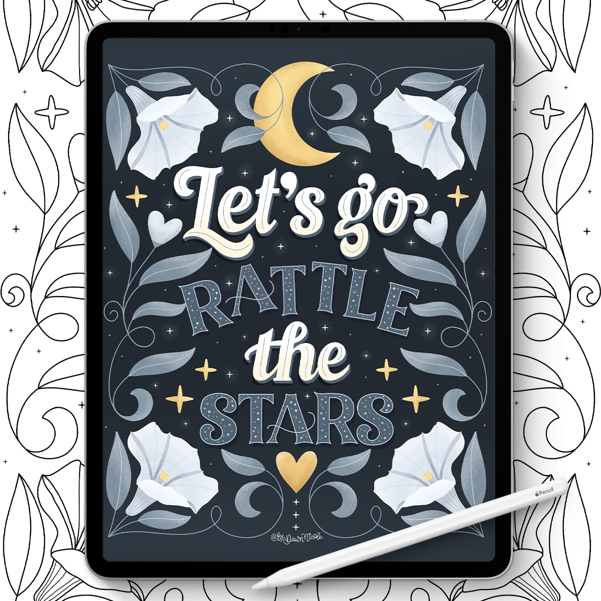
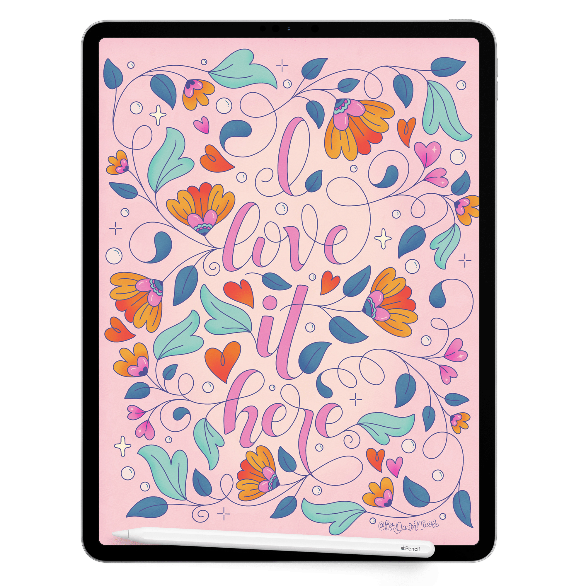
Using flourishing as a frame for your lettering, as I did with the piece below, is also an easy way to get started!
Simple Flourish Shapes to Practice First
Start with basic shapes like S-curves, C-curves, loops, dots, and tapered lines. These foundational strokes appear in most flourish styles and help build muscle memory. Practice drawing them in different sizes and directions to improve control. Once these feel natural, you can begin combining them into more decorative forms.
MAKE IT EXTRA EASY with Procreate Stamp Tools
In Procreate, flourishes can be drawn with monoline or pressure-sensitive brushes for smooth, controlled curves. Use QuickShape and Streamline features to clean up wobbly lines and achieve more consistent results. You can also use stamp or embellishment brushes to place ready-made flourishes, then adjust size, rotation, and opacity. Working on a separate layer makes it easy to experiment without affecting your lettering.
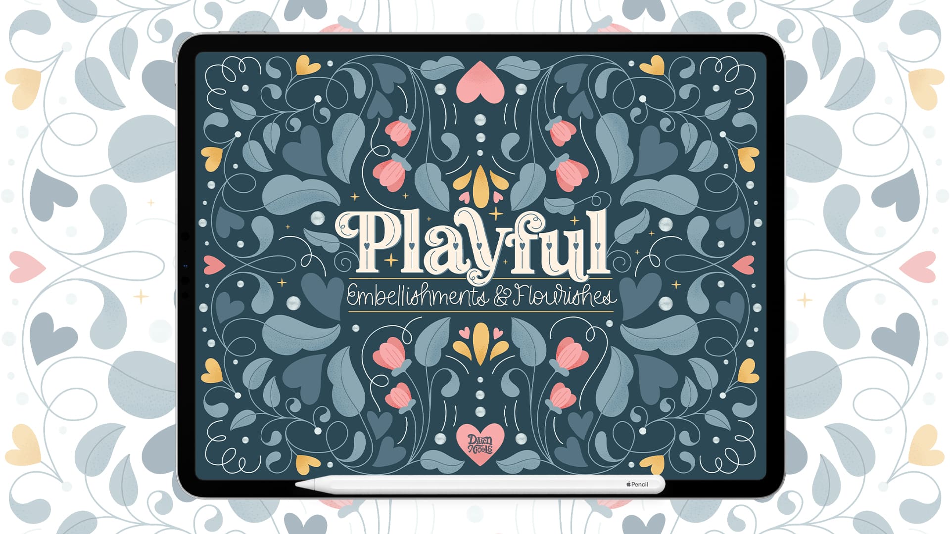
If you love the look of flourishes but don’t always want to draw every swirl from scratch, stamp tools can speed up the process and make it more playful. I often use my Playful Embellishments Procreate Kit for quick decorative flourishes, doodles, and accents that I can resize, rotate, and customize to fit my lettering. It’s a fun shortcut that still keeps your final piece feeling handmade and unique.
Playful Embellishments Procreate Stamp Kit
Watch this video tutorial to see them in action!
Common Mistakes to Avoid
One common mistake is adding too many flourishes, which can clutter the design and distract from the words. Another is uneven spacing or inconsistent stroke weight that makes embellishments feel disconnected. Flourishes should follow the flow of your lettering, not fight against it. When in doubt, remove one or two accents and see if the design feels clearer. As you become better at drawing flourishes, you’ll be able to create more intricate pieces that feel playful but not chaotic.
Practice Ideas for Better Flourishes Fast
Fill a practice page with repeated curves and loops to build smooth hand motion and confidence. Try adding one small flourish to the same word in five different ways to explore variation. Trace over successful flourishes you like to understand their rhythm and structure. Short, focused practice sessions improve control much faster than occasional long ones.
💡 Easy Tip: Use the flourish stamps in my Playful Embellishments Stamp Kit to create your own practice sheets to trace.


Happy Creating!


