How to Draw the Letter C in 3 Lettering Styles (Free Practice Sheet!). Learn how to draw the letter C in sans serif, serif, and script styles in Procreate — includes a free practice worksheet.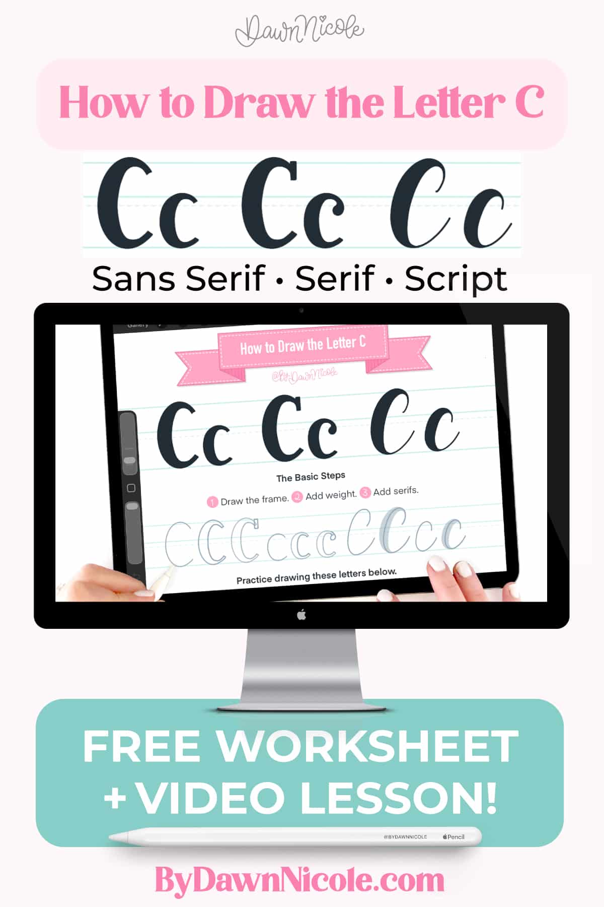
How to Draw the Letter C in 3 Lettering Styles
Learn how to draw the letter C in multiple hand-lettering styles using Procreate. In this beginner-friendly step-by-step tutorial, you’ll learn sans serif, serif, and script versions. Plus, you can download a free practice worksheet to follow along!
What You’ll Learn
In this lettering lesson, you’ll learn:
- How to draw a sans-serif C
- How to add serifs
- Script lettering strokes for C
- Common beginner mistakes
- A “level-up” your lettering tip
Tools Used for This Tutorial
- iPad + Apple Pencil
- Procreate app
- Monoline brush
- Practice Worksheet (download it for free below)
Free Letter C Practice Worksheet
Download the free letter C practice sheet to trace and practice each style shown in the video. The download includes both a printable PDF and a Procreate format worksheet.
The worksheet features:
- Uppercase + lowercase C/c
- All 3 lettering styles
- Stroke directional arrow and steps demo
- Blank practice space
WATCH THE VIDEO LESSON
This quick lesson guides you through each stroke, with beginner tips and optical corrections, so your letterforms look balanced and polished.
This year is all about sharing TONS of free Procreate video tutorials!
Subscribe to my YouTube Channel!
Level-Up Your Letter C
⭐ Bonus Tips:
- Uppercase C: Overshoot the capline and baseline slightly. Round letters need a bit of overshoot to look the same height as flat letters.
- Lowercase c: Tight c’s can fill in fast at small sizes. Open the aperture more than feels natural to combat this. (Letter aperture is the partially enclosed, rounded negative space or “opening” within characters like ‘c’, ‘e’, ‘s’, ‘a’, or ‘n’.)
- Read all about the Anatomy of the Letter C to really dive into the terminology!
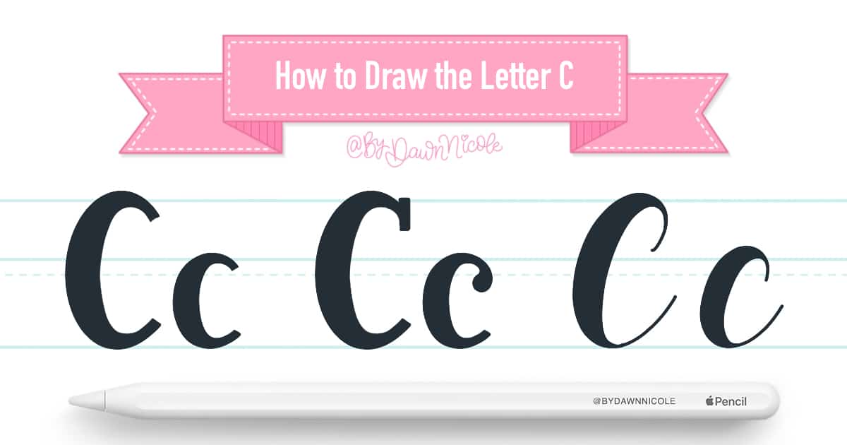
How to Draw the Letter C: Quick Steps
- Sans Serif: Draw your letter frame, and then add weight.
- Serif: Draw your letter frame, add weight, and finally, add the serif style of your choice.
- Script: Draw your letter frame and add weight to the downstrokes. You can make your upstrokes thicker as well, but the downstrokes should always be thicker by comparison.
FAQ: Letter C
Is the letter C hard to hand-letter?
Nope! C is one of the easiest. Yay!
What style should beginners start with?
Monoline and Sans Serif styles are the simplest, so I recommend starting with whichever feels less stressful to you.
Can I practice this without Procreate?
Absolutely! I’ve included both a printable PDF and a Procreate file in the free worksheet download, so you can practice digitally, analog, or both!
What about a Calligraphy Letter C?
Calligraphy is different from lettering. With lettering, we’re drawing. whereas in calligraphy, we write by applying pressure to control the width of our upstrokes and downstrokes. Want to try it? Check out my free calligraphy drills video and worksheet!
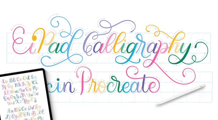
iPad Calligraphy in Procreate: The Full Class
First, I’ll teach you the terminology, drills, letters, and words. Then, we’ll do three fun class projects to take it to the next level. I’ll have you feeling like a pro in no time!
You’ll need an iPad, Apple Pencil, and the Procreate App. The Procreate Brushes, Color Palette, Worksheets (so many worksheets!), and Reference Guide/Artwork are all included in the class download.
This beginner-level comprehensive Calligraphy class includes over 3 hours of video instruction.
iPad Calligraphy in Procreate Class →
HELPFUL LINKS
- How to Draw the Letters A–Z (series hub page)
- Go Back: How to Draw the Letter B
- Next up: How to Draw the Letter D
- Read all about The Anatomy of Letters: An A-Z Guide
- Ready to level up? Check out my 12 Playful Lettering Styles!


Happy Lettering!


