Anatomy of the Letter A
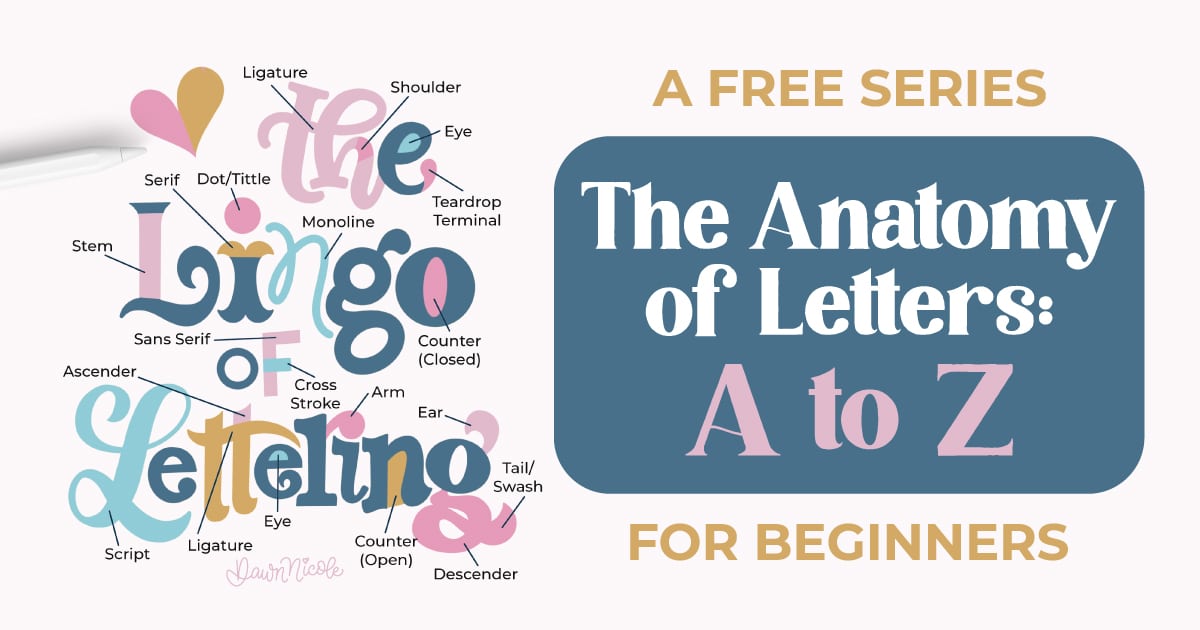
Understanding the anatomy of letters is one of the fastest ways to improve your lettering and typography skills, so I’m doing a whole series on the terminology of typography.
Whether you’re drawing a bold uppercase A or a flowing lowercase a, knowing the names and functions of each part helps you make better styling choices, fix proportion issues, and create more polished letterforms.
In this guide, I’ll break down the letter’s structure, explore common lowercase forms, and highlight the key features every lettering artist should know.
Uppercase LETTER A
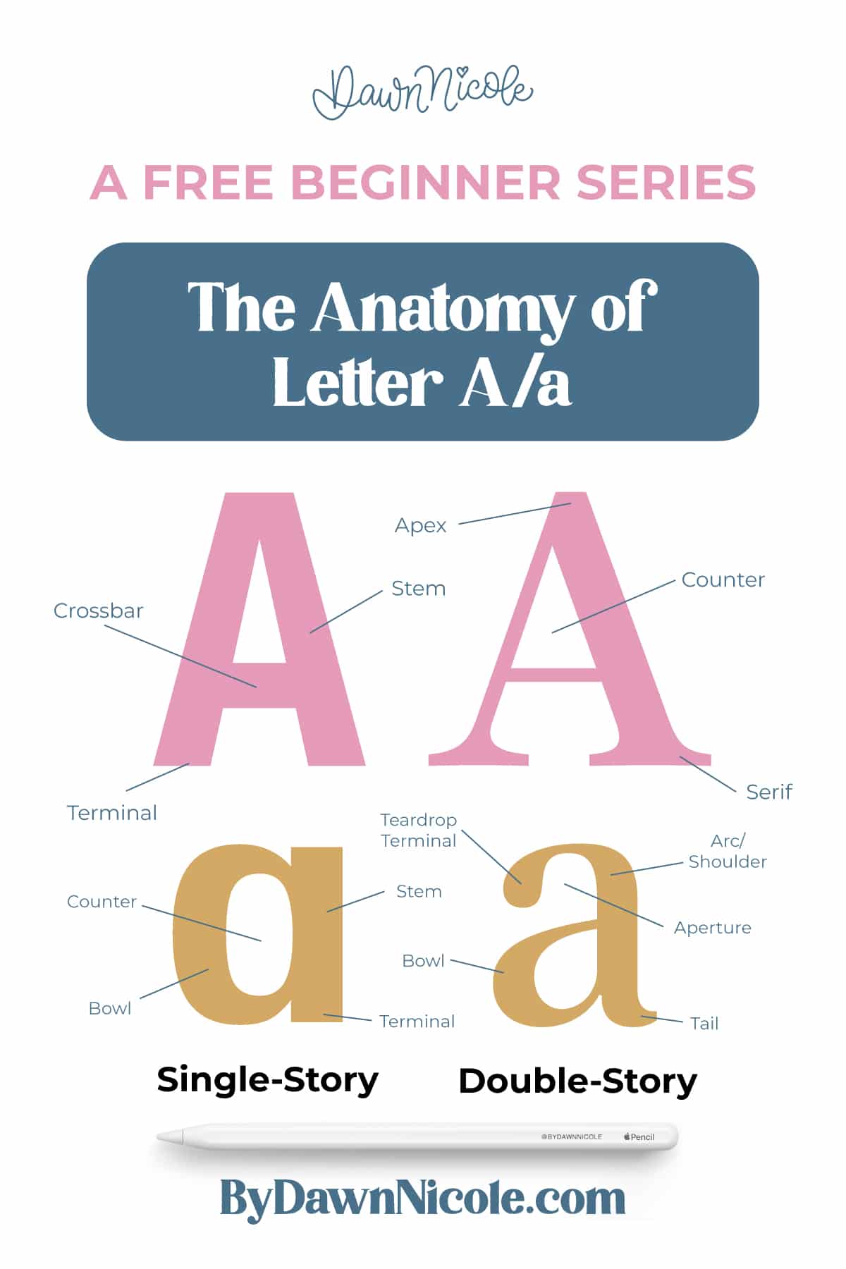
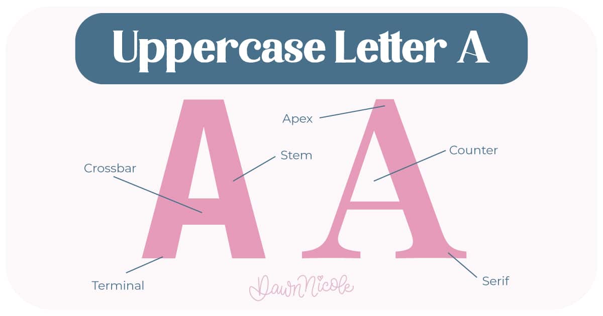
The uppercase A is built from two diagonal strokes that rise and meet at the top, forming a pointed peak. These strokes are connected by a horizontal line called the crossbar, creating the familiar triangular structure. Understanding each part helps you control balance, weight, and style when lettering.
- Apex: The top point where the two diagonal strokes meet.
- Stems: The left and right diagonal strokes that form the sides.
- Crossbar: The horizontal stroke connecting the stems, usually placed slightly below center for visual balance.
- Serifs: Small decorative “feet” at the ends of the stems in serif styles.
- Terminals: Stroke endings in sans-serif or script styles (when no serif is present).
- Counter: The interior white space.
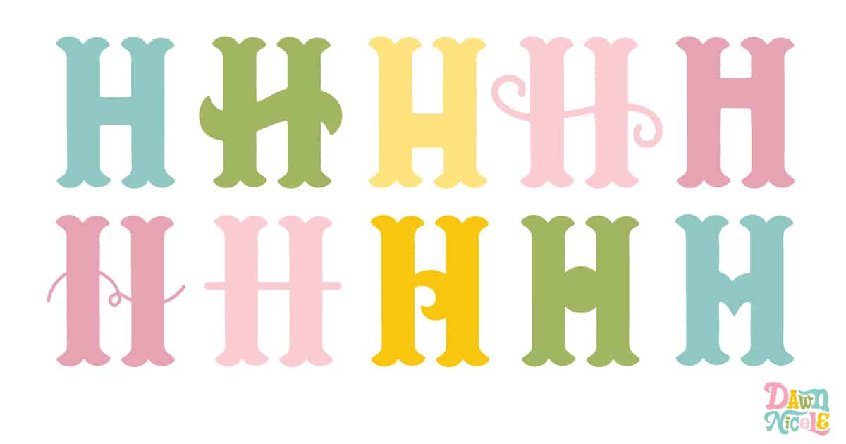
💡Pro Tip: Shifting the crossbar slightly higher or lower can dramatically change the personality of your A. I’ve demonstrated this below with the letter H (which is a graphic from my 14 Tips for Creating Custom Lettering blog post). Go check it out for additional tips on letter customization.
LOWERCASE A
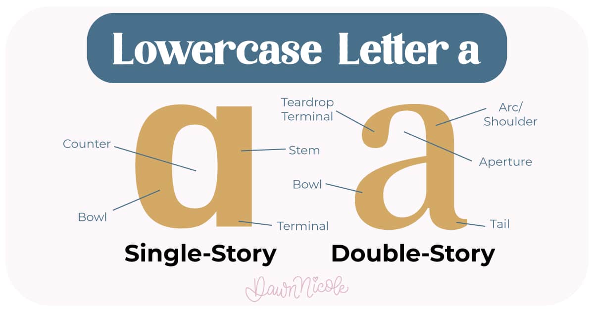
The lowercase a appears in two common forms, and each has its own structure and personality.
Double-Story “a” (typography form)
Common in print and many digital fonts.
- Bowl: The rounded main body of the letter.
- Counter: The enclosed white space inside the bowl.
- Arc/Shoulder: The arced area between the stem and the top terminal.
- Aperture: The white space within the arch.
- Tail: A small decorative stroke at the base of the stem.
- Terminal: The end of a stroke that does not include a serif.
Single-Story “a” (handwritten form)
Common in handwriting, scripts, and many casual styles.
Built from a simple oval or circular shape plus a stem.
Easier to draw and more common in brush lettering and calligraphy.
HELPFUL LINKS
Want to learn how to draw each letter in three foundational styles?
Ready to get more playful with your styles?
I’ve got you covered. Check out the links below!
- Hand Lettering the Alphabet: A-Z. A free video series covering how to draw every letter in three foundational styles.
- The Anatomy of Letters: An A–Z Guide
- Ready to level up? Check out my 12 Playful Lettering Styles.
Happy drawing!
