Anatomy of the Letter B
Understanding the anatomy of the letter B helps you draw cleaner curves, balance proportions, and create more polished lettering. The letter B is built from a strong vertical stem paired with one or two rounded bowls that create its distinctive shape. What sets B apart from many other letters is its combination of straight structure and curved volume.
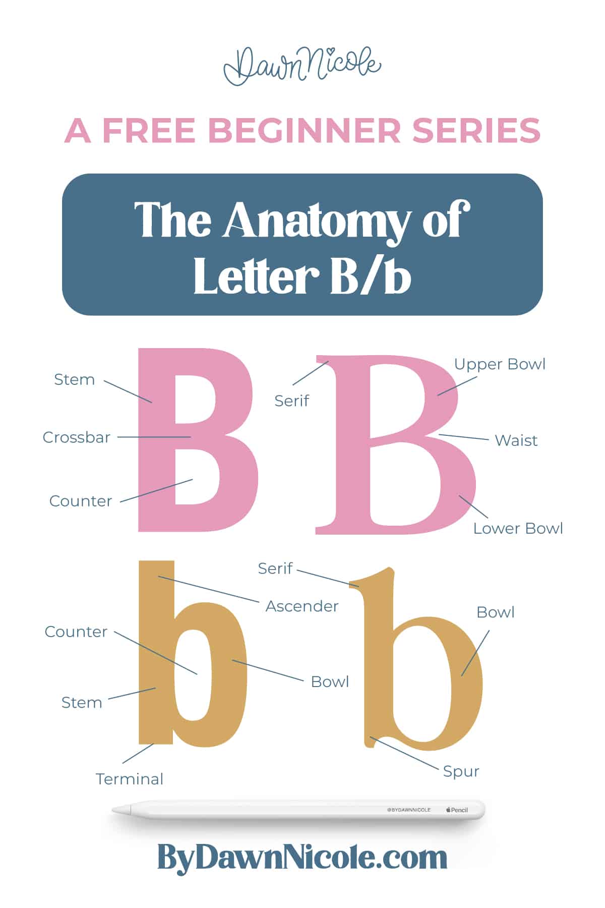
Learning how these parts work together will help you draw smoother curves, balance proportions, and maintain consistent weight in your lettering. At its core, the letter B is defined by a main vertical stroke and enclosed curved forms. The spaces inside those curved forms are called counters, and their size and shape play a big role in readability and style.
In this guide, I’ll break down the structure of both uppercase and lowercase B and walk through the key anatomical features lettering artists should know.
CORE ELEMENTS
- Stem: The main vertical stroke that establishes the letter’s height and alignment.
- Bowl: A rounded, enclosed curved stroke attached to the stem.
- Counters: The enclosed white spaces inside each bowl.
- Serifs: Small finishing strokes at the ends of the stem in serif styles.
- Terminals: Stroke endings in sans-serif or script styles.
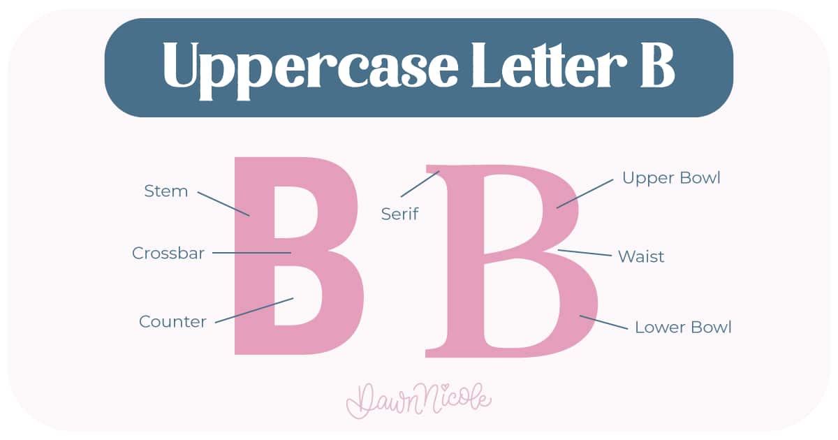
Uppercase LETTER B
- Has two bowls: an upper and a lower.
- The lower bowl is usually slightly larger for visual balance.
- Reaches from the baseline to the cap height.
- Each bowl connects to the stem at a joint, where the curve meets the vertical stroke.
💡Pro Tip: In lettering, adjusting the bowl size, counter shape, or stem weight can quickly change the personality of your B. How to draw it can determine whether it’s playful and bouncy or formal and sturdy.
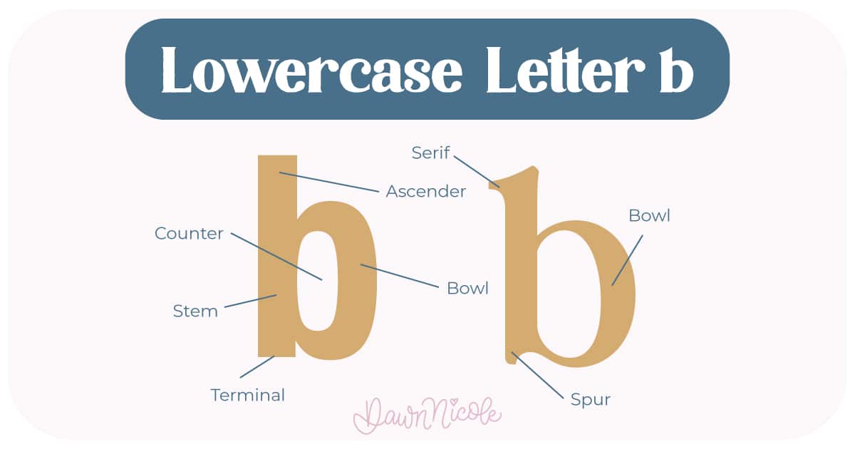
LOWERCASE LETTER B
- Has one bowl that sits on the baseline.
- Includes an ascender, which is the portion of the stem that rises above the x-height.
- The curved bowl connects to the stem at the shoulder/joint.
- More open and simplified than the uppercase form.
HELPFUL LINKS
Want to learn how to draw each letter in three foundational styles?
Ready to get more playful with your styles?
I’ve got you covered. Check out the links below!
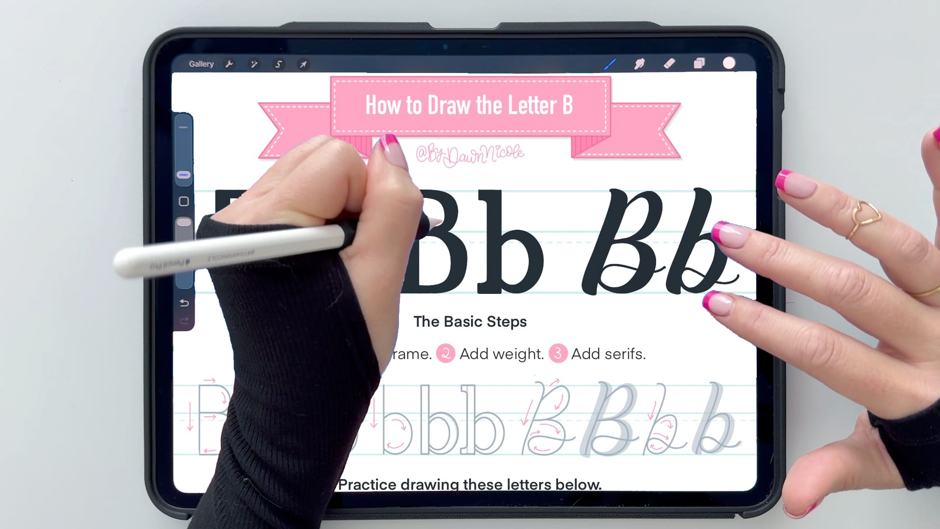
- Hand Lettering the Alphabet: A-Z. A free video series covering how to draw every letter in three foundational styles.
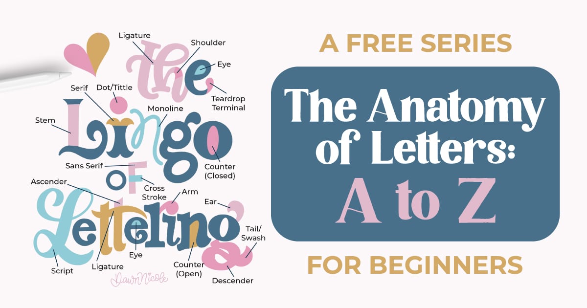
- The Anatomy of Letters: An A–Z Guide
- Ready to level up? Check out my 12 Playful Lettering Styles.


Happy drawing!


