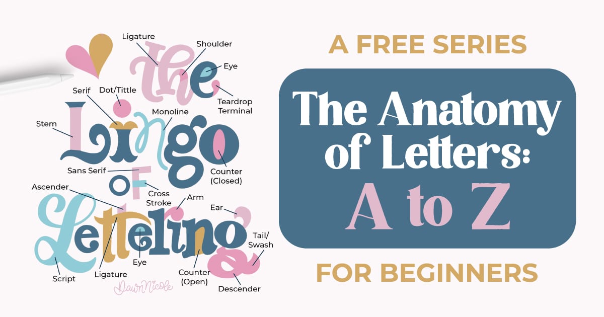
Anatomy of the Letter C
The letter C is one of the simplest (and most important!) shapes in lettering. Both uppercase and lowercase C are formed from a single curved stroke that creates an open, circular path. Because of its clean structure, the C shape often serves as a foundation for building other letters, such as O, G, and Q, and even parts of A and E, across many lettering styles.
What makes the letter C distinctive is not just the curve itself, but how the stroke begins and ends. The shape, angle, and finish of those endpoints dramatically affect the overall style and readability.
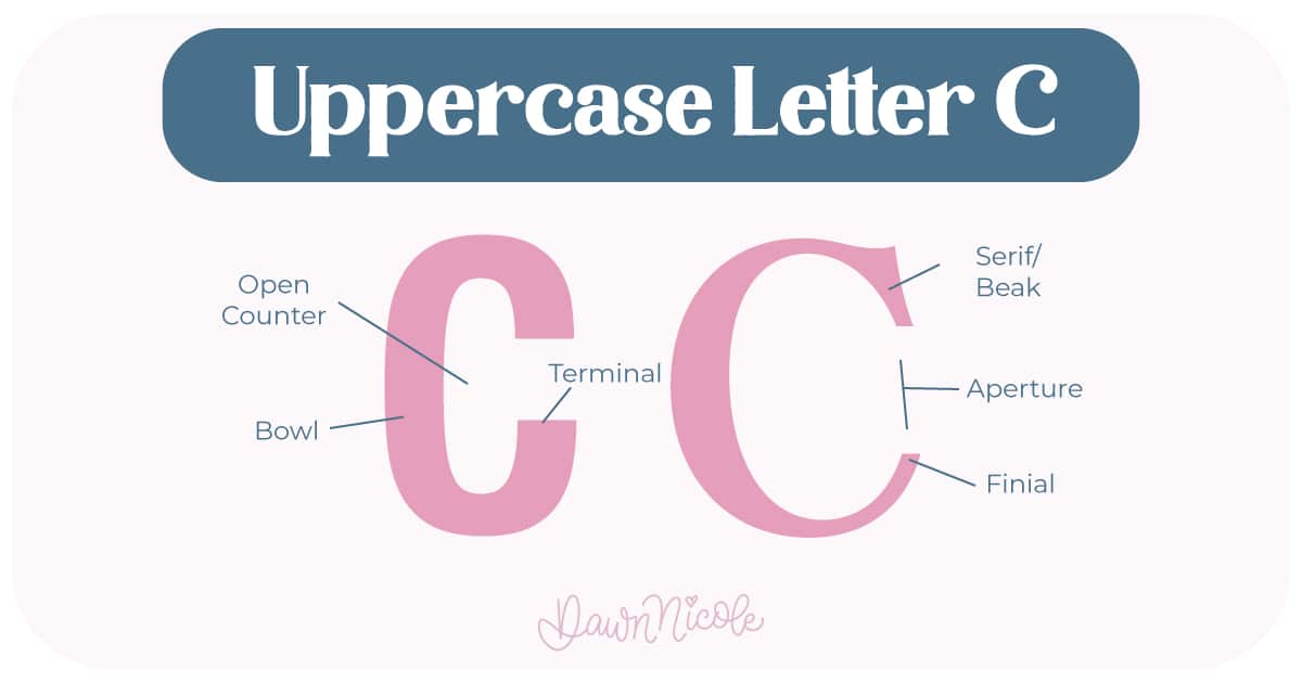
CORE ELEMENTS
- Stroke: The main continuous curved line that forms the letter’s shape.
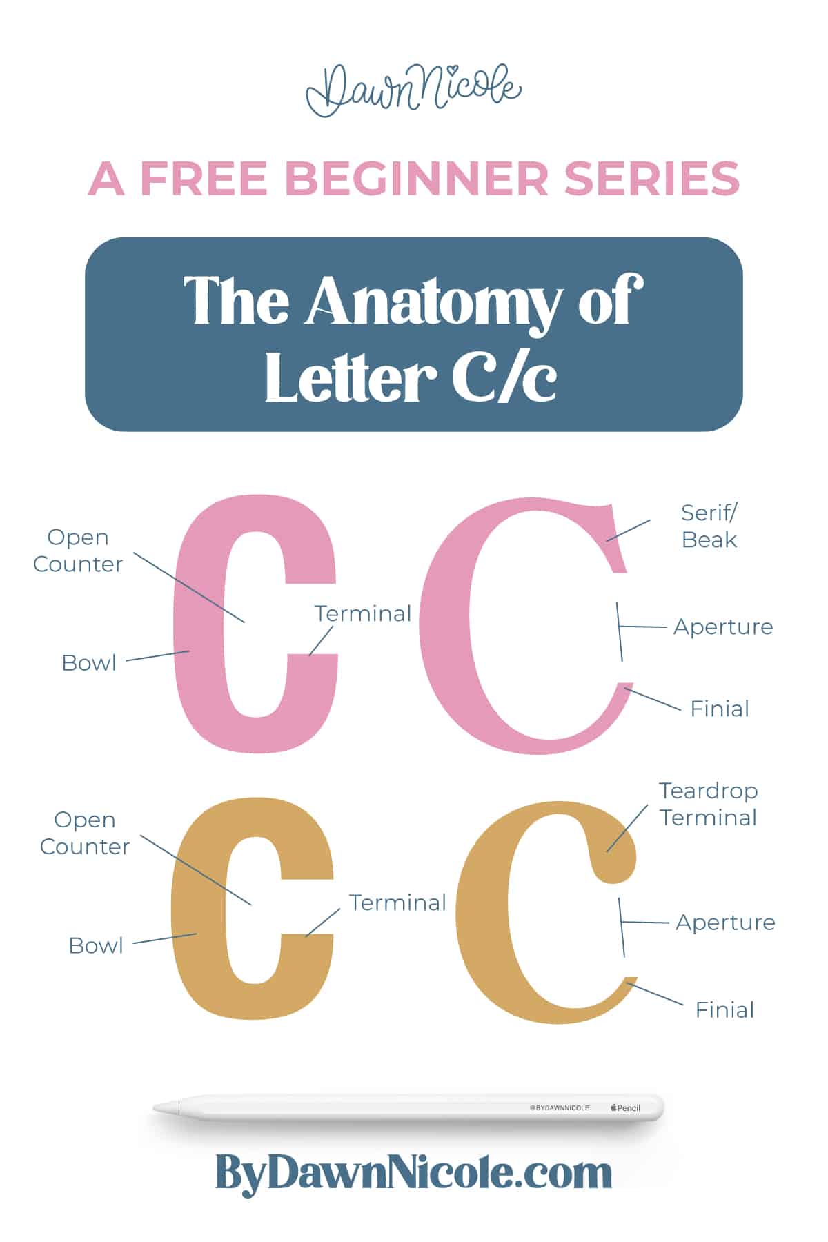
- Bowl: The primary curved body of the letter (sometimes referred to as the spine for this letter).
- Open Counter: The open interior space inside the curve.
- Aperture: The opening between the two ends of the stroke that keeps the counter from closing.
- Terminals: The endpoints of the stroke, which may be flat, rounded, angled, or flared.
- Serifs (optional): Small decorative finishing strokes at the terminals in serif styles.
- Finial: a tapered, curved, or slightly flared terminal (end) of a letter stroke.
- Beak: a sharp, decorative, triangular-shaped projection or serif found at the end of an arm in certain character strokes
Uppercase LETTER C
- Typically spans from baseline to a bit above cap height and often has more even curve tension.
- The aperture width (how open the C is) strongly affects legibility and personality.
💡Pro Tip: Because the C is pure curve with no vertical stems, it’s an excellent practice letter for improving curve control, stroke contrast, and spacing in your lettering work.
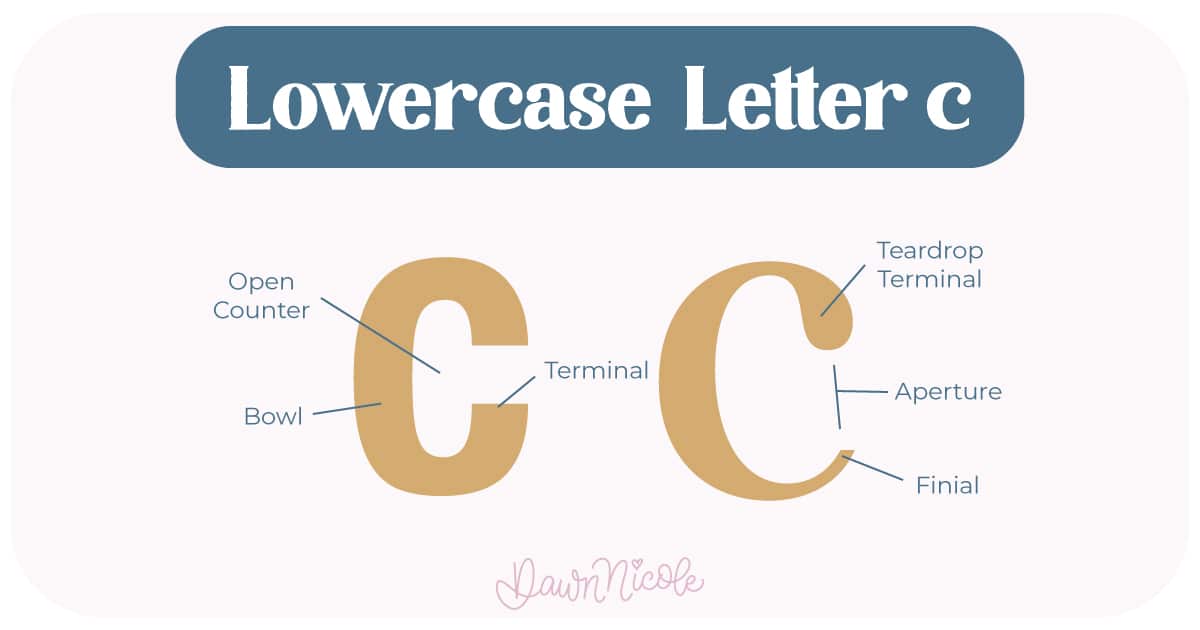
LOWERCASE LETTER C
- Usually spans baseline to x-height and may appear more compact or more open depending on the font or lettering style
- The aperture width (how open the C is) strongly affects legibility and personality.
 HELPFUL LINKS
Want to learn how to draw each letter in three foundational styles?
Ready to get more playful with your styles?
I’ve got you covered. Check out the links below!
- Hand Lettering the Alphabet: A-Z. A free video series covering how to draw every letter in three foundational styles.
- The Anatomy of Letters: An A–Z Guide
- Ready to level up? Check out my 12 Playful Lettering Styles.
Happy drawing!
 HELPFUL LINKS


