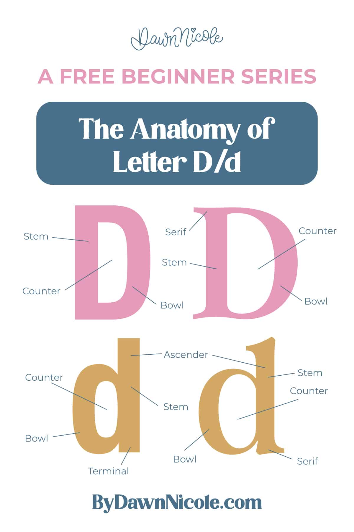
Anatomy of the Letter D
The letter D combines a strong vertical stroke with a broad curved form, giving it a sturdy spine and a rounded outer shape. In both uppercase and lowercase, D is built from a stem plus a bowl that creates an enclosed counter. Understanding how these two parts connect will help you control curve tension, spacing, and weight distribution in your lettering.
While uppercase and lowercase D share the same basic idea, their proportions and vertical reach are different, especially because the lowercase version includes an ascender.
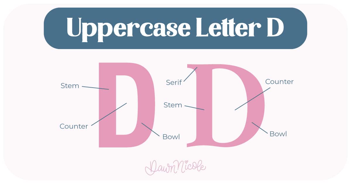
Uppercase LETTER D
The uppercase D is formed from a straight vertical stem and a large curved stroke that connects to the top and bottom of that stem.
- Stem: The primary vertical stroke that forms the backbone of the letter
- Bowl: The large curved stroke that closes against the stem to create the rounded right side
- Counter (closed): The fully enclosed interior space inside the bowl
- Serifs (optional): Small finishing strokes at the top and bottom of the stem in serif styles
- Terminal (sans serif styles): A clean stroke ending where no serif is present
💡Pro Tip: Some typographers use the term lobe for a bowl that closes against a straight stem, as seen in the uppercase D.
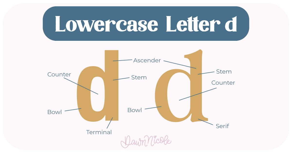
LOWERCASE LETTER D
The lowercase d keeps the same core idea (stem plus bowl), but shifts the proportions and adds vertical reach above the x-height.
- Stem: The main vertical stroke
- Ascender: The portion of the stem that rises above the x-height
- Bowl: The rounded enclosed stroke attached to the stem
- Counter: The enclosed white space inside the bowl
- Terminal or serif: The finishing stroke at the end of the stem, depending on style
Because the D relies on one straight edge and one continuous curve, it’s a great letter for practicing smooth bowl construction and consistent curve weight in your lettering work.
 HELPFUL LINKS
 HELPFUL LINKS
Want to learn how to draw each letter in three foundational styles?
Ready to get more playful with your styles?
I’ve got you covered. Check out the links below!
- Hand Lettering the Alphabet: A-Z. A free video series covering how to draw every letter in three foundational styles.
- The Anatomy of Letters: An A–Z Guide
- Ready to level up? Check out my 12 Playful Lettering Styles.


Happy drawing!


