Anatomy of the Letter F
The letter F is a great example of how a simple structure can still have a lot of personality. Both uppercase and lowercase forms rely on a strong vertical stem, but the strokes that branch off from it give each version its distinct look. When you understand how those parts work together, you can control proportion, spacing, and style much more intentionally in your lettering.
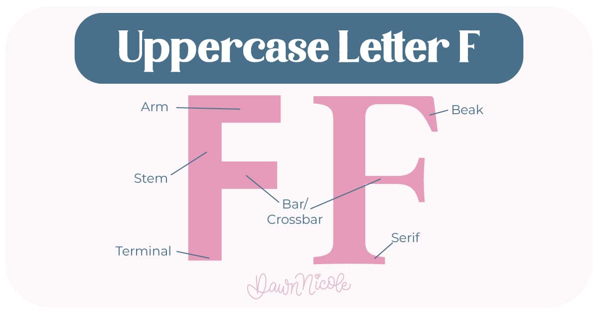
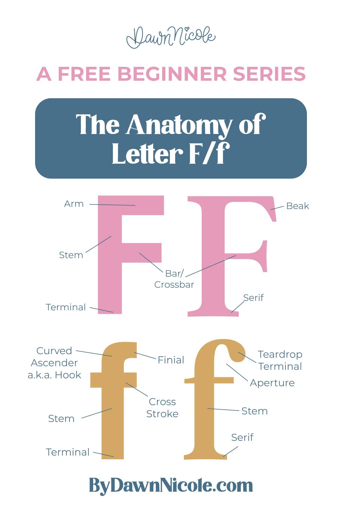
Uppercase LETTER F
The uppercase F is built from one vertical stem and two horizontal arms. It shares the same basic framework as the letter E but lacks the bottom arm, making spacing and balance especially important.
- Stem: The main vertical stroke that forms the backbone of the letter.
- Arms: The horizontal strokes extending from the stem (top, middle, and bottom)
- Middle arm (bar): Usually shorter than the top and bottom arms for visual balance.
- Beak: A small decorative spur or angled finish sometimes found at the ends of the arms in serif styles
- Serifs (optional): Small finishing strokes on the ends of the arms and stem in serif typefaces
- Terminals: Clean stroke endings where no serif is present
💡Pro Tip: Serif vs. Beak – I shared this tip for Letter E, but it’s also true for the F. A serif is a small finishing stroke, like a little “foot,” added to the end of a letter’s line. A beak is more dramatic and pointed. It’s a sharp, triangular, or hook-like detail that extends from the end of a horizontal arm, often seen on letters like E, F, T, or a lowercase r. Think of it this way: every beak is a stylized type of serif, but not every serif has that bold, pointy beak shape.
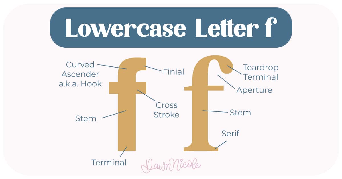
LOWERCASE LETTER F
The lowercase f is more expressive and often more complex. It typically includes a tall ascender, a curved top, and a stroke that crosses through the stem.
- Ascender: The portion of the letter that rises above the x-height
- Hook: The curved stroke at the top that gives many lowercase f forms their signature shape
- Stem: The primary vertical stroke
- Aperture: The partially open white space created by the hook
- Cross stroke: The horizontal stroke that intersects the stem (unlike a crossbar, it actually cuts through).
- Terminal: Clean stroke endings where no serif is present.
- Teardrop/Ball Terminals: Terminals can also be shaped, for example, like Teardrop or Ball Terminals.
- Finial: A tapered terminal.
- Descender (in some styles): In italic or script forms, the stroke may extend below the baseline;
Because the uppercase F is mostly straight and the lowercase f often mixes straight and curved strokes, this letter pair makes excellent practice for switching between structure and flow in your lettering.
 HELPFUL LINKS
 HELPFUL LINKS
Want to learn how to draw each letter in three foundational styles?
Ready to get more playful with your styles?
I’ve got you covered. Check out the links below!
- Hand Lettering the Alphabet: A-Z. A free video series covering how to draw every letter in three foundational styles.
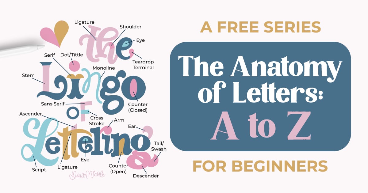
- The Anatomy of Letters: An A–Z Guide
- Ready to level up? Check out my 12 Playful Lettering Styles.


Happy drawing!


