Anatomy of the Letter I
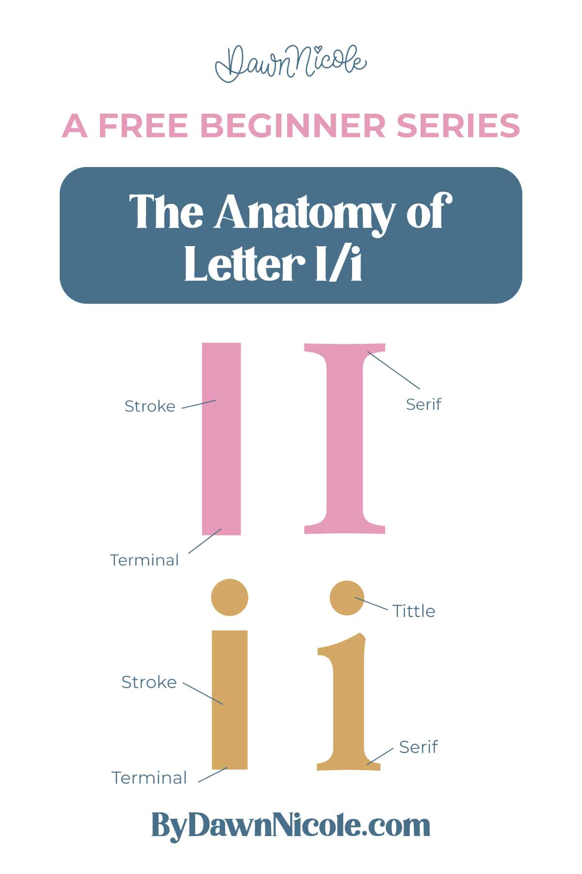
The letter i may be simple and small, but it has one very important detail that gives it personality. It’s made up of two main parts: a simple vertical stem and a detached dot called a tittle. That tiny dot does a lot of visual work, especially in lowercase.
In the lowercase i, the stem sits neatly on the baseline, and the tittle floats above the x-height. In the uppercase I, you’ll usually see a single vertical stroke, sometimes with serifs at the top and bottom, depending on the style.
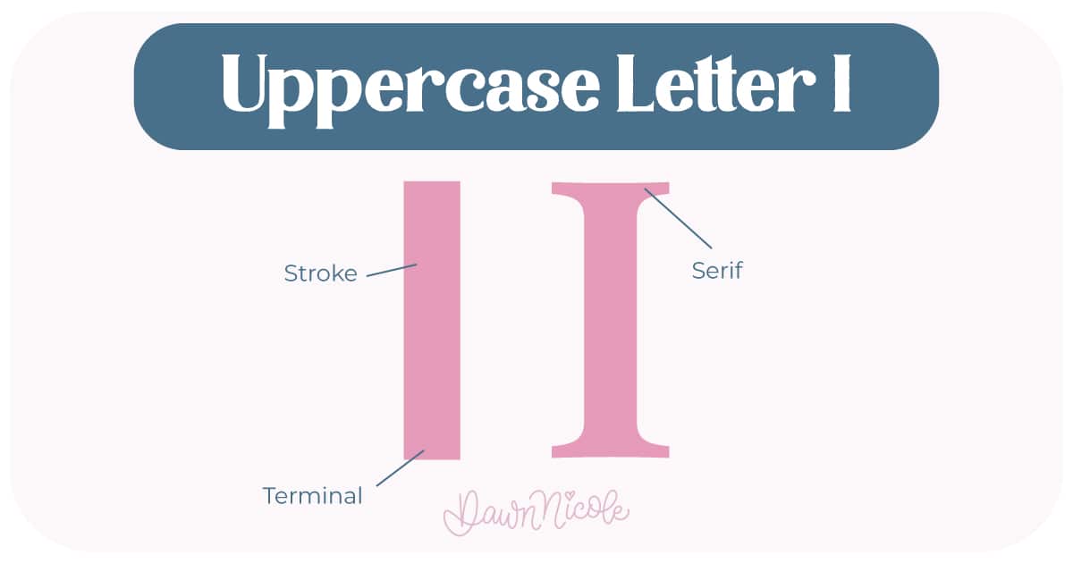
Uppercase LETTER I
- Stem (Stroke): The main vertical stroke that anchors the letter to the baseline
- Serifs (optional): Small finishing strokes at the top and bottom of the uppercase stem in serif styles
- Terminal: The end of the stroke in sans serif styles, which may be flat, rounded, or slightly angled
💡Pro Tip: Add slight width when it’s part of a word or phrase, as a mathematically thin I can look weak next to other caps.
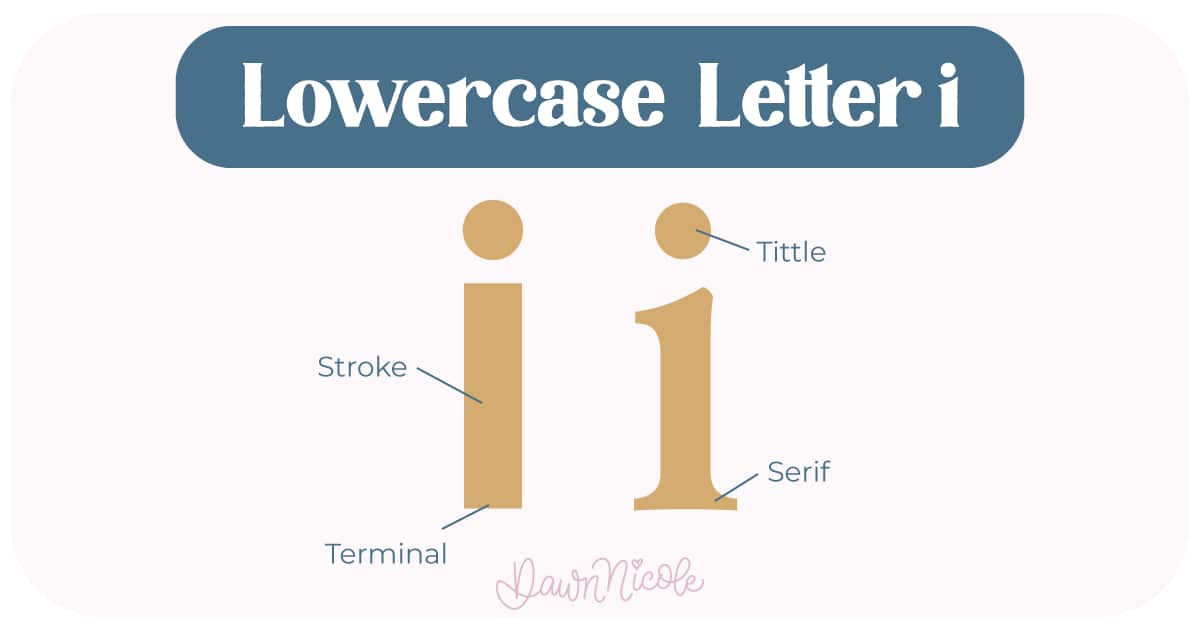
LOWERCASE LETTER I
- Stem (Stroke): The main vertical stroke that anchors the letter to the baseline
- Tittle: The small dot above the lowercase i (and j). Yes, it has an official name, and yes, lettering nerds love that.
- Serifs (optional): Small finishing strokes at the top and bottom of the uppercase stem in serif styles
- Terminal: The end of the stroke in sans serif styles, which may be flat, rounded, or slightly angled
💡Pro Tip: If the tittle looks “off”, try centering it optically, not mathematically.
Noteworthy
Because the letter i is so minimal, spacing and alignment matter a lot. The placement of the tittle, the height of the stem, and even the weight of the stroke can completely change how clean and polished your lettering feels.
 HELPFUL LINKS
 HELPFUL LINKS
Want to learn how to draw each letter in three foundational styles?
Ready to get more playful with your styles?
I’ve got you covered. Check out the links below!
- Hand Lettering the Alphabet: A-Z. A free video series covering how to draw every letter in three foundational styles.
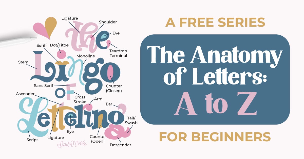
- The Anatomy of Letters: An A–Z Guide
- Ready to level up? Check out my 12 Playful Lettering Styles.


Happy drawing!


