Anatomy of the Letter K
The uppercase and lowercase letter Ks share the same basic blueprint: one strong vertical stem with two diagonal strokes branching off from it. But even though they’re built from the same parts, they feel very different in practice. The uppercase K is sharp and structured, while the lowercase k softens things up with a taller stem and a more compact, sometimes more curved lower leg.
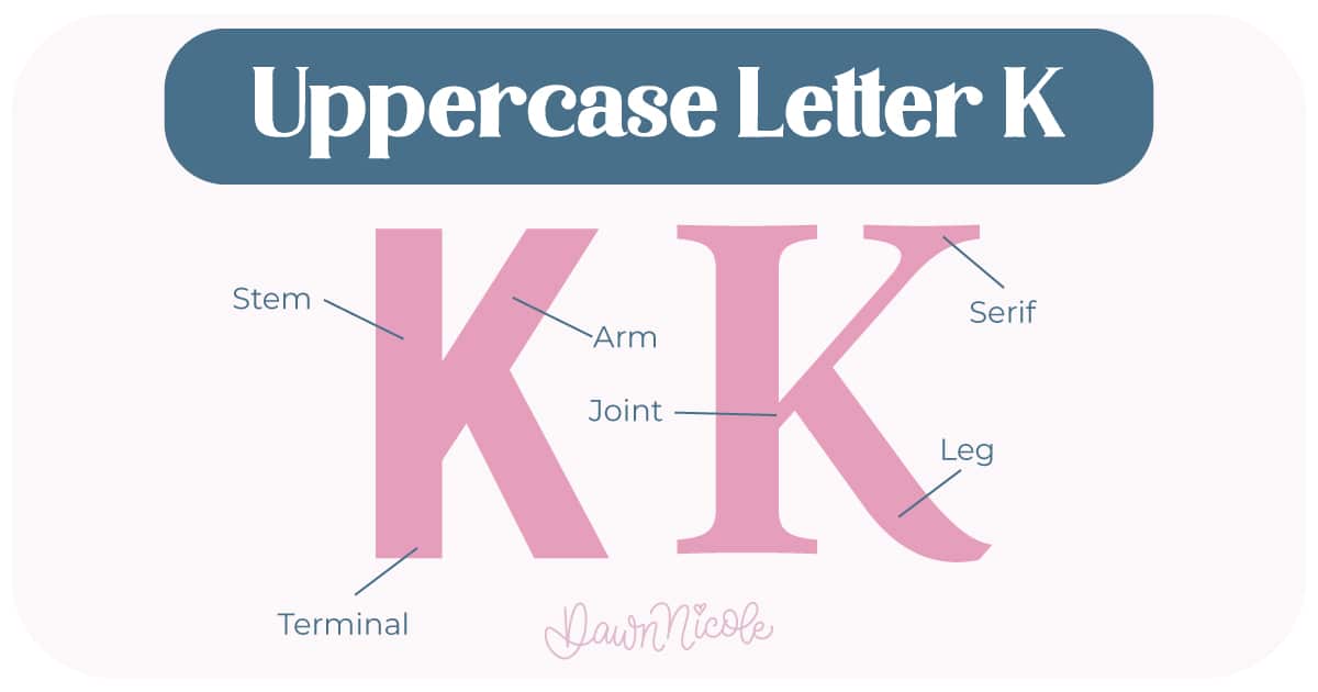
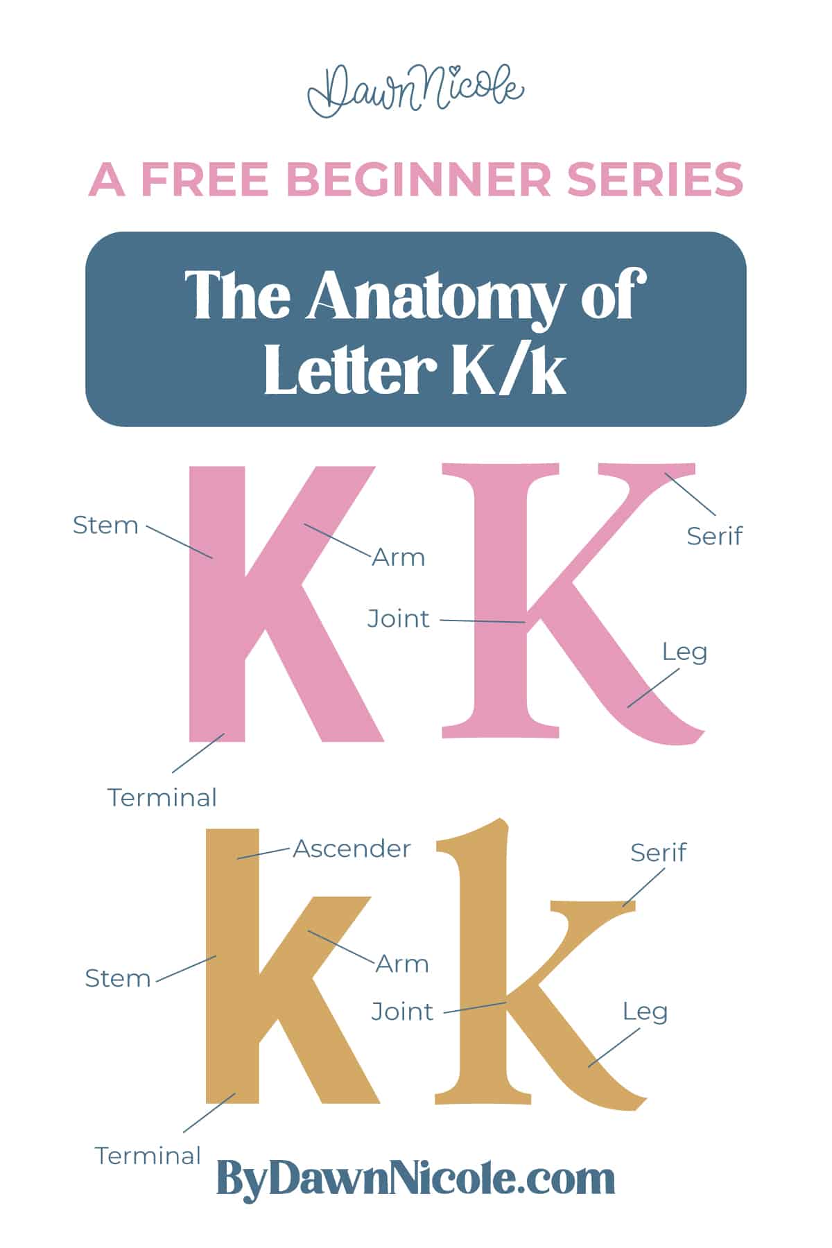
Uppercase LETTER K
The uppercase K is bold and angular. Everything hinges on where those diagonals connect to the stem.
- Stem: The main vertical stroke that forms the left side and anchors the letter
- Arm: The diagonal stroke that moves upward and to the right from the stem
- Leg: The diagonal stroke that moves downward and to the right
- Joint: The meeting point on the stem where the arm and leg connect
- Serifs (optional): Small finishing strokes at the top and bottom of the uppercase stem in serif styles
- Terminal: The end of the stroke in sans serif styles, which may be flat, rounded, or slightly angled
💡Pro Tip: The upper diagonal should be thinner or shorter than the lower. It prevents visual heaviness.
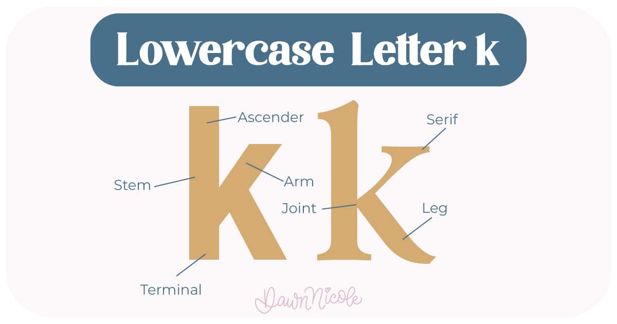
LOWERCASE LETTER K
The lowercase k keeps the same idea but changes the proportions.
- Ascender (stem): The tall vertical stroke that rises to cap height
- Arm: A shorter diagonal stroke that branches off the stem
- Leg: The lower diagonal stroke.
- Joint: The connection point, usually positioned a bit higher to keep the letter balanced
- Serifs (optional): Small finishing strokes at the top and bottom of the uppercase stem in serif styles
- Terminal: The end of the stroke in sans serif styles, which may be flat, rounded, or slightly angled
💡Pro Tip: Attach the arm and leg at slightly different heights to avoid same-point joins looking cramped.
Noteworthy
- Because the K is so angular, even a tiny shift in the joint placement can change the balance of the whole letter.
- Letter K relies on strong diagonals, so it’s a great letter for practicing angle consistency and clean intersections in your lettering work.
What Makes Them Different
- Size & Proportion: The uppercase K fills the full cap height. The lowercase k has an ascender that reaches that height, but the main body sits within the x-height.
- Joint Placement: In lowercase k, the arm and leg typically connect a little higher than you might expect, which keeps the letter from looking bottom-heavy.
 HELPFUL LINKS
 HELPFUL LINKS
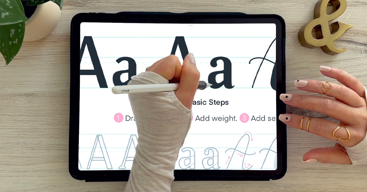
Want to learn how to draw each letter in three foundational styles?
Ready to get more playful with your styles?
I’ve got you covered. Check out the links below!
- Hand Lettering the Alphabet: A-Z. A free video series covering how to draw every letter in three foundational styles.
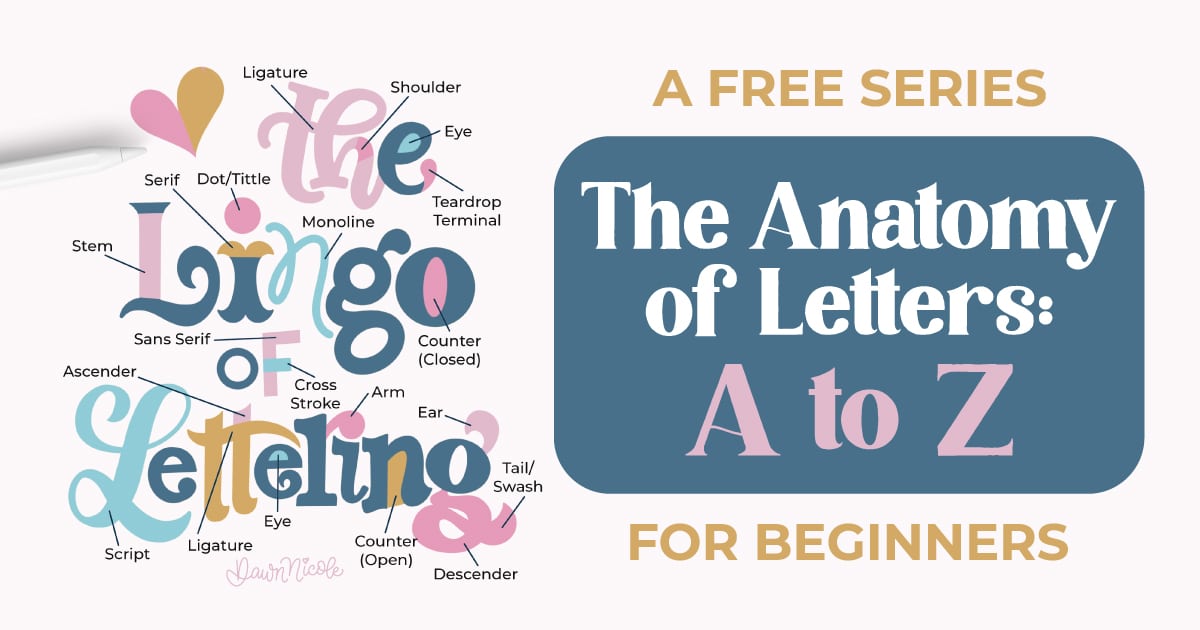
- The Anatomy of Letters: An A–Z Guide
- Ready to level up? Check out my 12 Playful Lettering Styles.


Happy drawing!


