Anatomy of the Letter L
The letter L keeps things simple, but don’t let that fool you. It’s built from one strong vertical stroke and a horizontal base, and small details make a big difference. The uppercase L feels grounded and architectural, while the lowercase l is tall, minimal, and sometimes surprisingly easy to confuse with other characters.
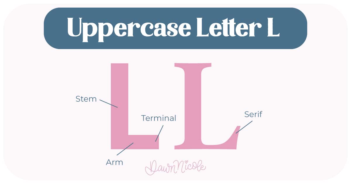
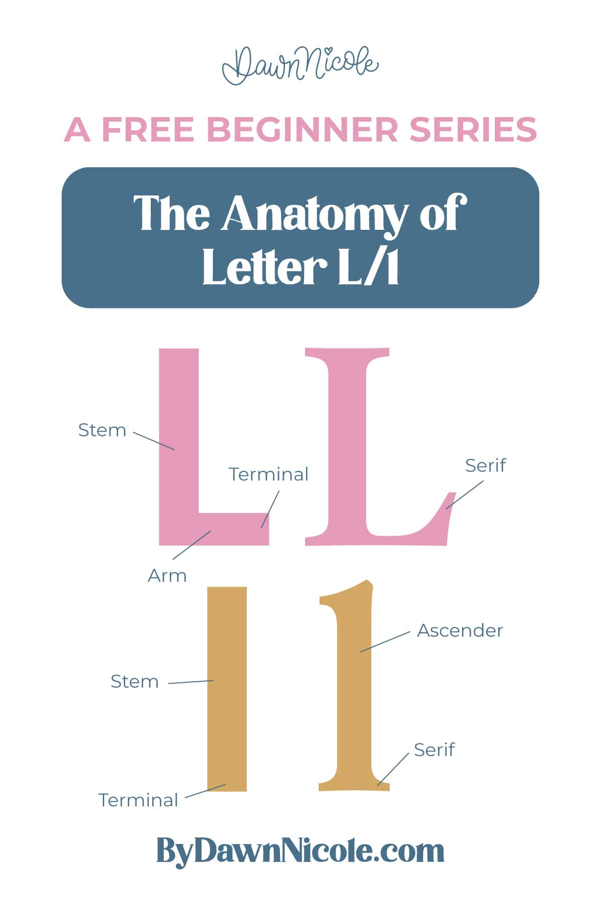
Uppercase LETTER L
The uppercase L is clean and structured. It runs from baseline to cap height and finishes with a strong horizontal base.
- Stem: The main vertical stroke extending from the baseline to the cap height
- Arm/Base: The horizontal stroke that moves to the right from the bottom of the stem
- Serifs (optional): Small finishing strokes at the top and bottom of the uppercase stem in serif styles
- Terminal: The end of the stroke in sans serif styles, which may be flat, rounded, or slightly angled
💡Pro Tip: Extend the foot slightly longer than you think. A short base/arm can make L look unfinished.
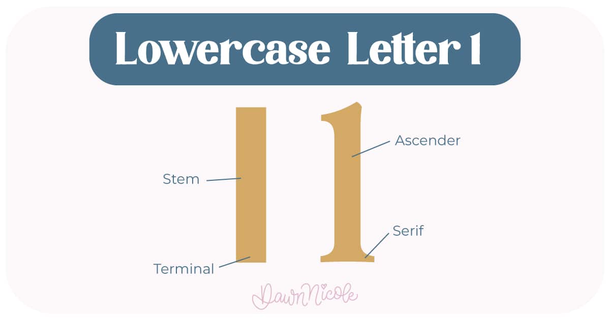
LOWERCASE LETTER L
The lowercase l is essentially one tall vertical stroke.
- Ascender (stem): The entire letter functions as an ascender, rising above the x-height. The primary vertical line
- Terminal/Serifs: Depending on the style, the top and bottom may end in small serifs or simple, clean terminals
💡Pro Tip: Try giving it a touch of curve or taper, as a perfectly straight lowercase L can look like a capital I.
Noteworthy
- Because the uppercase L is so open, spacing around it matters. That strong base can visually anchor a word, especially at the beginning.
- Even though L looks simple, it’s a great letter for practicing clean vertical strokes and paying attention to alignment and spacing in your lettering.
- Style Clarity: In many sans-serif fonts, the lowercase l is just a straight vertical line, which can make it easy to confuse with a capital I or the number 1. Serif styles usually solve that with distinct top and bottom serifs.
What Makes Them Different
Height: The uppercase L fills the full cap height. The lowercase l reaches ascender height, matching letters like h and k.
 HELPFUL LINKS
 HELPFUL LINKS
Want to learn how to draw each letter in three foundational styles?
Ready to get more playful with your styles?
I’ve got you covered. Check out the links below!
- Hand Lettering the Alphabet: A-Z. A free video series covering how to draw every letter in three foundational styles.
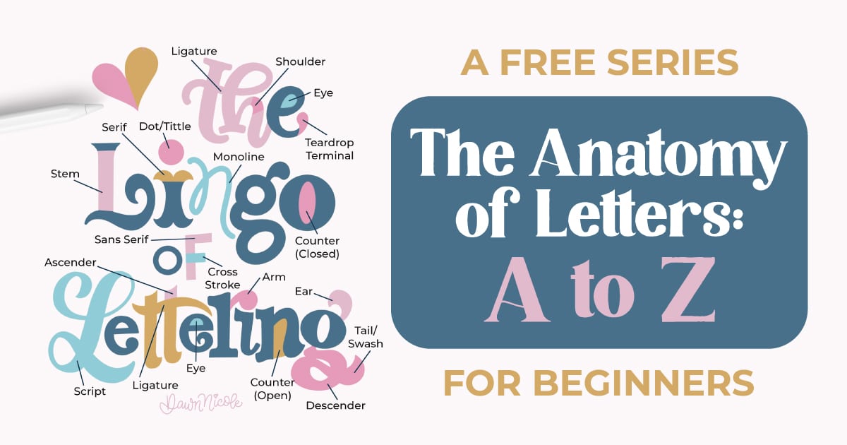
- The Anatomy of Letters: An A–Z Guide
- Ready to level up? Check out my 12 Playful Lettering Styles.


Happy drawing!


