Anatomy of the Letter M
The letter M is all about structure and rhythm. The uppercase version feels wide and grounded, built from strong verticals and sharp diagonals. The lowercase m softens that structure into repeating arches, creating movement and flow. Same letter family, very different energy.
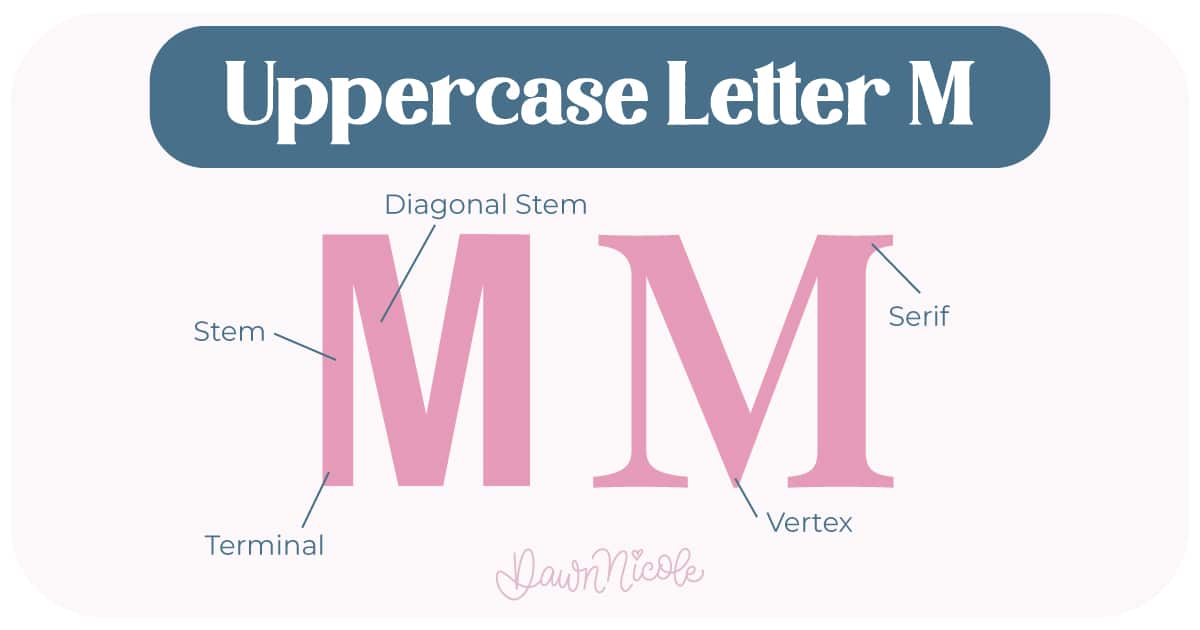
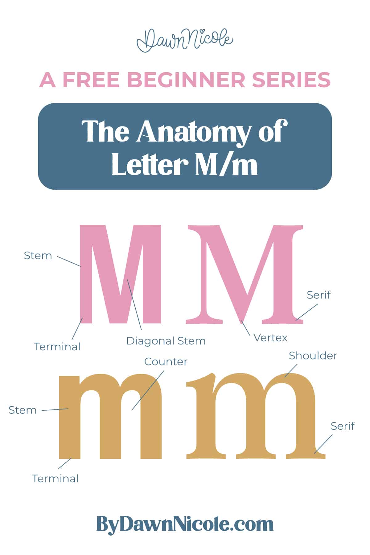
Uppercase LETTER M
The uppercase M stretches to cap height and usually takes up more horizontal space than most letters. It’s bold, balanced, and built from clear angles.
- Stems: The two outer vertical (or slightly slanted) strokes that anchor the letter.
- Diagonal Stems: The inner strokes that angle down and meet in the center, forming a V shape.
- Vertex: The bottom point where the diagonals meet.
- Terminal: The end of the stroke in sans serif styles, which may be flat, rounded, or slightly angled.
- Serifs (optional): Small finishing strokes at the tops and bottoms of the stems in serif styles
💡Pro Tip: Because the uppercase M is so wide and angular, spacing and symmetry matter. If one diagonal is even slightly off, the whole letter can feel crooked. The vertex can be moved up and down to change the style of the M.
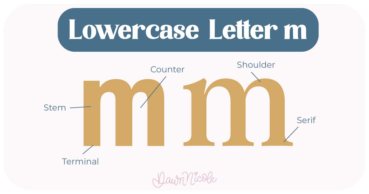
LOWERCASE LETTER M
The lowercase m trades sharp angles for rounded repetition. It lives within the x-height and creates rhythm through its arches.
- Stem: The first vertical stroke on the left.
- Shoulders: The two curved arches that rise and fall from the stems.
- Counters: The partially enclosed white spaces underneath each shoulder.
- Joints: The connection points where each shoulder meets a stem.
- Terminal: The end of the stroke in sans serif styles, which may be flat, rounded, or slightly angled.
- Serifs (optional): Small finishing strokes at the tops and bottoms of the stems in serif styles.
💡Pro Tip: Because the lowercase m repeats the same shape twice, consistency is everything. Matching shoulder height, curve tension, and spacing will make your lettering look polished instead of wobbly.
 HELPFUL LINKS
 HELPFUL LINKS
Want to learn how to draw each letter in three foundational styles?
Ready to get more playful with your styles?
I’ve got you covered. Check out the links below!
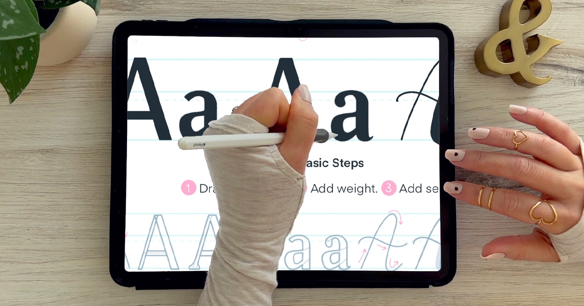
- Hand Lettering the Alphabet: A-Z. A free video series covering how to draw every letter in three foundational styles.
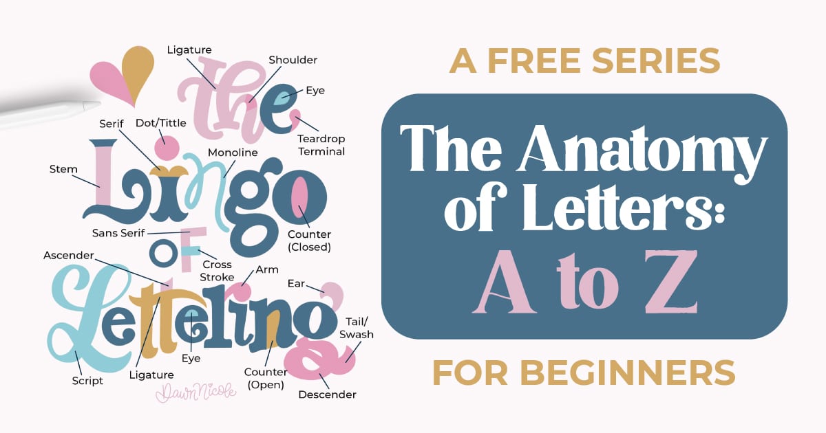
- The Anatomy of Letters: An A–Z Guide
- Ready to level up? Check out my 12 Playful Lettering Styles.


Happy drawing!


