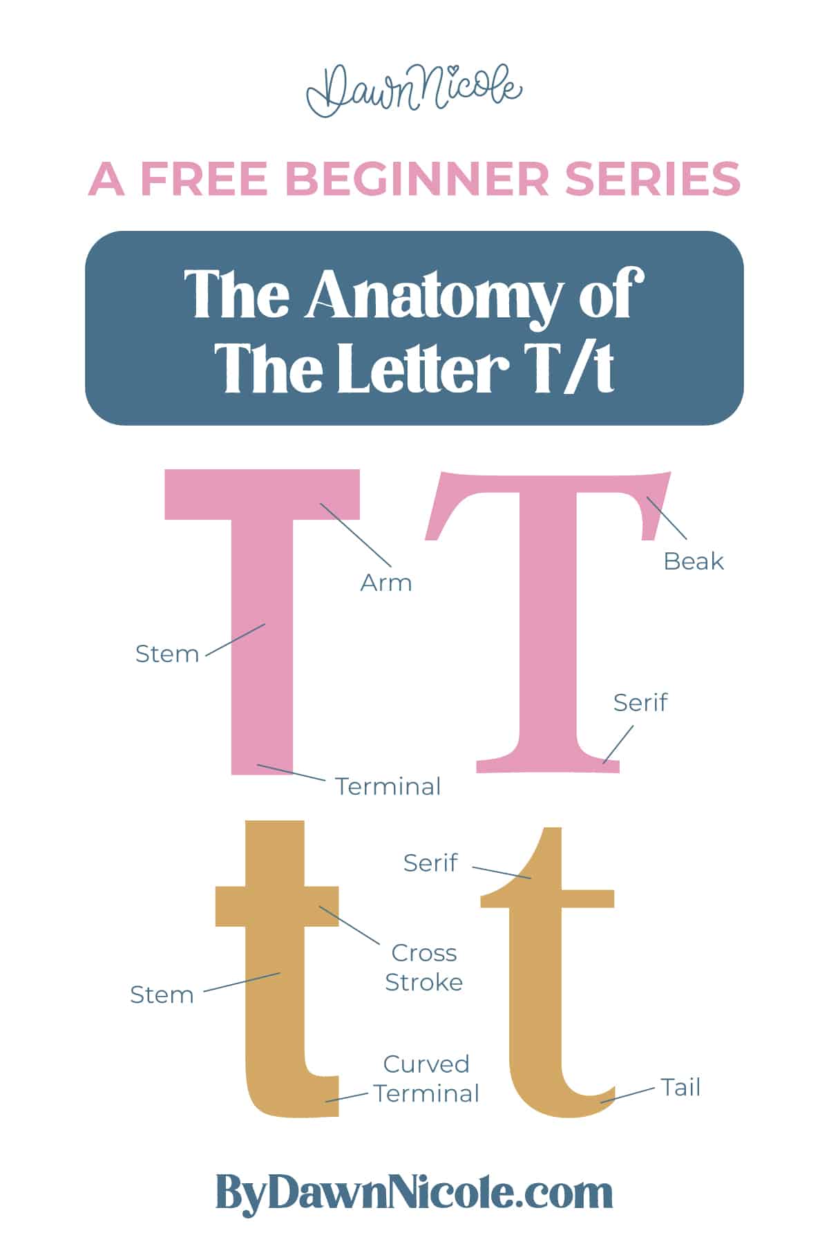
Anatomy of the Letter T
The letter T is all about the contrast between vertical and horizontal strokes. The uppercase version is clean and structured, built from a strong stem and a wide top arm. The lowercase t keeps that same idea but adds a cross stroke and a bit more personality with its proportions and finishing details.
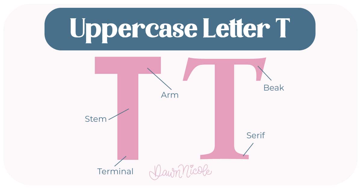
Uppercase LETTER T
The uppercase T is simple, bold, and easy to read. It’s made from one vertical stroke and one horizontal stroke.
- Stem: The main vertical line that runs from the cap height down to the baseline.
- Arm: The horizontal stroke at the top. Unlike letters like H or A, this stroke doesn’t connect to anything on the other side.
- Terminal: The simple endpoints of a stroke.
- Serifs (optional): Small finishing strokes on stems in serif styles.
- Beak: A beak is the pointed, triangular detail you’ll notice at the ends of horizontal strokes on uppercase letters like T, F, E, and Z in some serif typefaces. It’s a small but intentional flourish, almost like a sharpened serif, that extends outward, giving the letter a bit more presence. Beyond decoration, it guides the eye and helps define the overall feel of the type, whether it reads as strong and structured or soft and refined.
💡Pro Tip: Because the structure is so minimal, alignment matters. If the arm isn’t centered over the stem, the whole letter will feel off.
LowerCase LETTER T
The lowercase t takes that same structure and softens it with proportion and detail.
- Stem/Post: The main vertical stroke.
- Cross Stroke: The horizontal line that cuts across the stem. It’s called a cross stroke instead of a crossbar because it intersects the stem rather than connecting two sides.
- Ascender: The part of the stem that rises above the x-height, usually stopping below cap height.
- Terminal: The finishing ends of the stroke. Simple endings are called terminals, while the curved one is called a tail.
- Serifs (optional): Small finishing strokes on stems in serif styles.
💡Pro Tip: The lowercase t is a small letter, but it carries a lot of personality. The height of the cross stroke, the curve of the tail, and the spacing around it can all subtly change how it feels in your lettering.
 HELPFUL LINKS
 HELPFUL LINKS
Want to learn how to draw each letter in three foundational styles?
Ready to get more playful with your styles? Check out the links below!
- Hand Lettering the Alphabet: A-Z. A free video series covering how to draw every letter in three foundational styles.
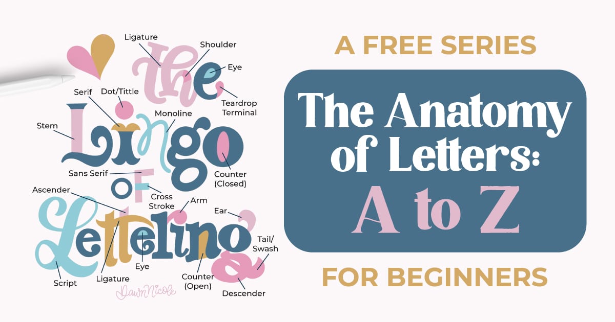
- The Anatomy of Letters: An A–Z Guide
- Ready to level up? Check out my 12 Playful Lettering Styles.


Happy drawing!


