Modern penmanship tips for calligraphy and lettering lovers. Learn how to build stroke control and create cleaner letterforms.
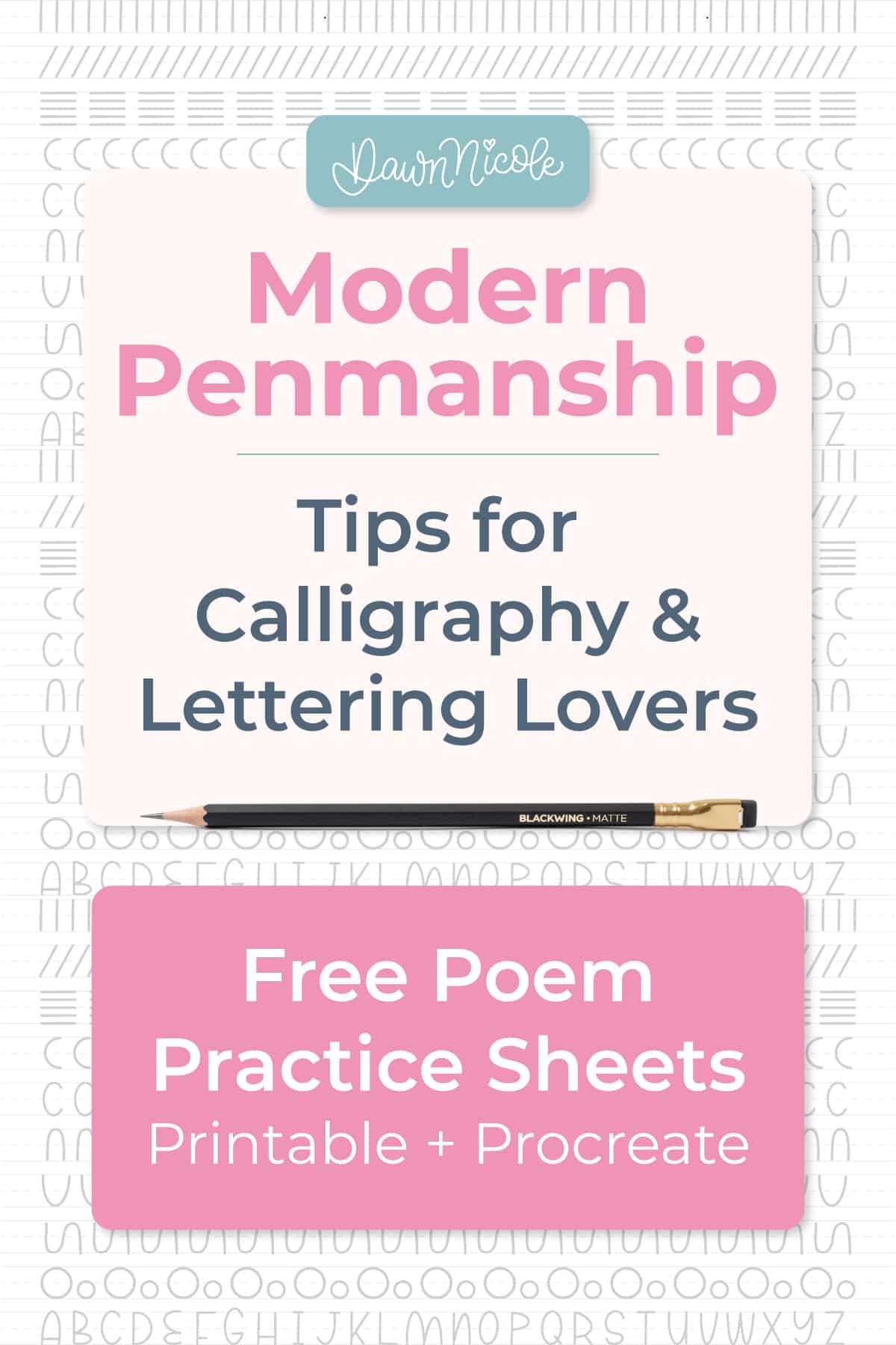
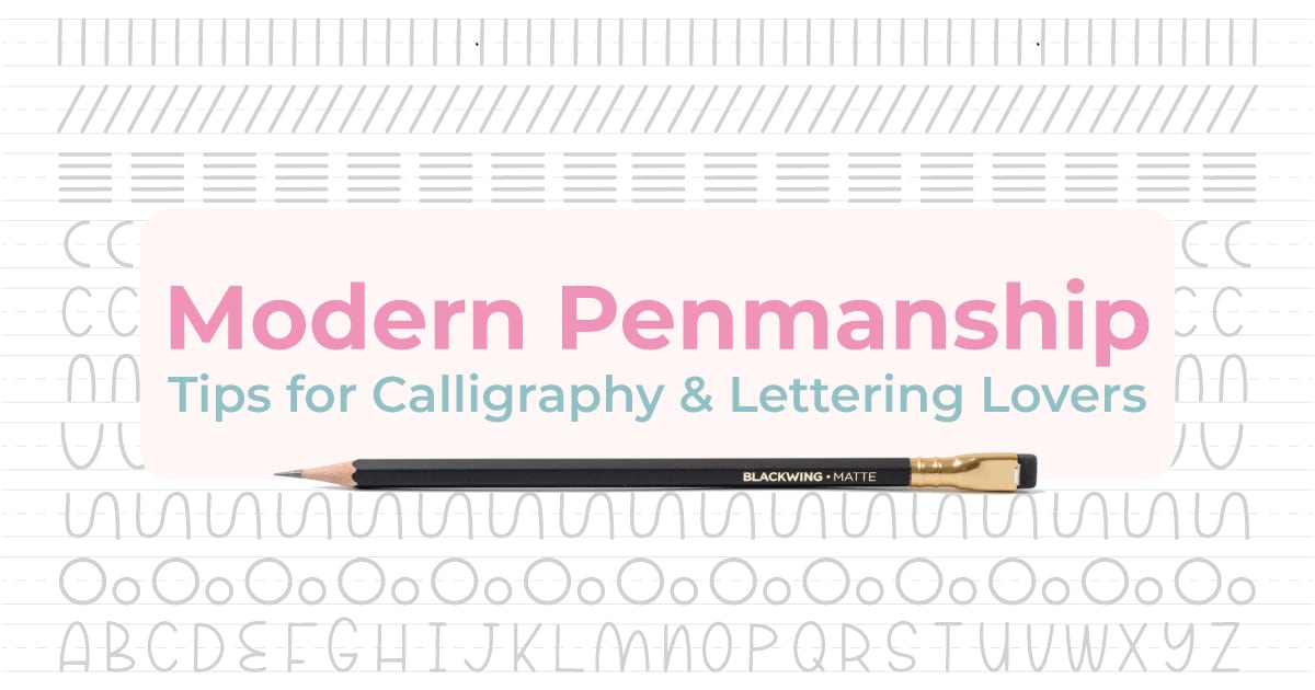
Modern Penmanship Tips for Calligraphy and Lettering Lovers
Penmanship is not old-fashioned; it’s foundational.
It might sound old-school, but it is one of the most powerful skill-building tools for modern calligraphy and lettering artists. Clean strokes, consistent spacing, and confident lines all start with strong penmanship habits. Whether you work with brush pens, dip pens, or Procreate, improving your penmanship will instantly level up your letterforms. In this guide, you’ll learn modern, practical penmanship tips and simple drills designed especially for calligraphy and lettering lovers.
Spoiler Alert: Don’t miss out on the free practice sheets toward the end of this blog post!
What Is Penmanship in a Modern Context?
- Simple definition: Penmanship is the skill of writing letters with clear, controlled, and consistent strokes. It focuses on how you form shapes on the page or screen, not just what style you use.
- Traditional penmanship vs modern lettering: Traditional penmanship emphasizes neat, legible handwriting built on repeatable stroke patterns. Modern lettering is more expressive and stylized, but it still relies on the same foundational stroke control taught in penmanship.
- How penmanship skills translate into better letterforms: Strong penmanship builds muscle memory, spacing awareness (also known as “kerning” in typography and lettering), and stroke consistency, which directly improve your letter shapes. When your basic strokes are steady and intentional, your lettering looks cleaner and more professional.
- Why control beats fancy tools: A high-end pen or brush cannot fix shaky strokes or uneven spacing. Solid control and technique will always make a bigger difference than any tool upgrade, whether you are working on paper or in Procreate.
The Core Skills Behind Great Penmanship
- Stroke Control
- Consistent Letter Height
- Spacing and rhythm
- Slant and alignment
- Pressure control
- Line confidence
Modern Penmanship Tips for Lettering Lovers
Slow Down Your Strokes
Writing more slowly gives your hand time to form each stroke with intention, resulting in cleaner lines and more consistent letter shapes.
- Speed vs control: Fast writing often sacrifices accuracy, while controlled pacing improves precision, spacing, and overall readability.
- Why slow practice builds better muscle memory: Slow, deliberate repetition trains your hand to follow the correct motion patterns, so smooth and confident strokes become automatic over time.
Practice Basic Strokes First
Starting with simple stroke drills builds control and coordination before you move on to full letters and words.
- Underturns, overturns, compound curves: These core stroke shapes appear in most lowercase letters, so mastering them makes the entire alphabet easier to write well.
- Same foundations as calligraphy drills: The basic strokes used in penmanship practice are the same building blocks used in calligraphy and brush lettering.
Use Guidelines Every Time
Guidelines help you maintain consistent letter size, alignment, and slant while you practice.
- Baselines, x-height, slant guides: Baselines anchor your letters, x-height keeps lowercase size uniform, and slant guides maintain a steady angle across your writing.
- Works for paper and Procreate: Guides are just as helpful on digital canvases as on printed worksheets, and they can be added as a background layer in Procreate.
Focus on Consistency Over Style
Consistent letter shapes create stronger results than flashy styles built on shaky foundations.
Clean shapes before decorative flair: Master clean, simple forms first, then add flourishes and personality once your structure is solid.
Train Your Spacing Eye
Learning to see and adjust spacing improves readability and gives your lettering a more polished look. You hear me talk about the art of “eyeballing it” a lot in my video tutorials!
- Letter-spacing drills: Repeating letters with equal spacing trains your eye and hand to maintain a consistent visual rhythm.
- Word spacing tricks: Using simple visual cues, such as an “invisible letter width” between words, helps keep spacing balanced and intentional.
 Penmanship Drills That Improve Lettering Fast
- Stroke repetition drills: Repeating basic strokes in rows builds muscle memory and quickly improves line control and smoothness.
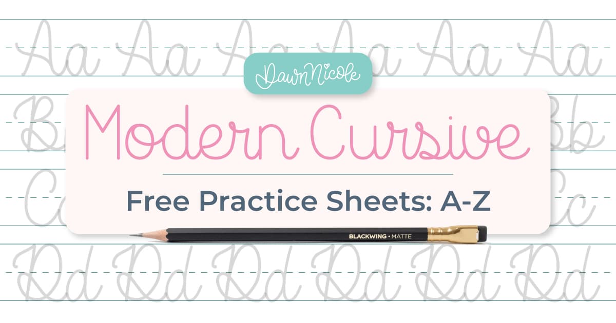
- Alphabet practice: Rewriting the alphabet slowly and intentionally helps correct letter shapes and reinforces consistent structure. Check out my Modern Cursive Alphabet free practice sheet series. Letters like C, O, and U are great for beginner practice.
- Word rewriting exercises: Practicing the same word multiple times trains spacing, rhythm, and letter connections.
- Quote copying practice: Copying short quotes develops endurance and consistency while applying good penmanship across full phrases.
- Trace → rewrite → freehand method: Tracing first, then copying, and finally writing freehand creates a step-by-step path from guided control to independent skill. I also discuss this a lot in my video lessons.
Monoline Magic: pENMANSHIP Practice Workbook
My Monoline Magic: A Playful Penmanship Workbook has all of these things in one printable workbook!
In this 40-page instant download PDF workbook, you’ll improve your muscle memory and smooth out those shaky lines, all while having fun with monoline styles!
Inside you’ll find:
- 40-page monoline penmanship workbook
- Printable PDF format
- JPG files for digital practice
- Stroke drills and muscle memory exercises
- Lettering and flourishing practice pages
- Four alphabet styles: Playful Sans Serif, Typewriter style, Doodle-y Sans Serif, and a Funky Serif. Plus, some Mixed Style Practice Pages.
- Public domain poems and quotes you can use in your own artwork
- Beginner-friendly and low-stress practice structure
- Flip through every page of the workbook below so you can see exactly what you’re getting!
Get this workbook and start practicing today!
Digital Penmanship Practice in Procreate
Penmanship drills build the same stroke control and muscle memory on an iPad as they do on paper, making them just as effective for digital lettering.
- Why penmanship drills work digitally: Penmanship drills build the same stroke control and muscle memory on an iPad as they do on paper, making them just as effective for digital lettering.
- Brush settings that help control: Using brushes with lower streamline and moderate pressure sensitivity helps you see your true stroke habits and develop better control.
- Using guide layers: Guide layers with baselines, x-height, and slant lines keep your digital practice consistent and easy to correct.
- Recommended brush types: Simple monoline or pencil-style brushes are best for penmanship practice because they reveal inconsistencies instead of hiding them with texture or effects.
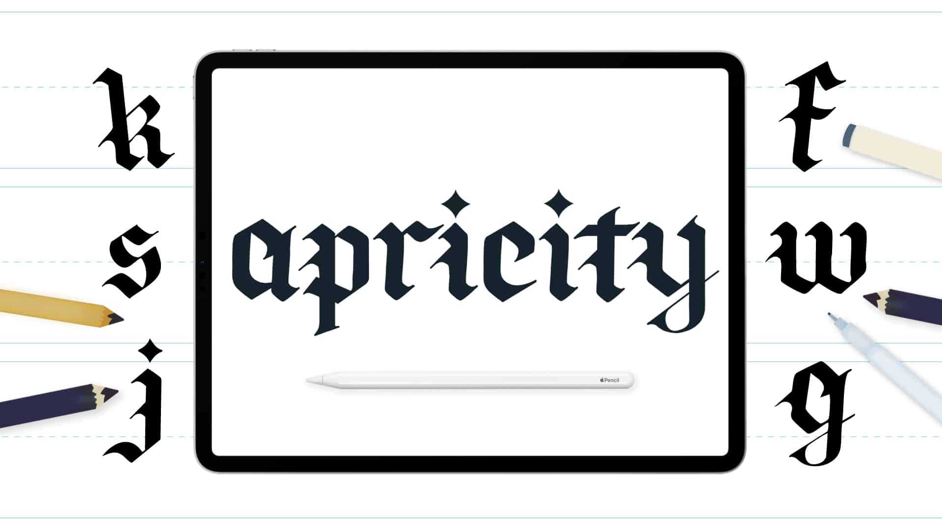
Apricity Gothic Blackletter Style Workbook
Common Penmanship Mistakes Lettering Artists Make
Jumping into ornate or advanced lettering styles before mastering basic strokes often leads to messy, inconsistent letterforms or just flat-out frustration that things aren’t coming out as you envisioned.
- Practicing too complex styles too soon: Skipping foundational stroke practice slows progress because letters are built from those same repeated movements.
- Skipping stroke drills: Skipping foundational stroke practice slows progress because letters are built from those same repeated movements.
- Inconsistent sizing: Randomly varying letter height and width makes text look uneven and harder to read. (I often break this rule for playful lettering, but penmanship has different “rules”.)
- Over-flourishing before mastering the basics: Adding too many flourishes too early can mask structural problems rather than fix them.
- Practicing without guides: Practicing without baselines and height guides makes it easy for spacing and alignment errors to become habits. It’s not cheating to use them. It’s planning and practicing consistency.
A Simple 5-Minute Daily Penmanship Routine
- 1-minute strokes: Warm up with basic stroke drills like straight lines, underturns, and curves to build control and loosen your hand.
- 2-minute alphabet rows: Write slow, deliberate rows of letters to reinforce consistent letter shapes and height.
- 1-minute spacing drill: Practice evenly spaced letters or short letter groups to train your eye for balanced gaps.
- 1-minute word practice: Rewrite one or two simple words repeatedly, focusing on clean strokes and consistent spacing.
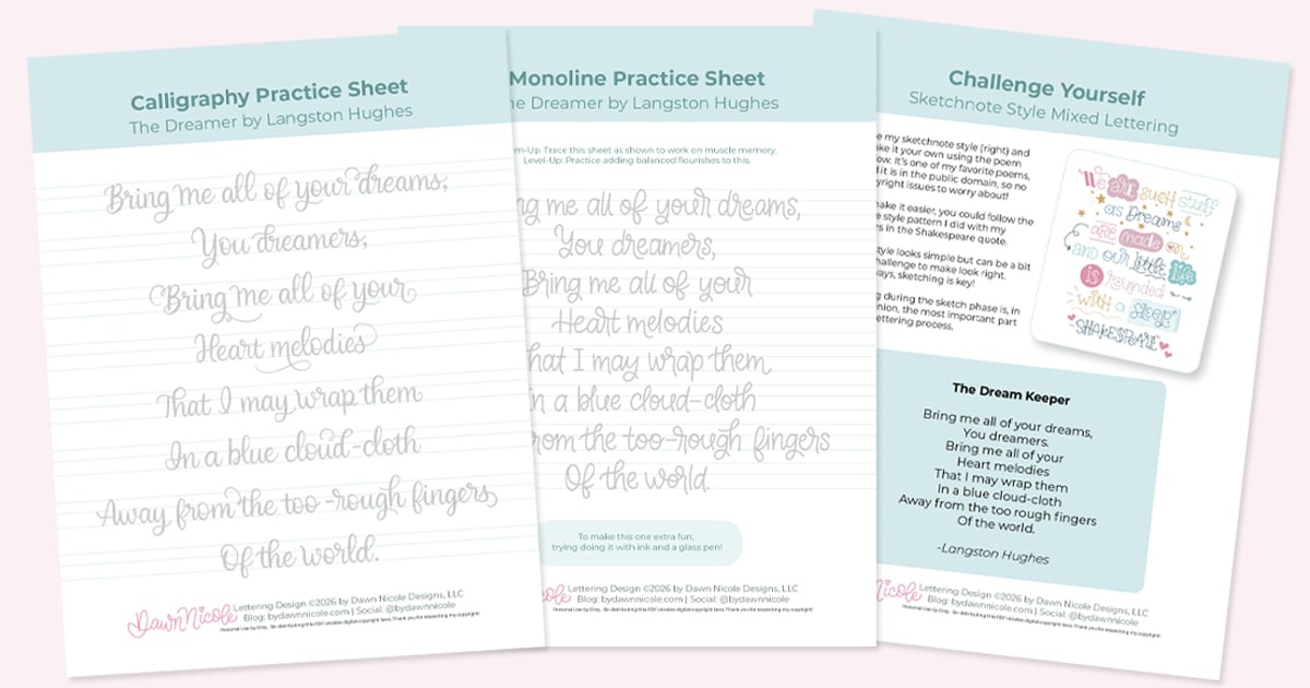
FREE PRACTICE SHEETS!
I shared these freebies with my newsletter friends, and now I’m sharing them with you.
One is for brush calligraphy practice, and the other is in monoline style.
Sign up for my newsletter to get exclusive freebies like this each month.
The download includes a Printable PDF + Procreate practice sheet.
P.S. New to brush calligraphy or want to learn?
Check out my free calligraphy drills video lesson and practice sheets.
Then, moved on to my Calligraphy Alphabet Guide and practice sheets.
How to Download & OPEN Files
If you’re using a computer:
- Download the ZIP file.
- Double-click the ZIP file to unzip it. This creates a standard folder containing the files.
- Open the folder, then locate the .procreate file and/or the PDF.
- Send to your iPad using AirDrop, iCloud Drive, Dropbox, or email.
- On your iPad, tap the file and select “Open in Procreate” to open the Procreate file, or open the PDF in your preferred app.
If you’re doing it directly on your iPad:
- Download the ZIP file and open the Files app.
- Go to your Downloads folder or the location you saved it.
- Tap the ZIP file once. The iPad will automatically unzip it into a new folder.
- Open the new folder and tap the .procreate file.
- Tap Share → Open in Procreate (or it may open automatically).
FAQ Section
What is penmanship?
Penmanship is the skill and technique of writing letters by hand in a clear, controlled, and consistent way. It focuses on stroke quality, spacing, slant, and overall readability rather than decoration or style.
Is penmanship the same as calligraphy?
No. Penmanship focuses on clean, legible handwriting, while calligraphy is more decorative and style-driven. Strong penmanship skills make learning calligraphy much easier because the foundational strokes are similar.
Can adults improve penmanship?
Yes, absolutely. Penmanship is a motor skill, and motor skills improve with targeted practice. Even a few minutes of daily stroke and letter drills can produce noticeable improvement within weeks.
Does penmanship help with brush lettering?
Yes. Penmanship training improves stroke control, spacing awareness, and shape consistency, all of which directly enhance brush lettering, calligraphy, and digital lettering.
Can you practice penmanship in Procreate?
Yes. Penmanship drills work digitally just like they do on paper. Using Procreate’s guidelines, controlled brushes, and stroke practice sheets can build the same level of control and consistency as traditional pen practice.
Happy Practicing!


