Anatomy of the Letter G
The letter G builds on the same curved foundation as the letter C, then adds extra structure, giving it a more distinctive personality. In uppercase, you start with a rounded bowl, add a horizontal bar, and often a small spur. In lowercase, you’ll see two common versions: the double-storey form used in many print fonts, and the single-storey form common in handwriting and modern sans serif styles.
Understanding which version you’re drawing and how the parts connect will help you keep your G readable, balanced, and stylistically consistent.
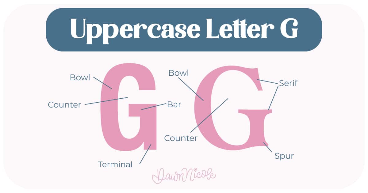
Uppercase LETTER G
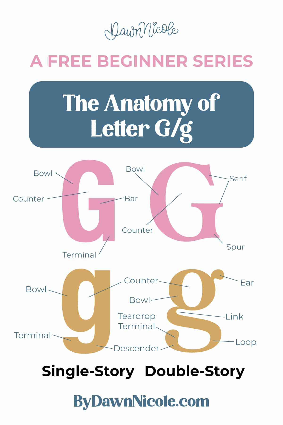
The uppercase G begins with a curved bowl and adds interior detail on the right side.
- Bowl: The main curved stroke that forms the outer shape, similar to a C
- Bar (or crosdbar): The horizontal stroke that extends inward from the right side
- Spur: A small projecting hook or notch where the bar meets the curve in many styles
- Counter (open): The interior white space inside the bowl
- Serifs (optional): Small finishing strokes on the ends of the arms and stem in serif typefaces
- Terminals: Clean stroke endings where no serif is present
💡Pro Tip: G is a curved letter, so don’t forget the overshoot we talked about in the lesson for letter C.
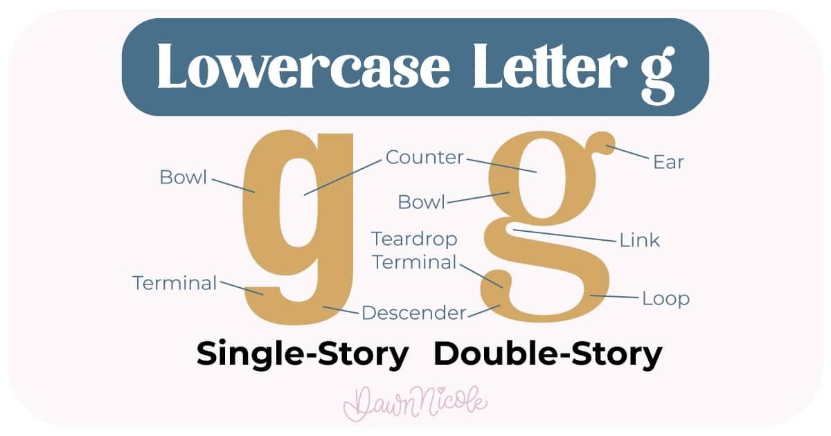
LOWERCASE LETTER G
Lowercase g appears in two widely used forms. Both include a bowl and a descending portion, but the construction is very different.
Single-story g
Common in handwriting, scripts, and many sans serif fonts.
- Bowl: A single enclosed oval or circle
- Tail (or hook): The descending curved stroke
- Descender: The portion that drops below the baseline
- Counter: The enclosed white space inside the bowl
Double-story g
Common in serif and traditional book fonts.
- Bowl: The upper enclosed circular or oval shape
- Ear: A small decorative hook or flick on the upper right
- Link (or neck): The thin connector between the top bowl and lower loop
- Loop: The lower enclosed shape that sits below the baseline. It can be open or closed, depending on how you draw it.
- Counters: Enclosed white spaces inside the bowl and the loop
Noteworthy
- The baseline marks where most letters sit, and the lowercase g descender drops below it
- The shapes of the counters play a big role in readability, especially in the double-story form.
- The bottom of the top circle of the double-story g sits slightly above the baseline rather than directly on it.
- Because the letter G mixes curves, interior space, and added strokes, it’s excellent practice for controlling bowls, connections, and descenders in your lettering work.
 HELPFUL LINKS
 HELPFUL LINKS
Want to learn how to draw each letter in three foundational styles?
Ready to get more playful with your styles?
I’ve got you covered. Check out the links below!
- Hand Lettering the Alphabet: A-Z. A free video series covering how to draw every letter in three foundational styles.
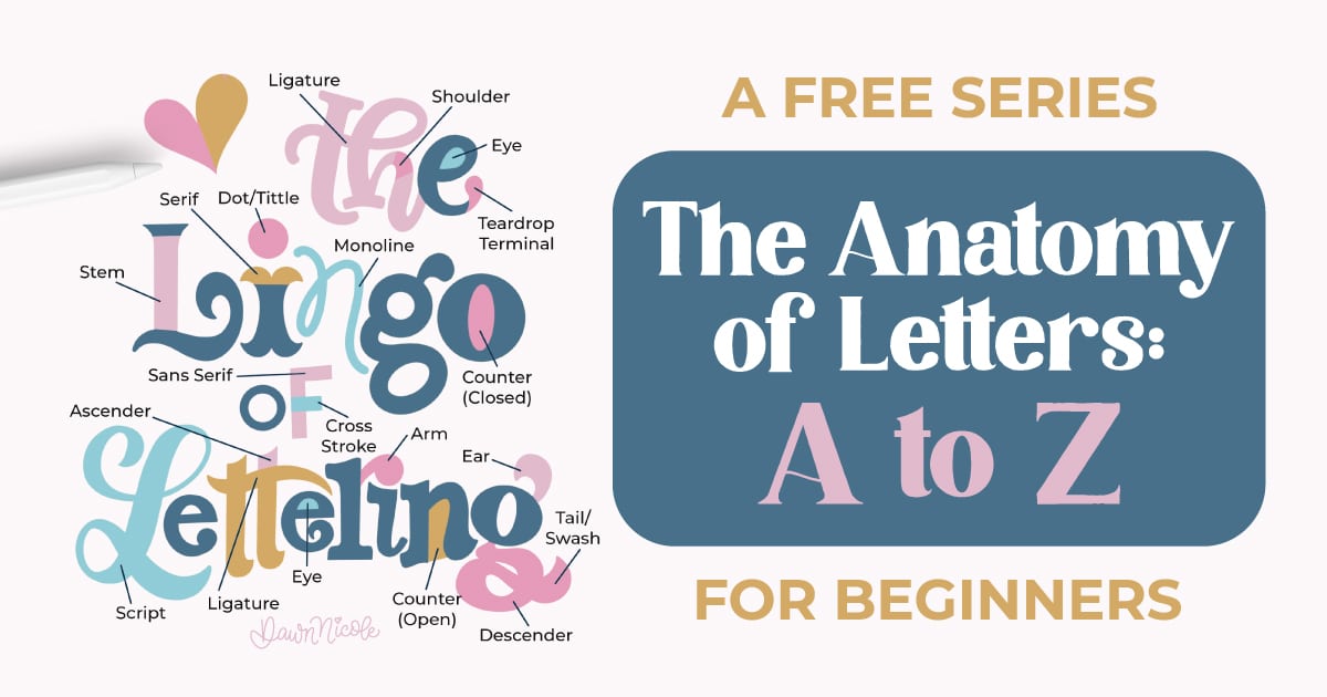
- The Anatomy of Letters: An A–Z Guide
- Ready to level up? Check out my 12 Playful Lettering Styles.


Happy drawing!


