Anatomy of the Letter N
The letter N gives you two completely different construction styles depending on the case. The uppercase N leans into sharp angles and strong diagonals. The lowercase n softens everything into a stem and a smooth arch. Same letter, totally different build.
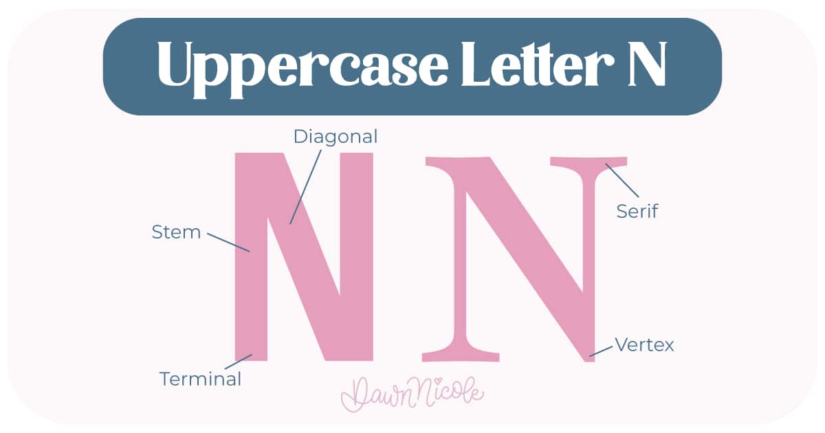
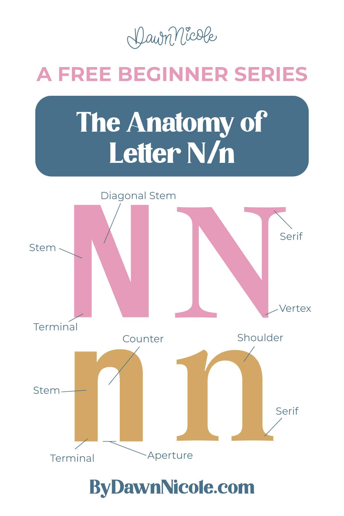
Uppercase LETTER N
The uppercase N follows a clean, zig-zag structure made from three strokes. It’s bold, directional, and all about strong lines.
- Stems: The two vertical strokes on the left and right that anchor the letter
- Diagonal: The slanted stroke that connects the top of the left stem to the bottom of the right stem
- Vertex: The bottom connection point where the diagonal meets the right stem
- Terminal: The end of the stroke in sans serif styles, which may be flat, rounded, or slightly angled.
- Serifs (optional): Small finishing strokes at the tops and bottoms of the stems in serif styles
💡Pro Tip: Because the uppercase N relies on a diagonal, angle consistency is everything. If that slant shifts even slightly, the whole letter can feel off-balance.
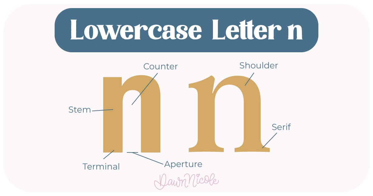
LOWERCASE LETTER N
The lowercase n trades sharp angles for curve and rhythm. It’s built from one vertical stroke and one arch.
- Stem: The main vertical stroke on the left
- Shoulder: The curved arch that rises from the stem and comes back down into the second vertical stroke.
- Counter: The white space tucked underneath the shoulder
- Aperture: The small opening at the bottom between the two strokes
- Joints: The connection points where each shoulder meets a stem.
- Terminal: The end of the stroke in sans serif styles, which may be flat, rounded, or slightly angled.
- Serifs (optional): Small finishing strokes at the tops and bottoms of the stems in serif styles.
💡Pro Tip: Lowercase n is one of the most foundational shapes in lettering. Master this shoulder, and you’ll improve m, h, and u at the same time.
 HELPFUL LINKS
 HELPFUL LINKS
Want to learn how to draw each letter in three foundational styles?
Ready to get more playful with your styles?
I’ve got you covered. Check out the links below!
- Hand Lettering the Alphabet: A-Z. A free video series covering how to draw every letter in three foundational styles.
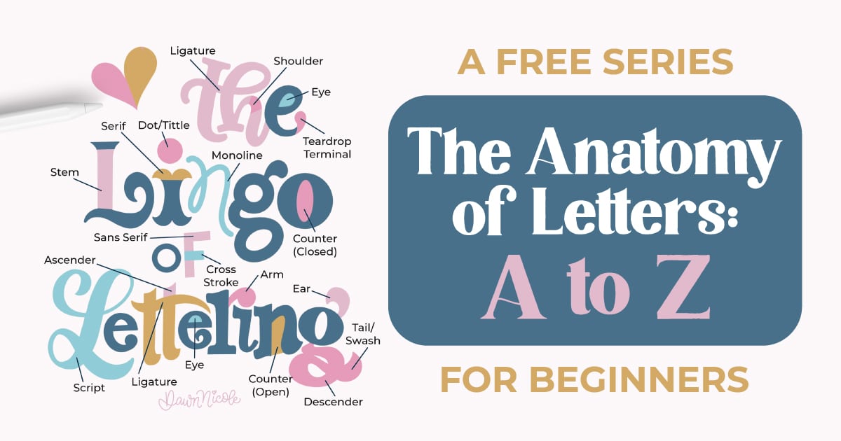
- The Anatomy of Letters: An A–Z Guide
- Ready to level up? Check out my 12 Playful Lettering Styles.


Happy drawing!


