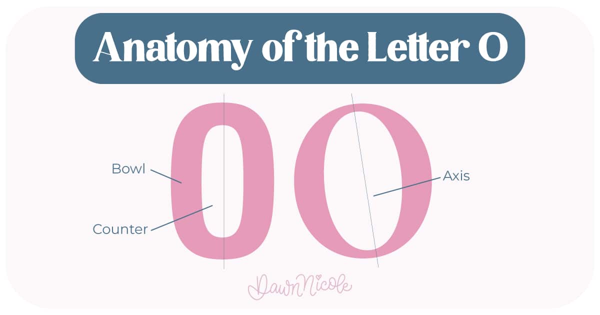
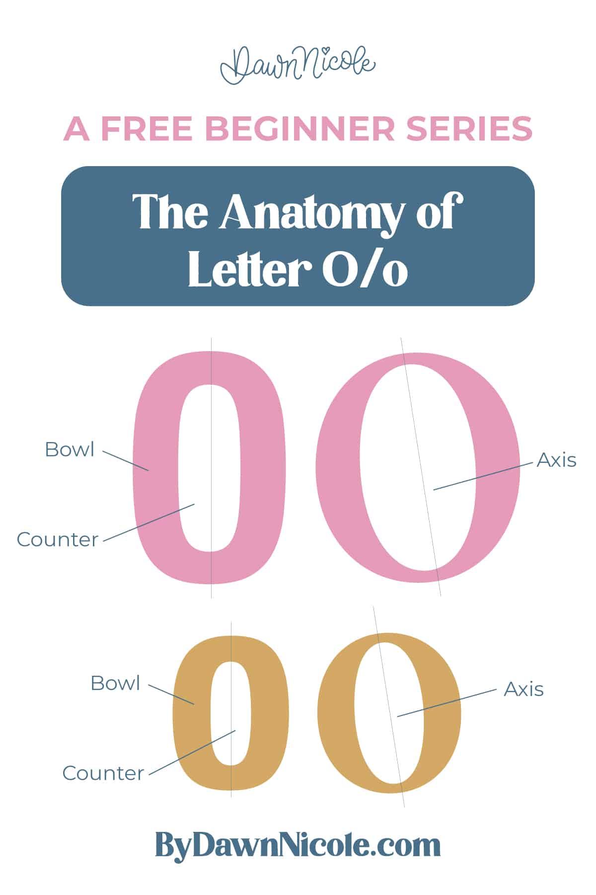
Anatomy of the Letter O
The letter O is one of the most important shapes in the entire alphabet. If you can draw a good O, you can build half the alphabet from it. Unlike letters with stems or crossbars, O is all curve. Its structure comes from how that curve moves and the space it surrounds.
This post is a bit different than the rest of the series, as the uppercase and lowercase letter Os are the same, just different sizes.
Uppercase + LOWERCASE LETTER O
Even though it looks simple, the O has a few key parts working together.
- Bowl: The continuous curved stroke that forms the outer shape
- Counter (closed): The fully enclosed white space inside the bowl
- Axis (or stress): An imaginary line that shows where the stroke is thickest and thinnest. In many typefaces, the sides are thicker, and the top and bottom are thinner, creating a vertical or slightly angled stress.
💡Pro Tip: Because O is pure curve, stroke contrast and smoothness matter a lot. Any flat spot or wobble shows immediately.
POSITIONING AND OPTICAL ALIGNMENT
Round letters like O need a little visual adjustment to look balanced next to flat letters.
- Baseline: The line the letter sits on. Most O shapes dip slightly below it. This is called overshoot, and it keeps the letter from looking too short.
- x-height: In a lowercase o, the top of the bowl reaches the x-height, often with a slight overshoot.
- Cap height: In an uppercase O, the top curve reaches the cap line, again usually with a subtle overshoot.
💡Pro Tip: That tiny extension above and below the lines makes a big difference in how polished your lettering feels.
A Little Context (Because It’s Fun)
- The letter O traces back to the Phoenician letter ayin, which meant “eye” and was shaped like one. That circular form stuck around for thousands of years.
- Because it’s a circle, O often symbolizes unity, wholeness, and infinity.
- And yes, people mix it up with the number 0 all the time. Typically, the letter O is more evenly circular, while the zero is slightly taller and more oval-shaped to help distinguish it.
💡Pro Tip: If you want to level up your lettering, start with O. Master the curve, control the counter, and everything built from that shape will get stronger.
 HELPFUL LINKS
 HELPFUL LINKS
Want to learn how to draw each letter in three foundational styles?
Ready to get more playful with your styles?
I’ve got you covered. Check out the links below!
- Hand Lettering the Alphabet: A-Z. A free video series covering how to draw every letter in three foundational styles.
- The Anatomy of Letters: An A–Z Guide
- Ready to level up? Check out my 12 Playful Lettering Styles.


Happy drawing!


