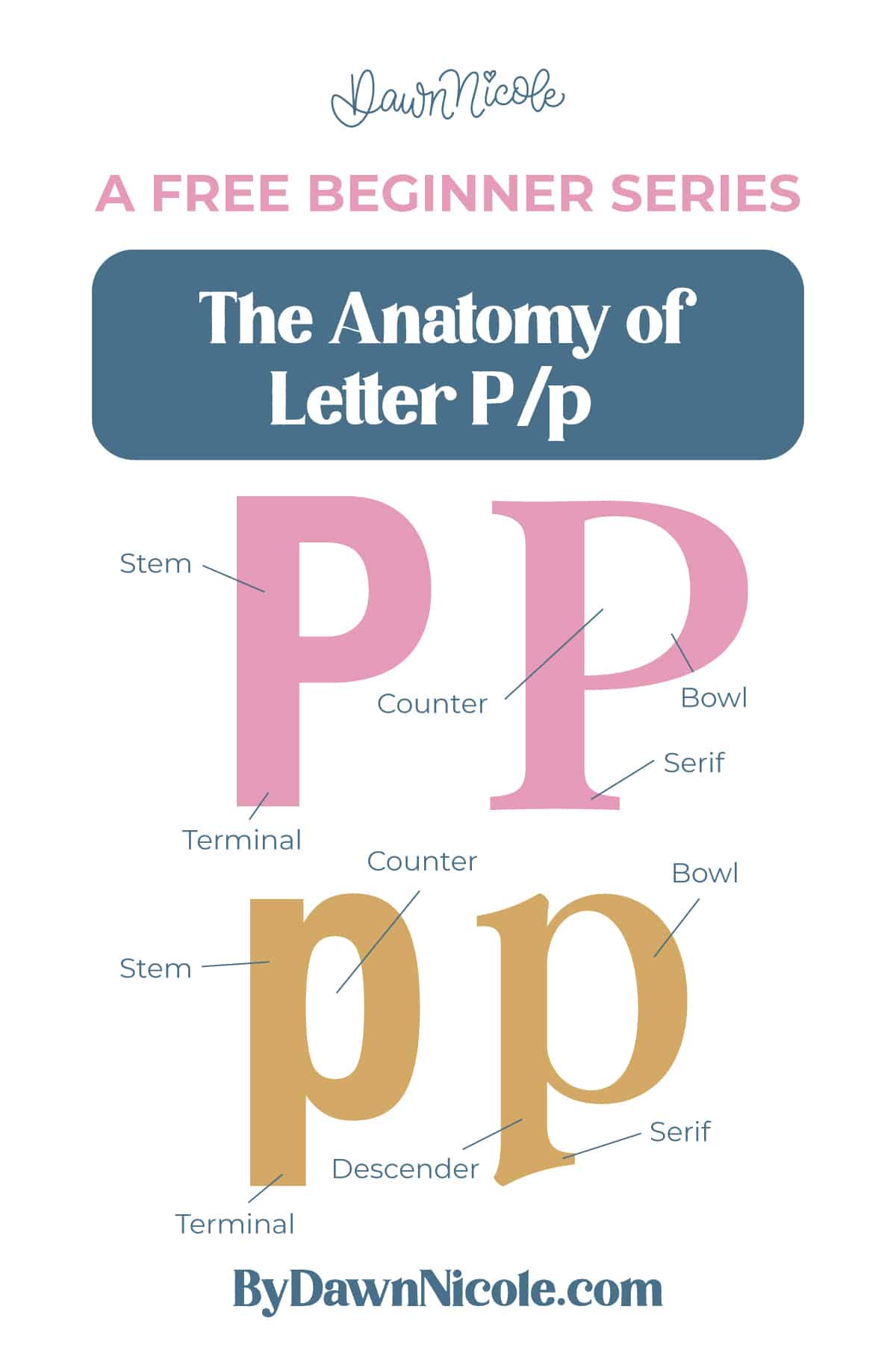
Anatomy of the Letter P
The letters P and p share the same basic idea: a strong vertical stem paired with a rounded bowl on the right. But their proportions and positioning make them behave very differently. The uppercase P sits neatly on the baseline, while the lowercase p dips below it with a long descender.
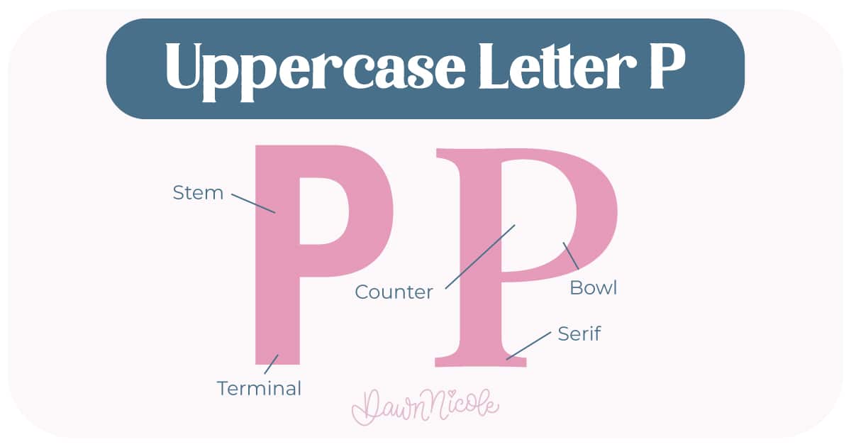
Uppercase LETTER P
The uppercase P is built from a tall vertical stroke and a single upper bowl.
- Stem: The main vertical stroke running from the cap height down to the baseline.
- Bowl: The rounded stroke on the upper right that connects to the stem at the top and again around the midpoint.
- Counter (closed): The fully enclosed white space inside the bowl.
- Terminal: The end of the stroke in sans serif styles, which may be flat, rounded, or slightly angled.
- Serifs (optional): Small finishing strokes at the tops and bottoms of the stems in serif styles.
💡Pro Tip: Structurally, you can think of the uppercase P as a vertical line paired with a half-circle shape. The bowl usually stops around the middle of the letter (or slightly below), so it doesn’t feel too heavy.
LowerCase LETTER P
The lowercase p keeps the same bowl shape but shifts everything downward.
- Stem (descender): The line the letter sits on. Most O shapes dip slightly below it. This is called overshoot, and it keeps the letter from looking too short.
- Bowl: The rounded stroke on the upper right that connects to the stem at the top and again around the midpoint.
- Counter (closed): The fully enclosed white space inside the bowl.
- Terminal: The end of the stroke in sans serif styles, which may be flat, rounded, or slightly angled.
- Serifs (optional): Small finishing strokes at the tops and bottoms of the stems in serif styles.
💡Pro Tip: Because the lowercase p includes a descender, spacing becomes more important when it appears in words. That extra length below the baseline adds rhythm and movement to your lettering.
 HELPFUL LINKS
 HELPFUL LINKS
Want to learn how to draw each letter in three foundational styles?
Ready to get more playful with your styles?
I’ve got you covered. Check out the links below!
- Hand Lettering the Alphabet: A-Z. A free video series covering how to draw every letter in three foundational styles.
- The Anatomy of Letters: An A–Z Guide
- Ready to level up? Check out my 12 Playful Lettering Styles.


Happy drawing!


