Anatomy of the Letter V
The letter V is all about sharp angles and clean diagonals. Instead of vertical stems, it’s built from two strokes that meet at a point, creating a strong, structured V-shape. Both uppercase and lowercase follow the same basic idea, but the proportions shift depending on the case.
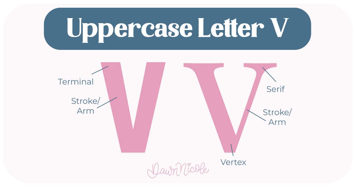
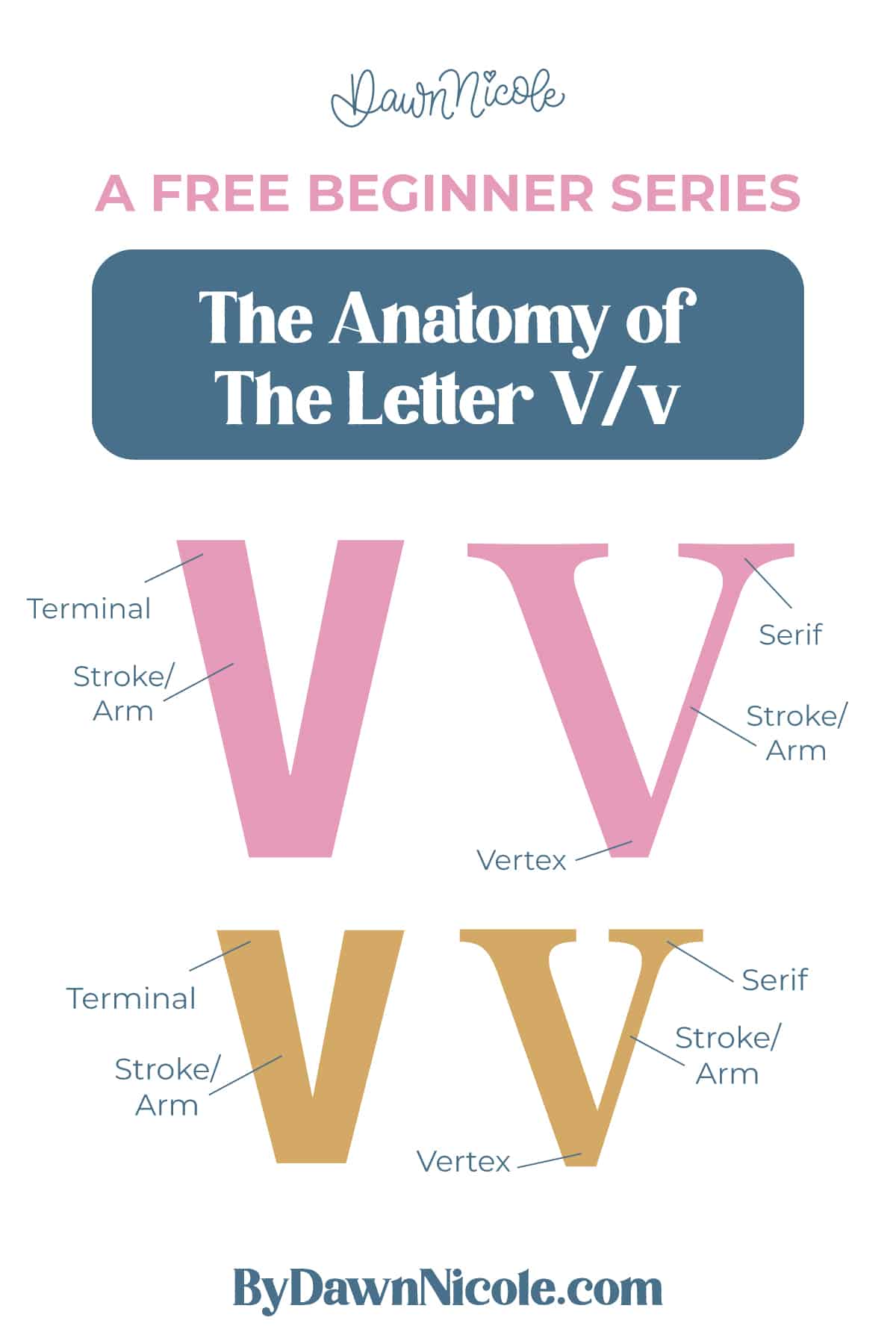
Uppercase LETTER V
The uppercase V is wide, angular, and built for balance.
- Arms/Strokes: The two diagonal lines that move down toward each other.
- Vertex: The sharp point where the two strokes meet at the bottom.
- Terminal: The endpoints of the stroke.
- Serifs (optional): Small finishing strokes at the end of a stem in serif styles.
💡Pro Tip: In well-designed lettering, the arms usually “fan out” slightly, meaning the top is wider than the bottom. This keeps the letter from looking too narrow or pinched. Also, if drawn with a bottom point, it dips just below the baseline. That tiny overshoot helps the V feel visually aligned with flat-bottom letters.
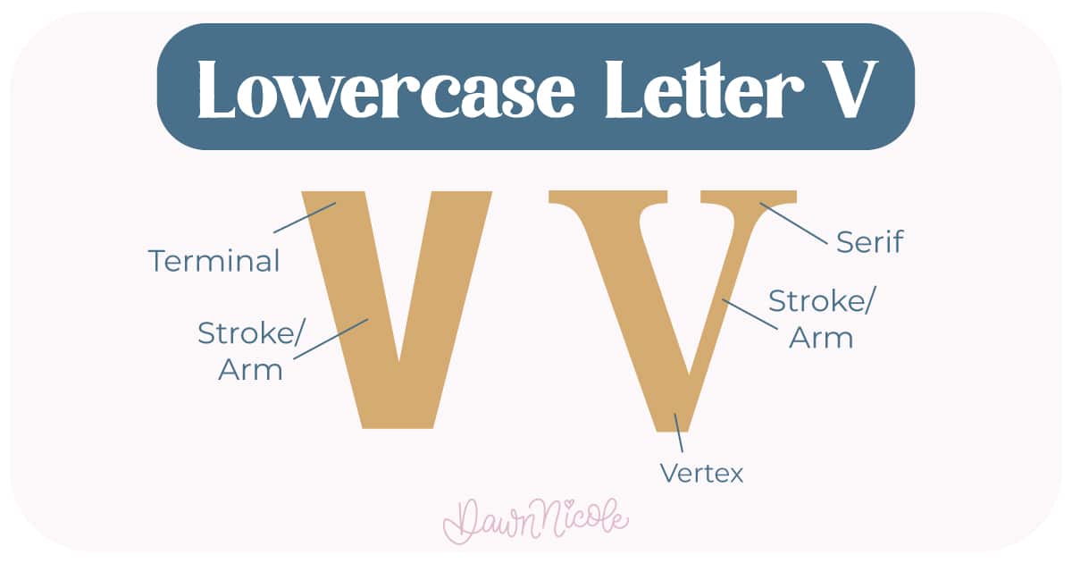
LowerCase LETTER V
The lowercase v keeps the exact same structure, just scaled down.
- Arms/Strokes: The two diagonal lines that meet at the bottom.
- Vertex: The bottom point where the strokes connect.
- Terminal: The finishing end of the stroke on the right, which may be simple, curved, or serifed.
- Serifs (optional): Small finishing strokes at the base of the stem or the end of the shoulder in serif styles.
💡Pro Tip: The top of the letter aligns with the x-height rather than the cap height. Just like the uppercase, the vertex usually dips slightly below the baseline for optical balance
Because V is made entirely of diagonals, it’s a great letter for practicing consistent angles and clean, sharp joins. If your diagonals are off, this letter will show it immediately.
 HELPFUL LINKS
 HELPFUL LINKS
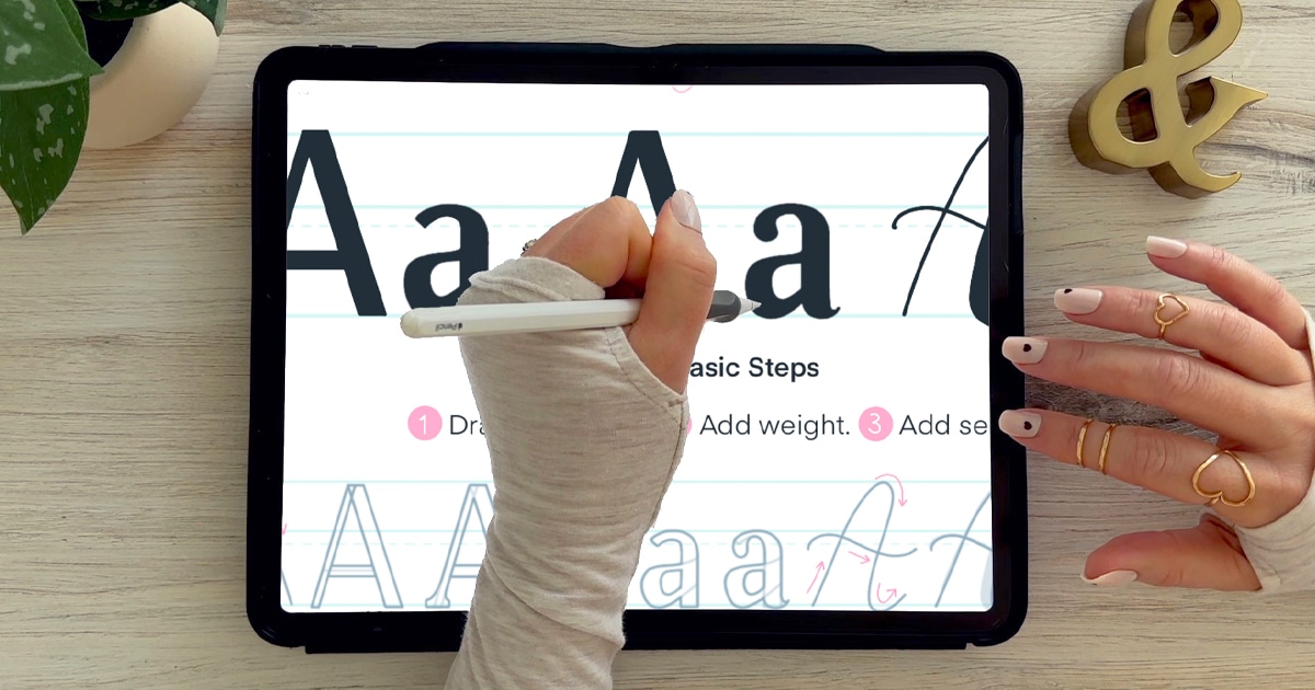
Want to learn how to draw each letter in three foundational styles?
Ready to get more playful with your styles? Check out the links below!
- Hand Lettering the Alphabet: A-Z. A free video series covering how to draw every letter in three foundational styles.
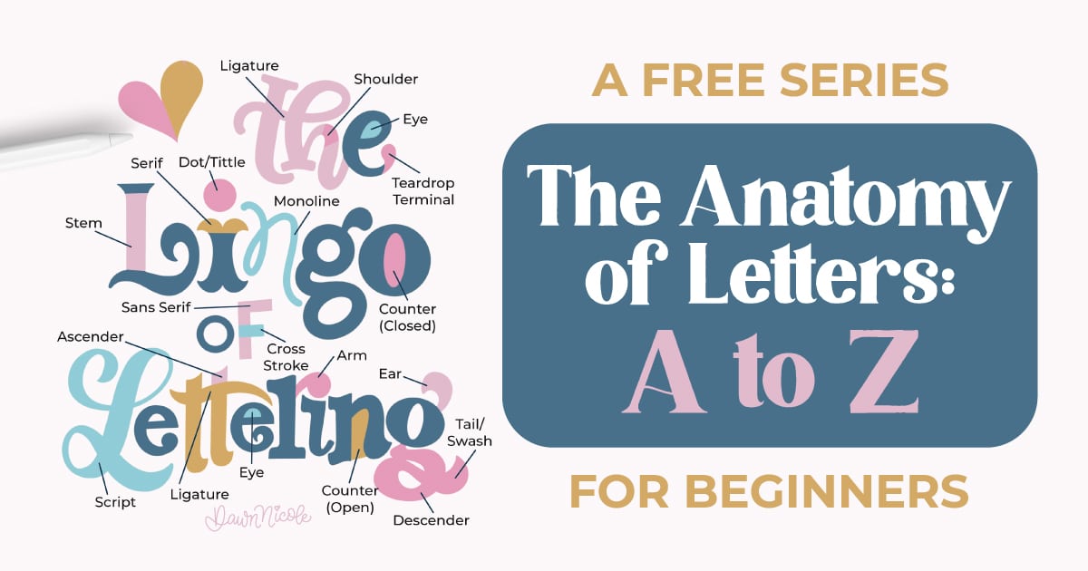
- The Anatomy of Letters: An A–Z Guide
- Ready to level up? Check out my 12 Playful Lettering Styles.


Happy drawing!


