Anatomy of the Letter W
The letter W is the widest letter of the alphabet. It is essentially a double V, although usually not quite as wide. It’s built from four diagonal strokes that create a zig-zag shape across the baseline. Because of that repetition, W is all about rhythm, spacing, and keeping your angles consistent. When it’s done well, it feels balanced and strong. When it’s off, it can look wobbly.
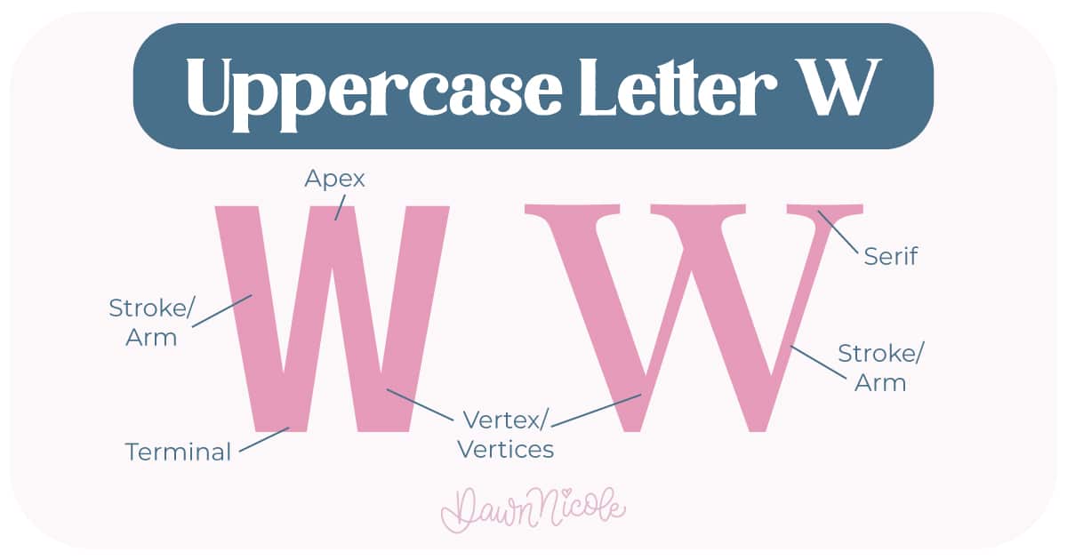
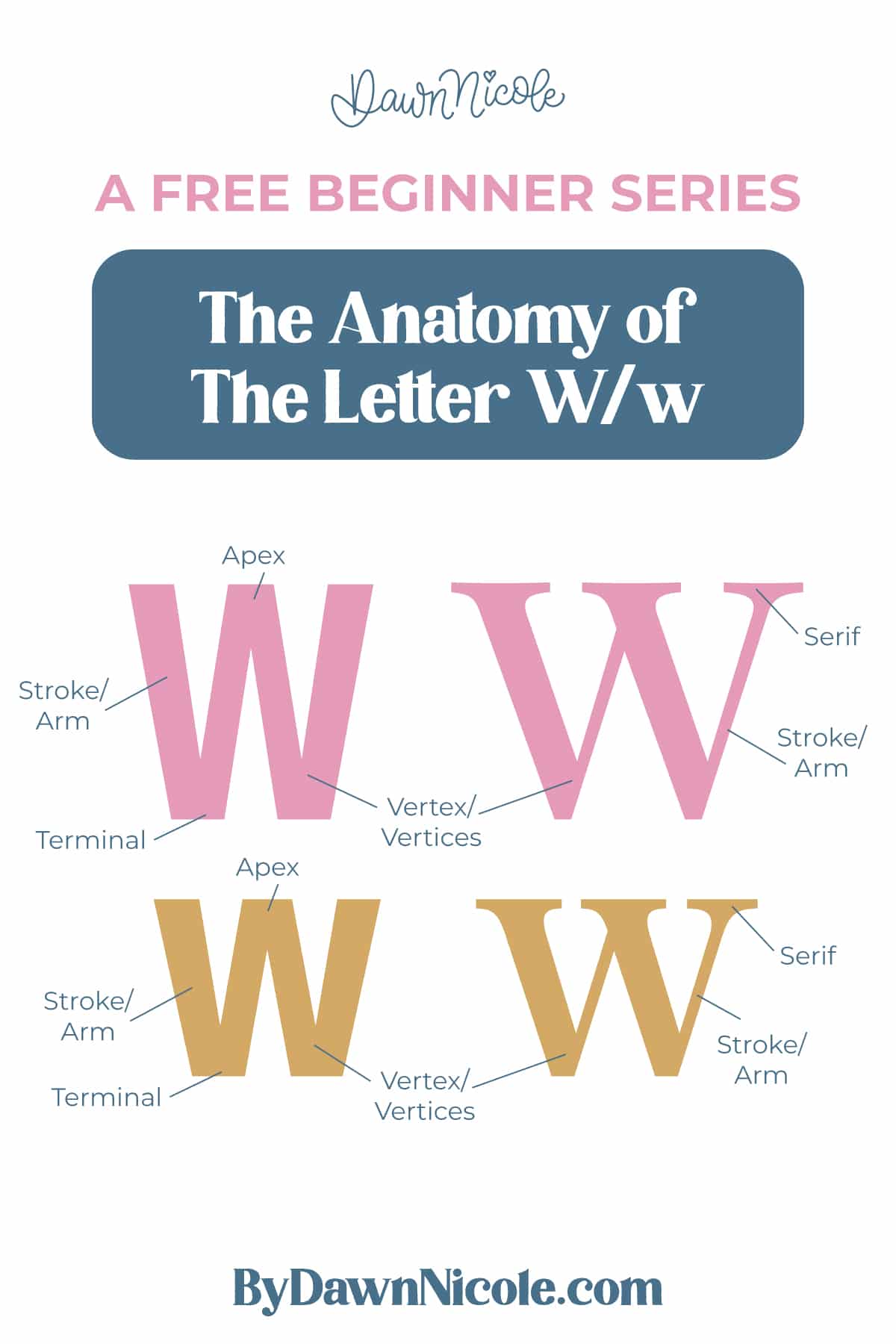
Uppercase LETTER W
The uppercase W is wide, angular, and usually takes up more horizontal space than most letters.
- Arms/Strokes: The four diagonal lines that move down and up across the letter
- Vertex (Vertices): The two bottom points where the strokes meet along the baseline (these often dip slightly below for overshoot when drawn with a point)
- Apex(es): The top point(s) where the strokes change direction.
- Terminal: The endpoints of the stroke.
- Serifs (optional): Small finishing strokes at the end of a stem/stroke in serif styles.
💡Pro Tip: Most well-balanced W’s are slightly wider at the top, with evenly spaced strokes to keep the shape from feeling cramped.
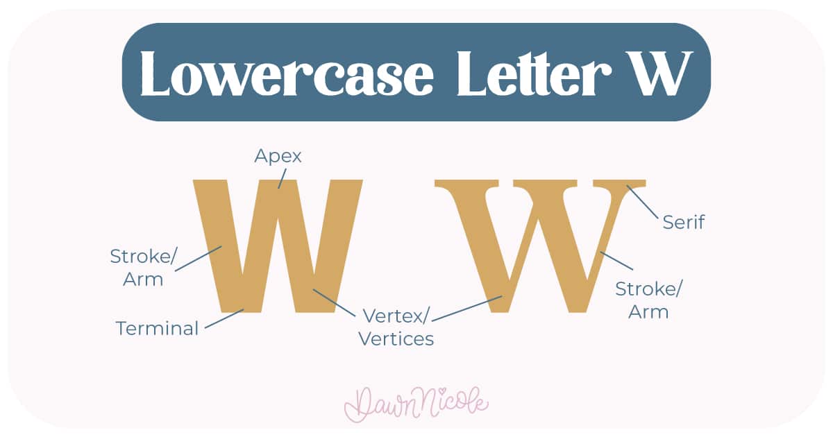
LowerCase LETTER W
The lowercase w follows the same structure but fits within the x-height.
- Arms/Strokes: The four diagonal lines that move down and up across the letter
- Vertex (Vertices): The two bottom points where the strokes meet along the baseline (these often dip slightly below for overshoot when drawn with a point)
- Apex(es): The top point(s) where the strokes change direction.
- Terminal: The endpoints of the stroke.
- Serifs (optional): Small finishing strokes at the end of a stem/stroke in serif styles.
💡Pro Tip: The W is a great letter for practicing rhythm and repetition. If you can keep all four strokes consistent, the rest of your diagonal letters will instantly improve.
What to Watch for:
- Spacing: Because W repeats the same shape twice, uneven spacing stands out immediately
- Angle consistency: All four diagonals should feel like they belong to the same system
- Width: Too narrow and it feels cramped, too wide and it loses structure
 HELPFUL LINKS
 HELPFUL LINKS
Want to learn how to draw each letter in three foundational styles?
Ready to get more playful with your styles? Check out the links below!
- Hand Lettering the Alphabet: A-Z. A free video series covering how to draw every letter in three foundational styles.
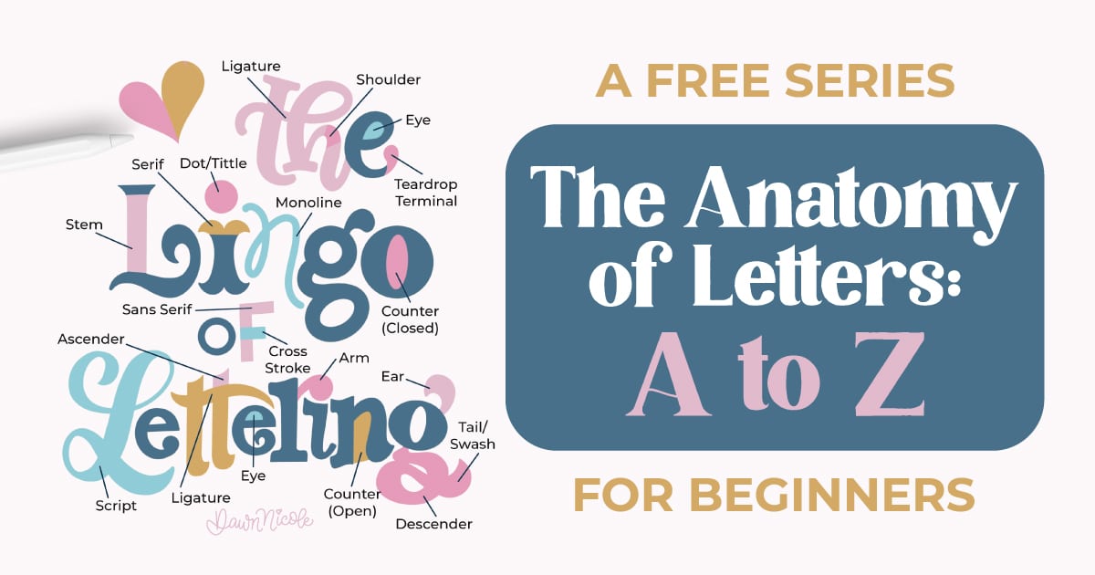
- The Anatomy of Letters: An A–Z Guide
- Ready to level up? Check out my 12 Playful Lettering Styles.


Happy drawing!


