Anatomy of the Letter Y
The letter Y combines two diagonal strokes with a vertical stem, giving it a strong split structure at the top and a clean, grounded finish at the bottom. It’s part diagonal, part vertical, which makes it a great letter for practicing transitions between angles and straight lines.
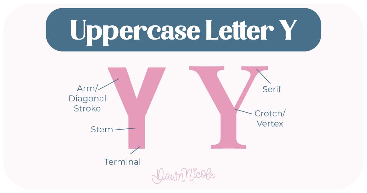
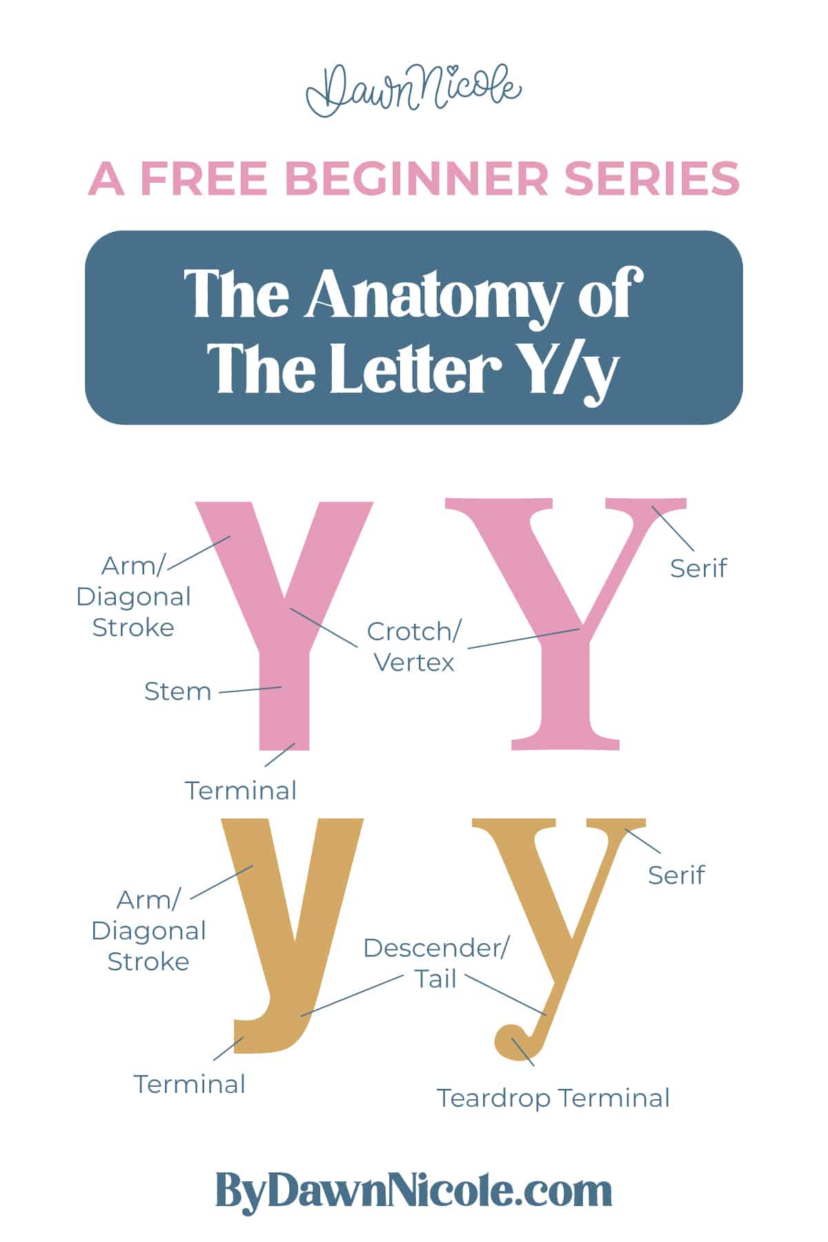
Uppercase LETTER Y
The uppercase Y starts wide at the top and funnels into a single vertical stem.
- Arms/Diagonal Strokes: The two diagonal strokes that branch out from the top and meet at the center.
- Stem: The vertical stroke that extends from the vertex down to the baseline.
- Vertex/Crotch/Junction: The point where the two arms connect and transition into the stem
- Terminal: The endpoints of the stroke.
- Serifs (optional): Small finishing strokes at the end of a stem/stroke in serif styles.
💡Pro Tip: The placement of the vertex/crotch is key. Too high or too low, and the whole letter can feel unbalanced.
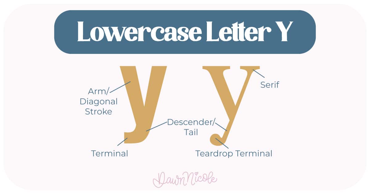
LowerCase LETTER Y
The lowercase y keeps the same split at the top but adds a descender.
- Arms/Diagonals: Two diagonal lines that meet at the crotch.
- Descender: The stroke that drops below the baseline.
- Tail: The finishing end of the descender, which may be straight, curved, or looped, depending on the style
- Terminal: The endpoints of the stroke.
- Serifs (optional): Small finishing strokes at the end of a stem/stroke in serif styles.
💡Pro Tip: Because X is all diagonals and one central crossing, it’s a great letter for practicing precision. Nail the angles and the center point, and the whole letter snaps into place.
What to Watch for:
- Crotch/Vertex placement: The point where the arms meet should feel centered and balanced.
- Angle vs. vertical: Keep the transition from diagonal arms to vertical stem smooth.
- Descender flow: In lowercase y, the tail should feel natural, not stiff or forced.
Because Y blends diagonals and verticals, it’s a great letter for refining transitions in your lettering. Get that vertex right, and the whole letter clicks.
 HELPFUL LINKS
 HELPFUL LINKS
Want to learn how to draw each letter in three foundational styles?
Ready to get more playful with your styles? Check out the links below!
- Hand Lettering the Alphabet: A-Z. A free video series covering how to draw every letter in three foundational styles.
- The Anatomy of Letters: An A–Z Guide
- Ready to level up? Check out my 12 Playful Lettering Styles.


Happy drawing!


