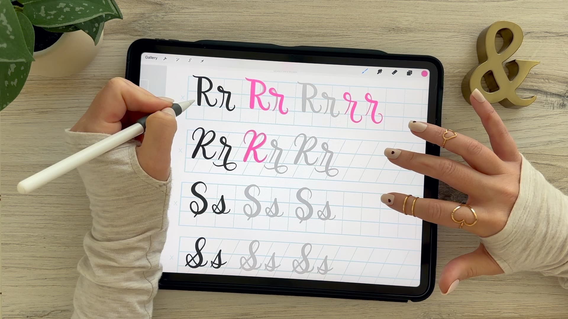
Calligraphy R: Uppercase & Lowercase (Video Tutorial). Learn to draw the letter R in this step-by-step brush calligraphy video tutorial for beginners. Follow along with paper or Procreate!
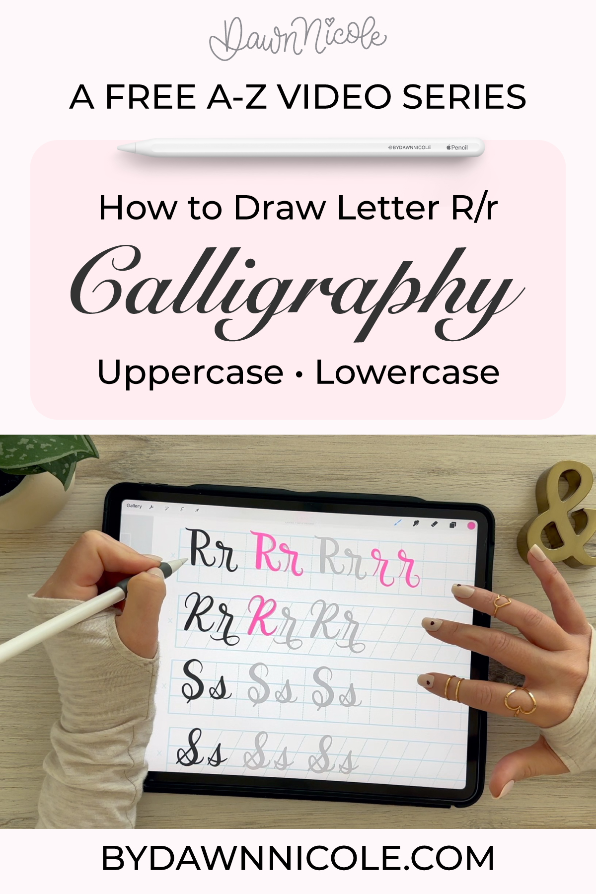
Calligraphy R: Uppercase & Lowercase (Video Tutorial)
If you’ve been practicing brush calligraphy, the letter R is a great next letter to work on.
Each letter brings its own challenges, and repetitive practice helps you build control, practice curves, transitions, and consistency. Once this one clicks, you’ll start to notice improvement across your lettering as a whole.
In this tutorial, I’ll walk you through both uppercase and lowercase, step by step, so you can practice with intention (and actually see progress).
Brush Calligraphy Basics
Before we start, remember the two rules that make brush calligraphy work:
- Upstrokes = light pressure (thin lines)
- Downstrokes = heavy pressure (thick lines)
Everything we’re about to do is built on that contrast.
Calligraphy R: Uppercase and Lowercase Video Tutorial
CALLIGRAPHY Alphabet A-Z: Free VIDEO TUTORIALS
Use the links below to watch the video for each letter of the alphabet. Click the letter you want to go to the blog post. Start with A or jump to any letter you want to practice first. I recommend starting with the calligraphy drills lesson and free practice sheets.
A – B – C – D – E – F – G – H – I – J – K – L – M – N – O – P – Q – R – S – T – U – V – W – X – Y – Z
Want to Take This Further?
If you’re practicing on Procreate and want more guidance on strokes, consistency, and building polished lettering pieces, I walk through the full process step by step inside my iPad Calligraphy in Procreate course.
It’s designed to take you from practicing letters… to actually creating finished work you’re proud of.
All of the practice sheets and Procreate brushes I’m using in the free video series are included in this class.
Want Step-by-Step iPad Calligraphy Lessons?
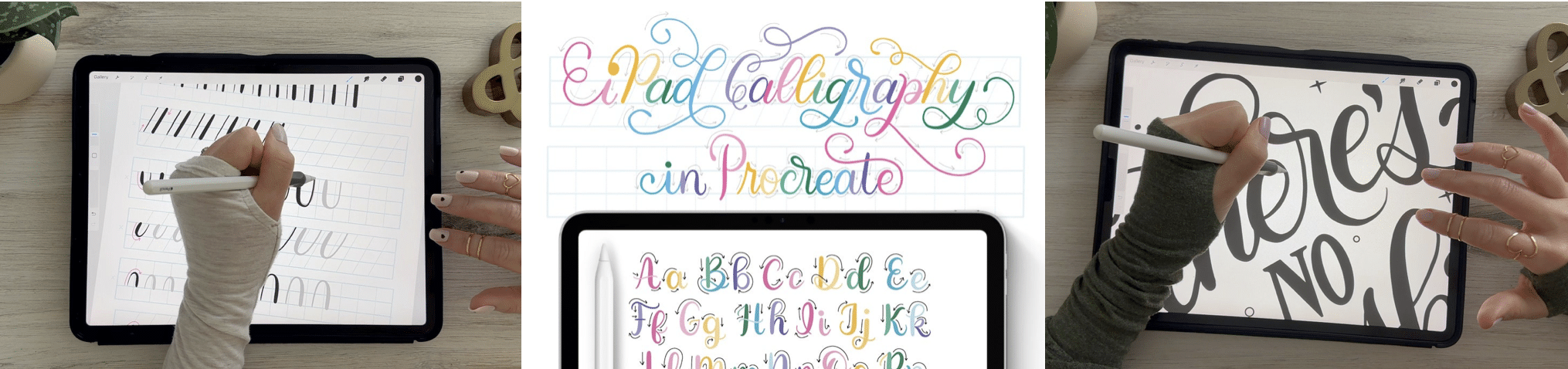
If you want guided, start-to-finish instruction for learning calligraphy on your iPad, I teach the full process inside my iPad Calligraphy in Procreate class. You’ll learn strokes, letterforms, words, and finished pieces with real-time demos and practice projects.
There are 50 Lessons and 3 Hours of Video Content. It’s well-organized and easy to follow via my online class platform (Thinkific). All the brushes and worksheets you need to learn iPad Calligraphy are included with the class.
- Intro Lessons (3 lessons + Class Downloads)
- Drills (1 lesson + Worksheet Set)
- Alphabet (26 lessons + Procreate Workbook)
- Words + Short Phrases (1 lesson + Worksheet Set)
- Tricky Letter Combos (1 lesson + Procreate workbook)
- Project No. 1: Calligraphy Word Art (6 Lessons)
- Project No. 2: Dancing Calligraphy Animation (2 Lessons)
- Project No. 3: Ghostwriting Animation (2 Lessons)
- Bonus Lessons (2 Lessons + Procreate Worksheet)
iPad Calligraphy in Procreate Class →
IPAD CALLIGRAPHY CLASS FAQs
- What Do I Need for this Class? You’ll need an iPad, Apple Pencil, and the Procreate App. Everything else you’ll need is included in your class downloads.
- Can I watch it anytime? Yes! The class is pre-recorded and available to watch at your convenience. You have lifetime access.
- Is it okay if I’m new to Procreate and/or Calligraphy? Yes, you are the intended audience for this class. We’ll take things step-by-step. I love project-based learning because it makes things more fun and easier to understand.
What to watch for
- A common mistake is making strokes feel too stiff. Try to keep everything fluid.
- Make sure your thick downstroke is actually thick (don’t be shy with pressure)!
- Try not to rush—smooth > fast.
Practice Tips for a Better “R”
“R” is where structure and flow start working together in a really satisfying way. It combines a strong stem, a curve, and a leg, so it’s great practice for transitions, spacing, and control.
- Start with a confident stem. Your first downstroke is the anchor: Heavy, even pressure. Smooth and steady. Everything else builds off this line.
- Keep the shoulder rounded (lowercase). The curved part of the lowercase “r” should feel soft and controlled, not pointy or stiff.
- Use light pressure on the curve. As you move into the shoulder, light on the upstroke. Slight pressure on the down curve. This creates that clean calligraphy contrast.
- Don’t overextend the arm/bowl. One of the biggest mistakes with “r” is making the arm too long. Keep it compact and balanced.
- Watch the transition point. Where the curve meets the stem should feel seamless, not pinched or disconnected.
- Uppercase “R” = think “P” plus a leg. Start with: Strong vertical stem. Rounded upper bowl. Then add a diagonal leg that feels intentional and balanced.
- Keep the leg clean and controlled. The diagonal stroke shouldn’t shoot too far outward. A subtle angle usually looks more polished.
Practice Words with “R”
These help with transitions and varied connections:
- run
- rain
- rise
- river
- radiant
Common Mistakes
- Pressing too hard on every stroke (you’ll lose contrast).
- Uneven shapes.
- Rushing through the letter instead of building it intentionally.
💡Extra Tip (THIS ONE HELPS FAST)
Practice this motion repeatedly:
- stem → curve → release
Then separately practice:
- stem → bowl → diagonal leg (for uppercase)
Breaking the pieces apart makes the full letter much easier to control.
“R” can feel a little awkward at first, but once the transitions smooth out, it becomes one of the prettiest letters in the alphabet.
FAQ: Calligraphy Letter R
How do you write calligraphy R?
A calligraphy R is created using a combination of thin upstrokes and thick downstrokes, following the natural flow of brush lettering. Watch the video lesson for more precise instruction on this letter.
Why is my letter uneven?
This usually comes down to inconsistent pressure or rushing your strokes. Slowing down and focusing on control will make a big difference.
Is it hard to learn calligraphy?
Some letters are trickier than others, but with step-by-step practice, they all become much easier over time.
Can I practice this in Procreate?
Yes, these same techniques apply to digital brush calligraphy, and Procreate is a great tool for practicing and refining your strokes.
HELPFUL LINKS
- Practice the next letter: Calligraphy S
- Or go back: Calligraphy Q
Related Series
- The Anatomy of Letters: An A-Z Guide
- Hand Lettering the Alphabet A–Z for Beginners
- Playful Bubble Letters: A-Z (with free Practice Sheets!)
- Playful Serif Lettering Alphabet: A-Z Tutorials (with freebies!)
- Modern Penmanship Tips for Calligraphy and Lettering Lovers
Subscribe to my YouTube Channel!
Happy Practicing!